Meet the Maker: Jane Dignum

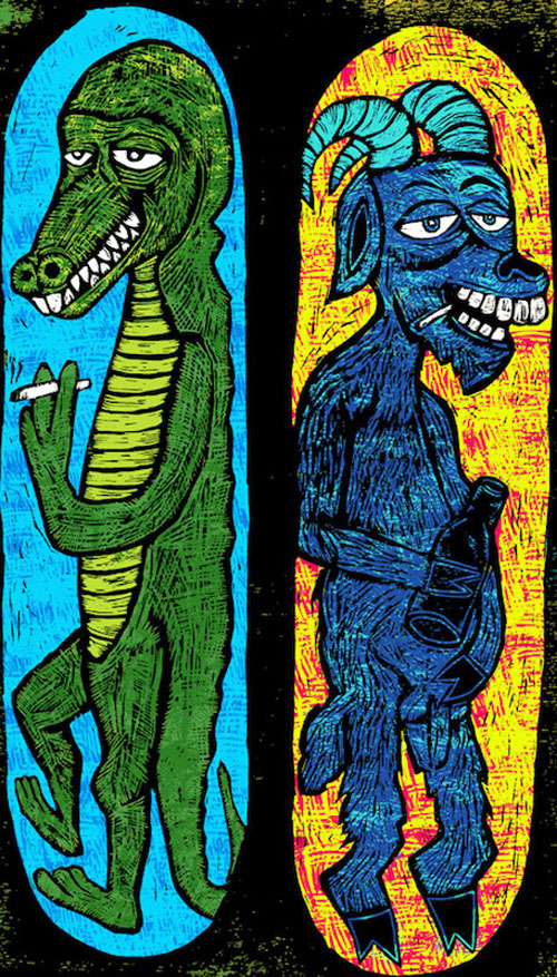
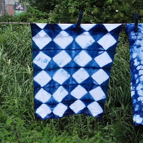
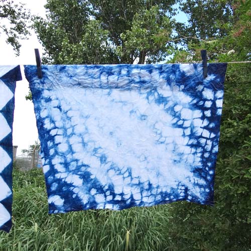
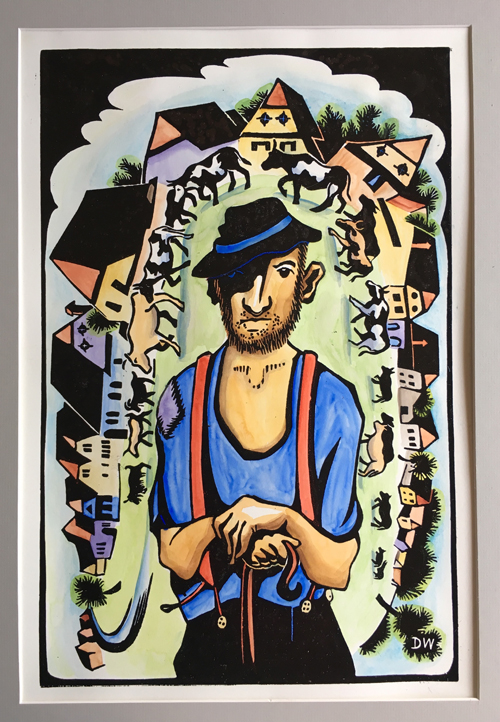
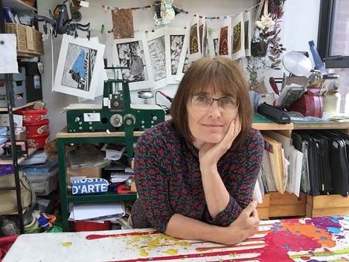
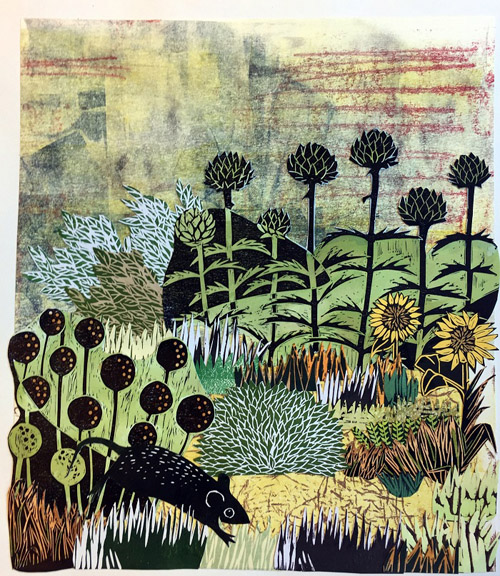
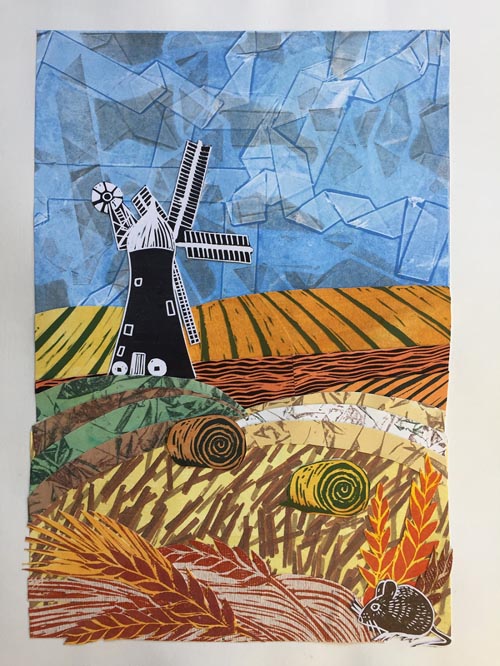
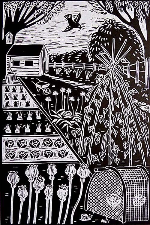
My name is Jane Dignum and I am a printmaker living in York, North Yorkshire. Although I like to try out lots of printmaking techniques, I tend to focus on Linocut and I also make collages from pieces of my prints. The city of York and the county of Yorkshire are great sources of inspiration for my work as is my allotment and the wildlife that I see there.

How and where did you learn to print? How long have you been printmaking?

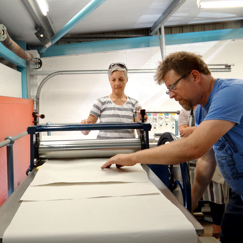
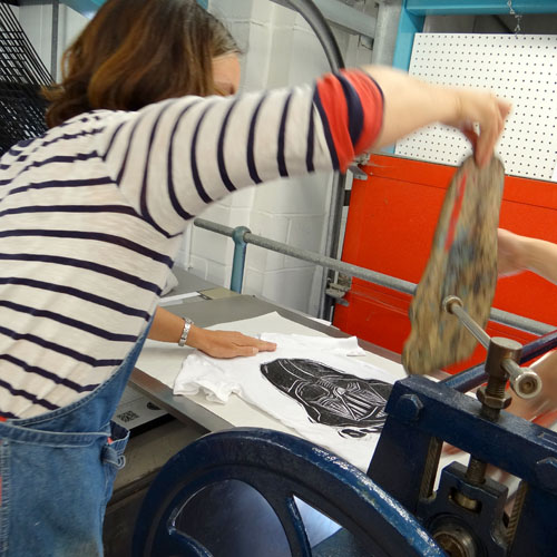
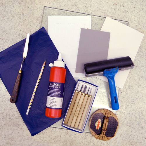
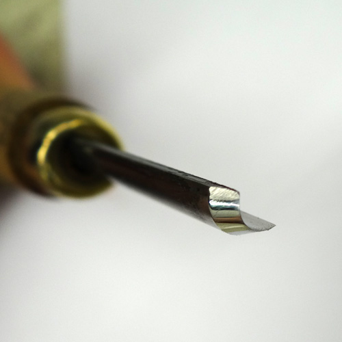
I have been printmaking on and off for at least twenty years. I used to mainly draw and paint but I have a tendency to become obsessed with fine detail. Printmaking allows for more stylistic freedom and to a degree, you are out of control of some of the process which is very exciting. I taught myself to relief-print as all I needed was a material such as Lino, a few tools, paper and ink. It is a very accessible form of printing and I was able to achieve satisfactory results just by working at the kitchen table. Then I completed a degree in Fine Art at Leeds College of Art. I was working full-time as a teacher and so the part-time course took six years to complete as tutorials were held in the evening and other study units were fitted into school holidays. It was aimed at people who were working and you had to be pretty dedicated to finish it. It was here that I was introduced to printmaking using all of the facilities that a print studio had to offer and I was hooked. Following this, when I left college, I did not have access to the same resources and so I stopped printmaking for a while. Then, I attended a Linocut workshop in York where I was introduced to the Hawthorn etching presses which are made locally. I took the plunge, invested in a press and this was the real start of my printmaking journey.

Describe your printmaking process.

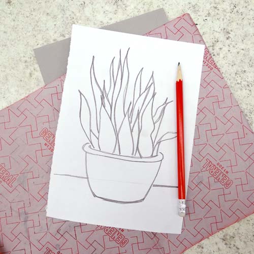
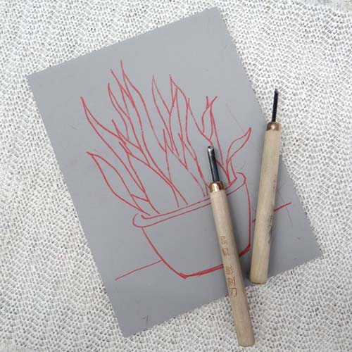
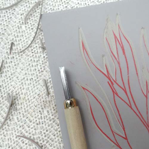
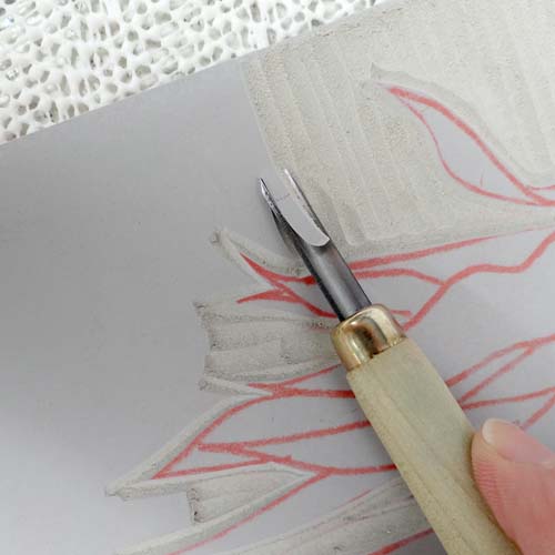
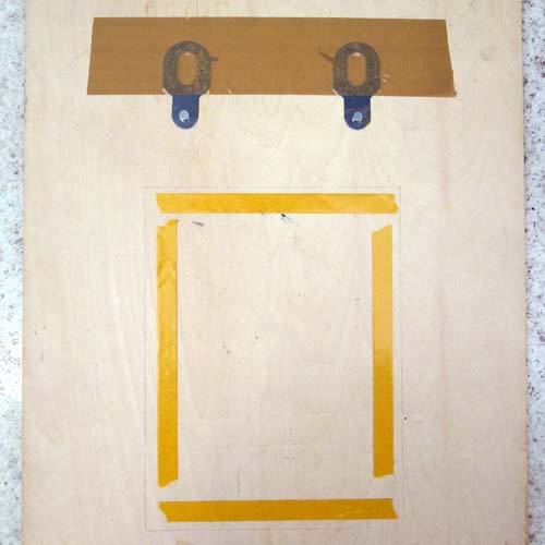
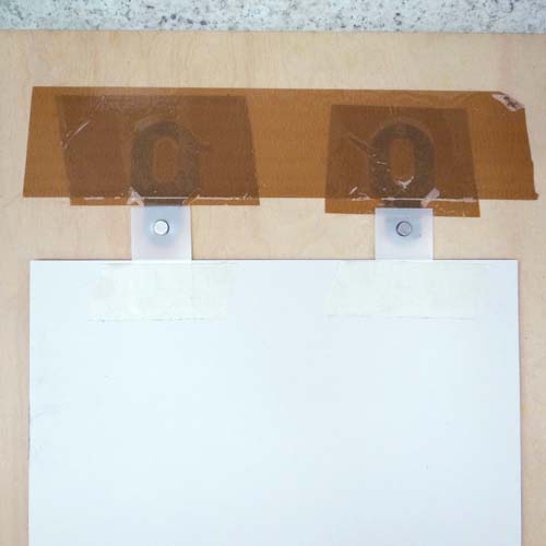
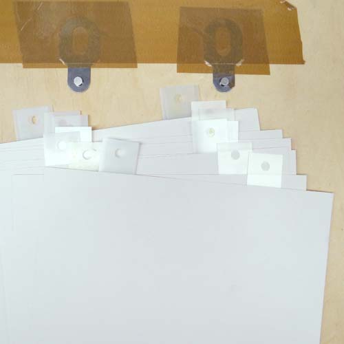
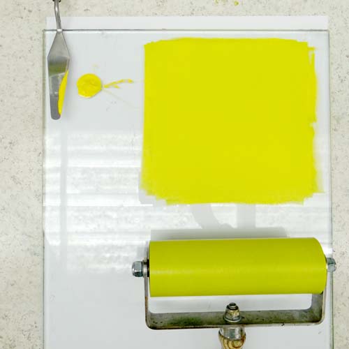
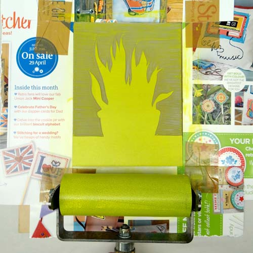
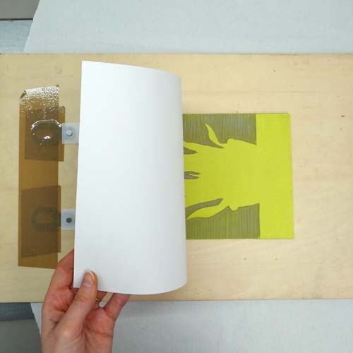
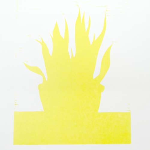
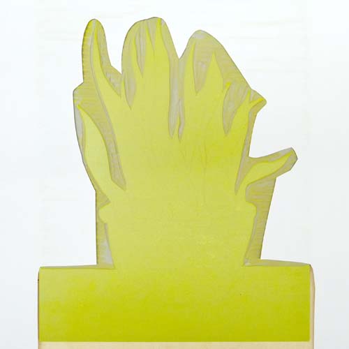
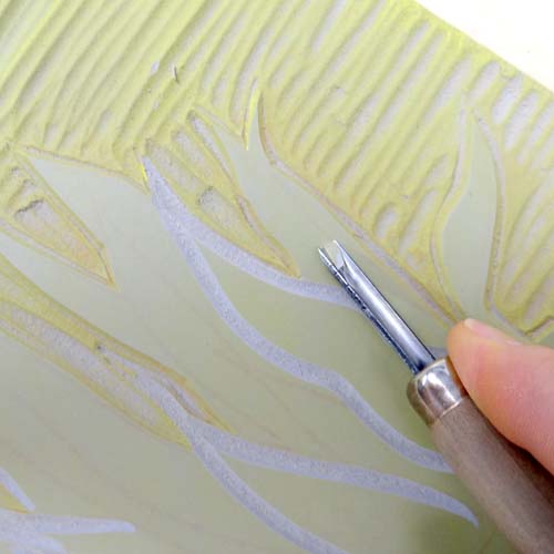
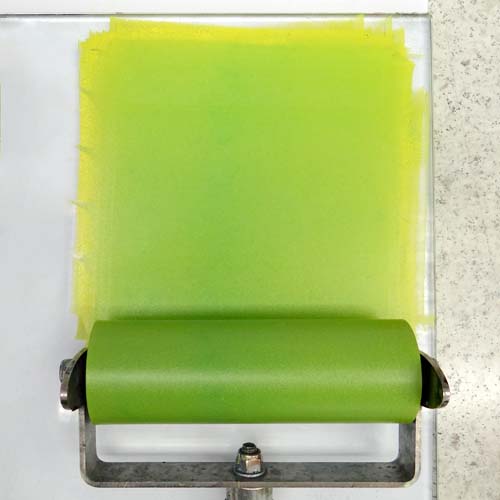
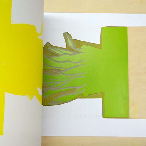
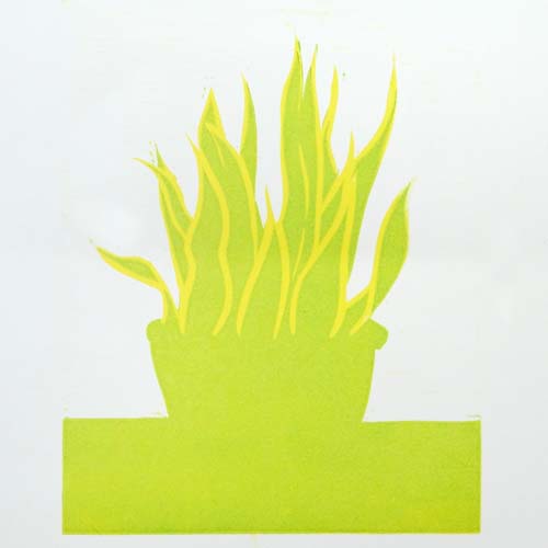
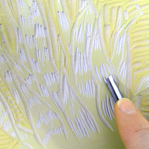
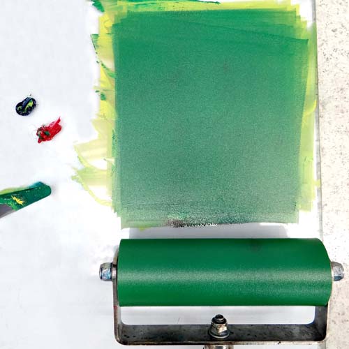
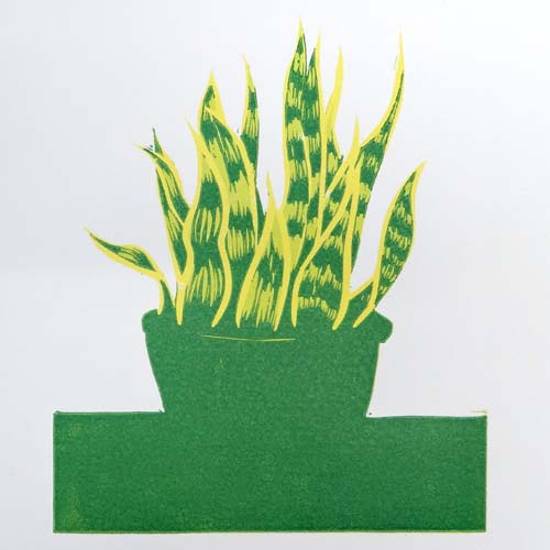
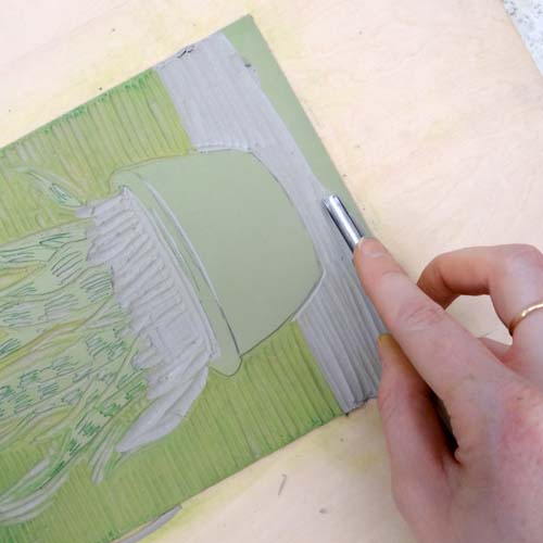
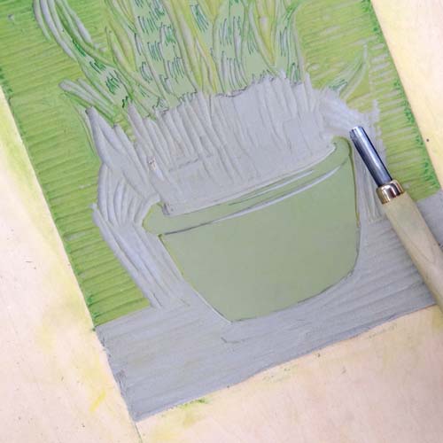
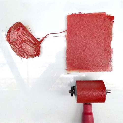
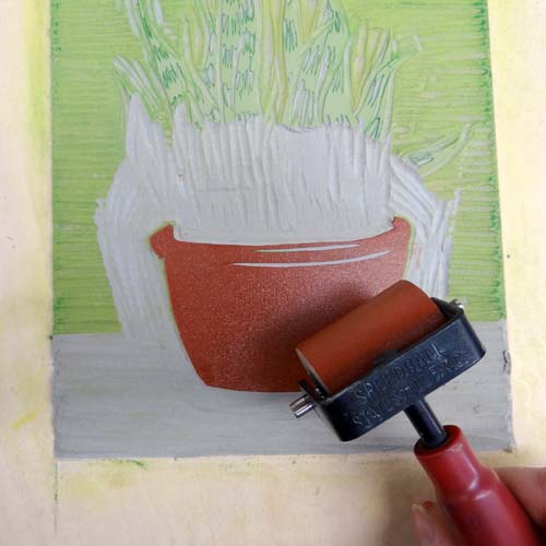
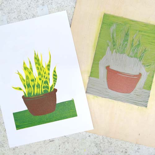
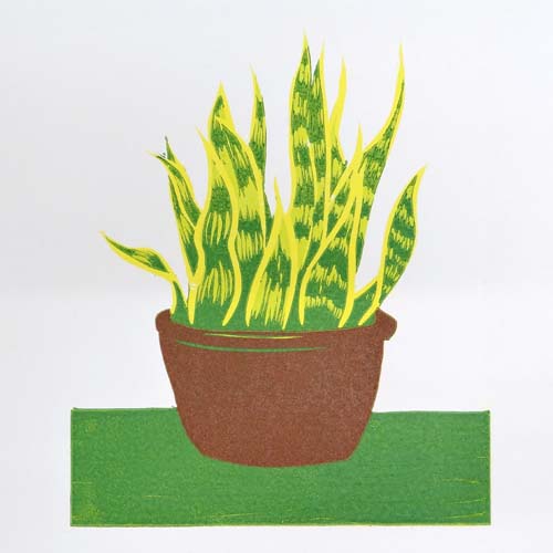
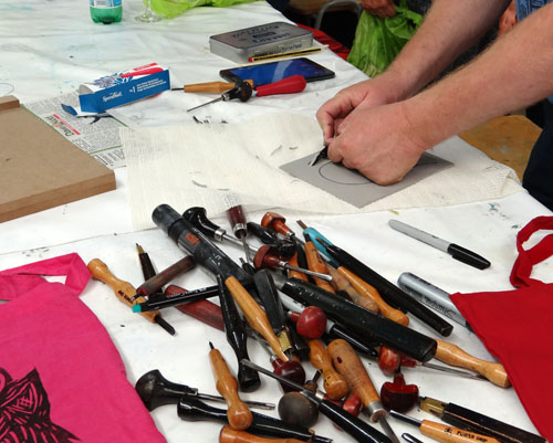
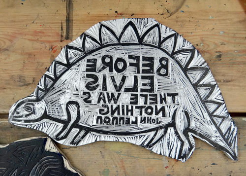
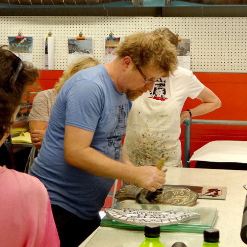
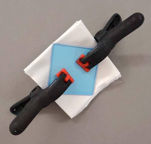
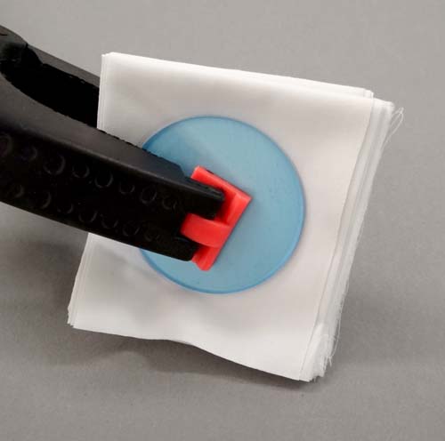
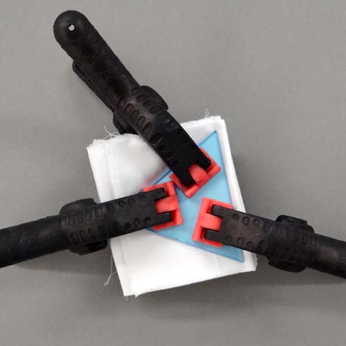
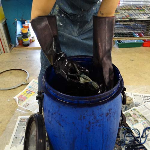
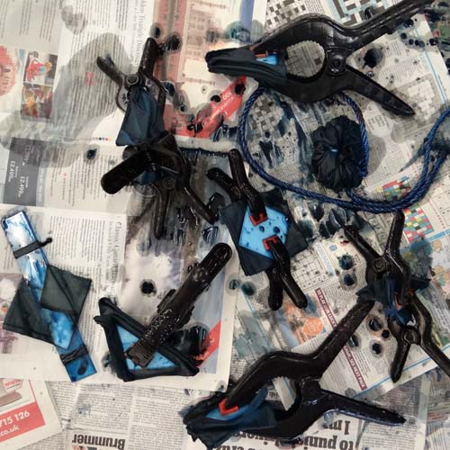
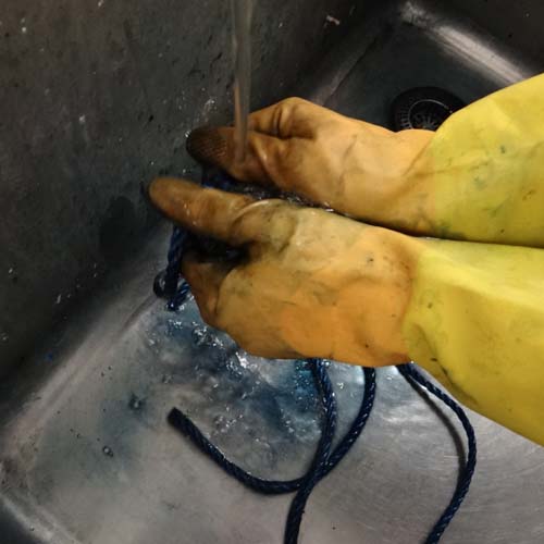
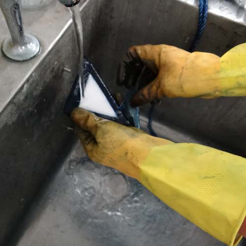
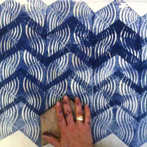
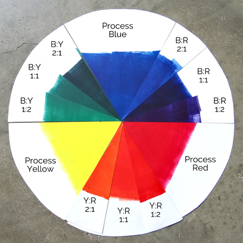
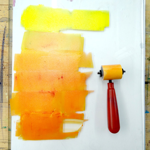
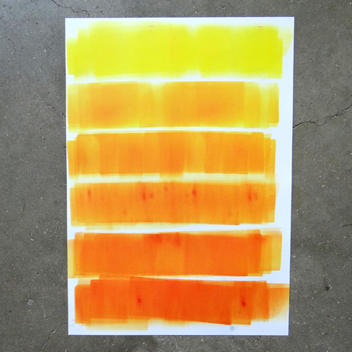
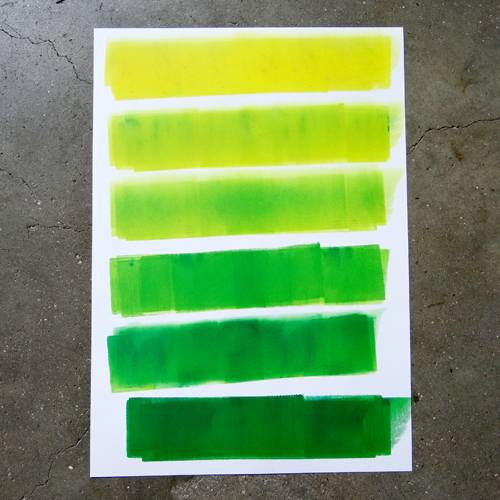
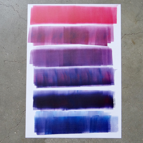
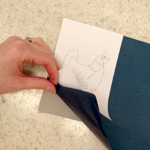
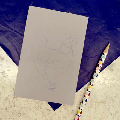
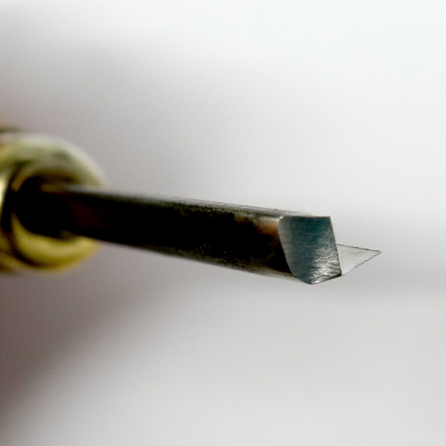
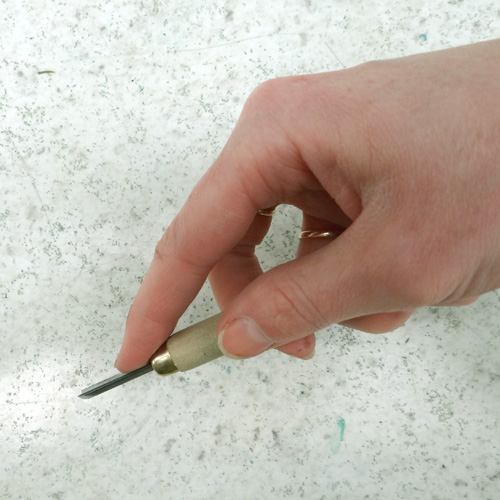
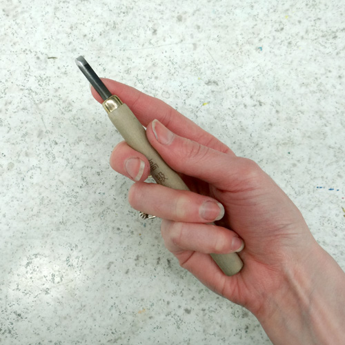
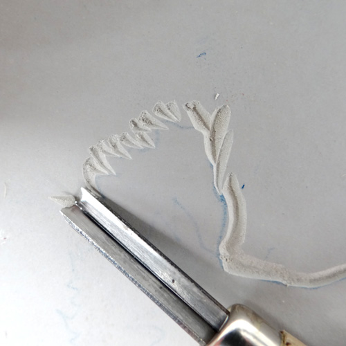
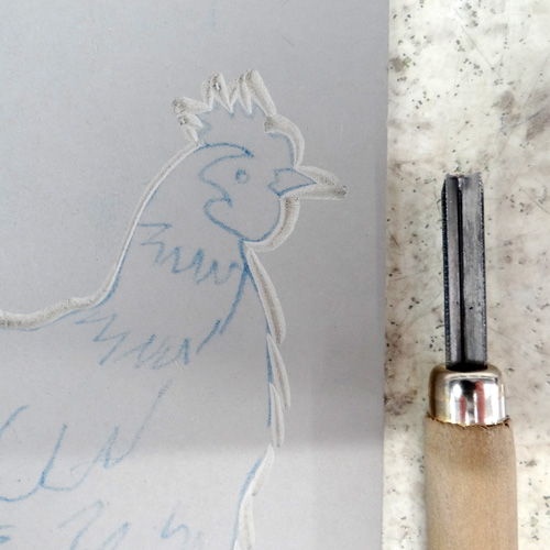
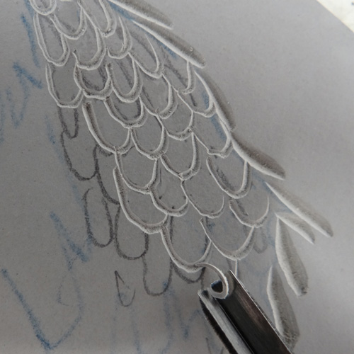
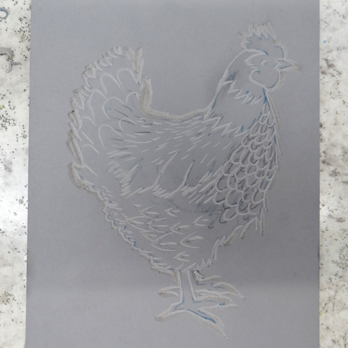
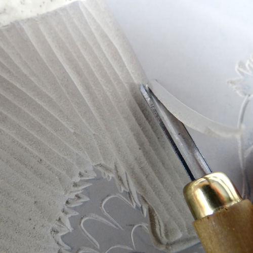
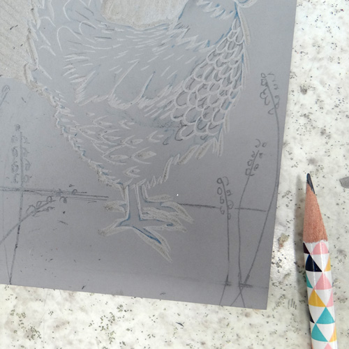
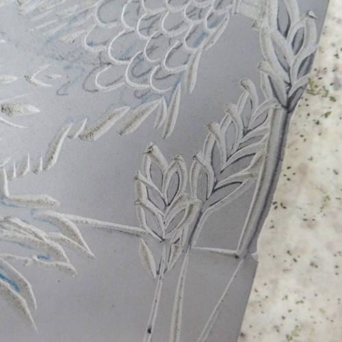
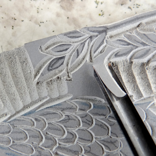
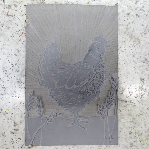
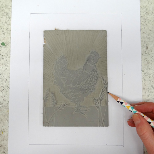
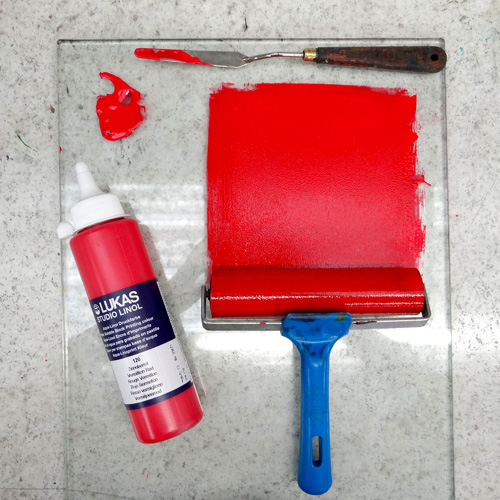
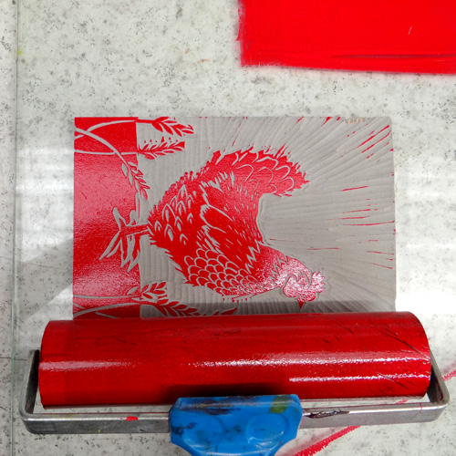
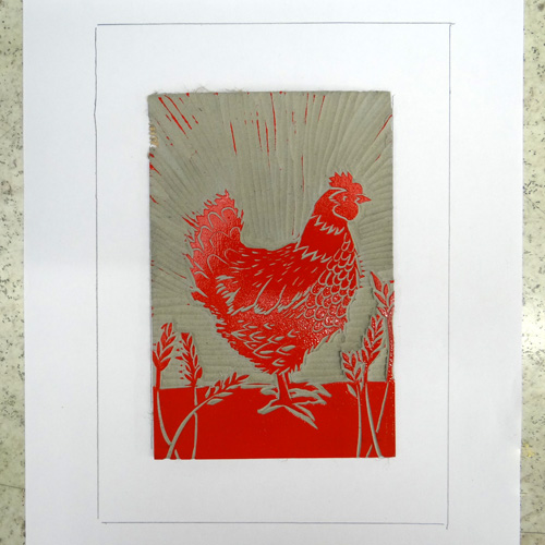
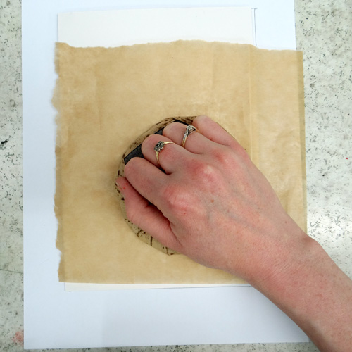
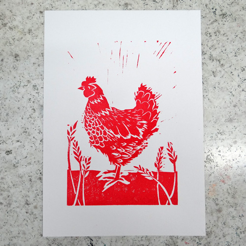
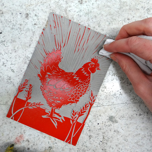
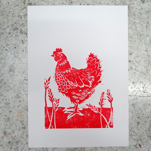
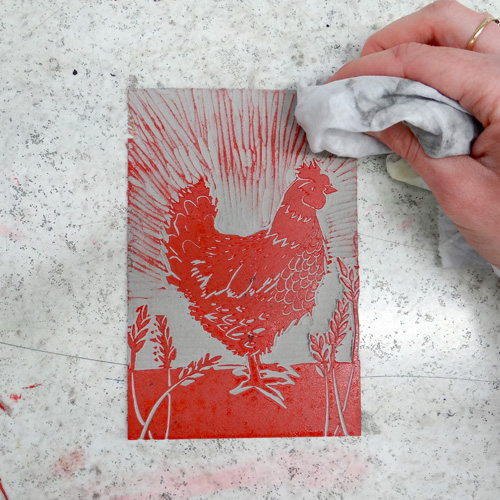
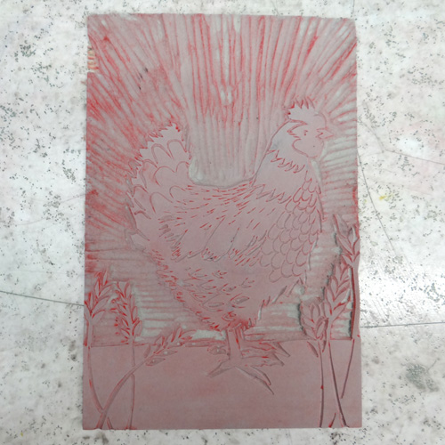
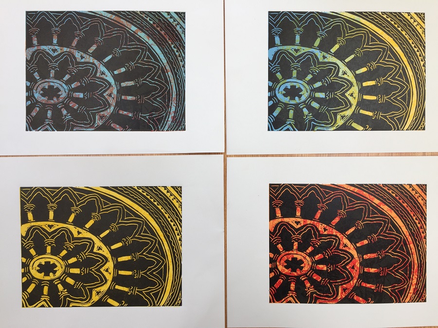
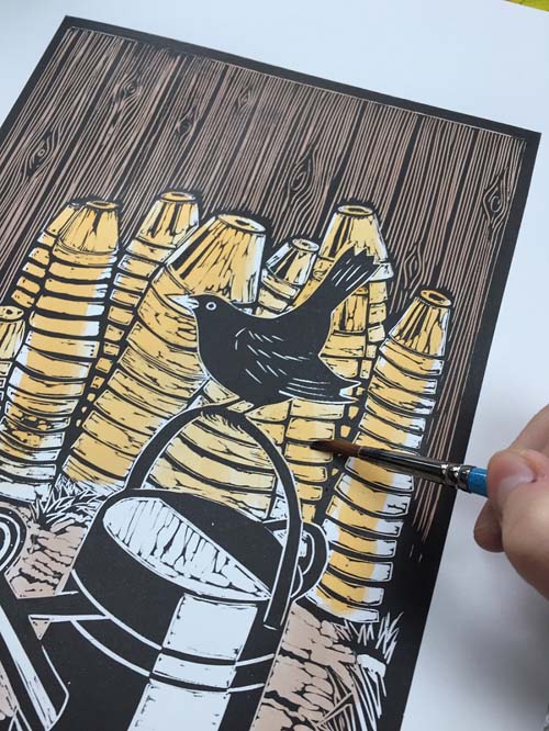
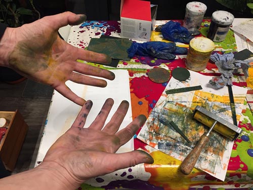
I have various ways of working and I often combine different methods. I always carry a small sketchbook and a camera with me wherever I go and am constantly on the lookout for interesting images and ideas. I then work out a design on paper or using an iPad. The iPad is useful for loading up my photographs and layering them to create a new composition. I then trace the design onto vinyl which I then carve. Sometimes I feel that a design works best just in simple black and white but at other times I feel that some colour is needed and I have various ways of achieving this. The ink that I use is oil-based so it allows me to hand-colour after the ink has dried using a water-based medium. I enjoy this as it combines my love of printing as well as painting. Another method I use is to transfer my design by printing it using Perspex onto another piece of vinyl. I then create separate printing plates for each colour, using the trusted Ternes Burton pins and tabs to register each one.

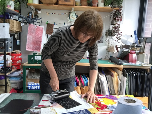
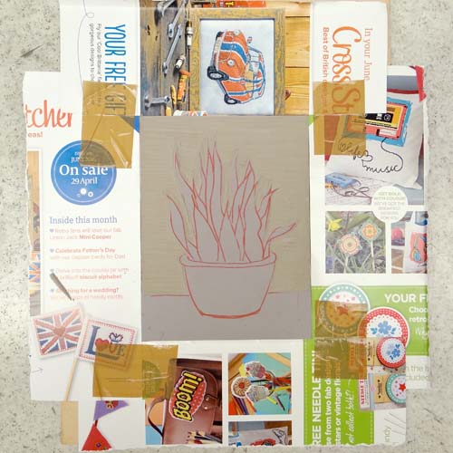
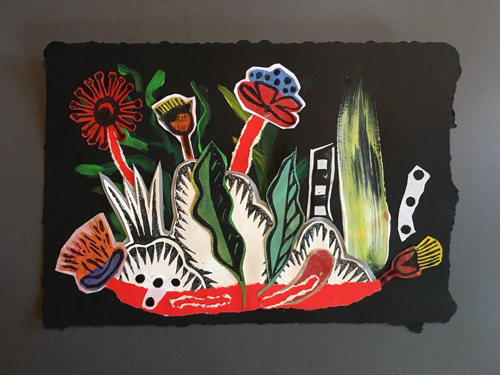
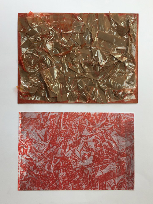
Although I don’t strictly create collagraph prints, I like to use collagraph techniques to create textures and interesting backgrounds. I stick all manner of materials onto card and try printing from them. Matchsticks, bubble wrap, cellotape, sandpaper all work very well. I am always on the lookout for different materials and keep examples of the results in my sketchbook. Sometimes, I chop up these experimental pieces to rearrange to make collages. I also use prints where maybe one corner hasn’t printed well but the rest is fine. I reuse the good bits and combine them all to create a unique piece. Nothing is wasted!

Where do you work?

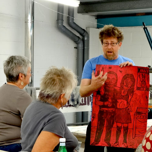
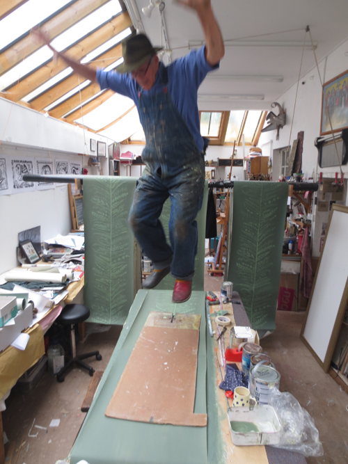
I work in my studio which has been purpose-built at the back of my house. It is there that I create my prints on my wonderful etching press. I usually spend my days carving, printing, collaging and experimenting with new ideas. I work in isolation which is why I have joined a local group of printmakers. We meet each month and discuss ideas, techniques and share tips. I believe that this is very important, so that your work does not become stale. We are a very active group, organising talks about printmaking, print fairs and exhibitions.

What inspires you?

I love to visit art exhibitions of all kinds and I have been influenced by too many artists to list them all. I have always loved David Hockney’s work and am fascinated by his etchings of The Fairy Tales of the Brothers Grimm. I also admire the Linocuts of Edward Bawden especially those showing architectural structures such as Borough Market and Covent Garden. I must also mention Robert Taverner, who is probably the greatest influence of all on me. His atmospheric countryside scenes with the sweeping grasses and stylised trees are just fantastic.

What is your favourite printmaking product?

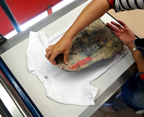
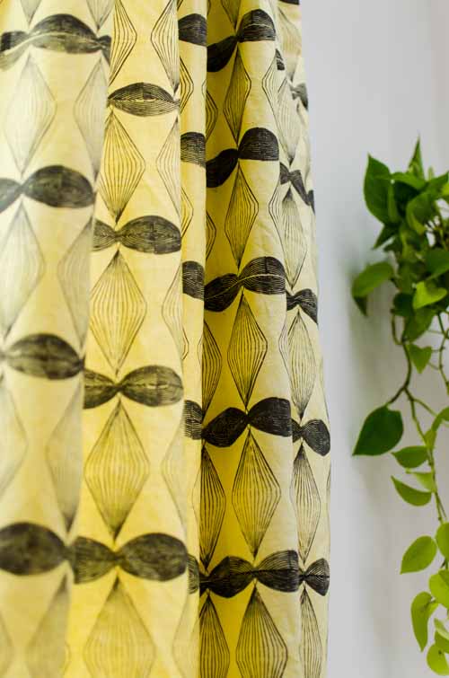
My favourite printmaking product is probably the range of Hawthorn Stay Open Inks. I use them all the time. I print with them onto all types of paper as well as on occasion, fabric. I can’t vouch for how well they would wash however! I have a printed onto a large white piece of fabric which I occasionally use as a screening off curtain at shows. I used scrunched up parcel tape stuck onto a large piece of card which I inked up and then printed over the entire piece of fabric. Once this was dry, I then printed ammonites in a range of sizes and colours all over the top of the background print. I had to print each ammonite separately. Lots of people admire this when they see it and I am probably the most proud of this work. It took about two weeks to create and dry.

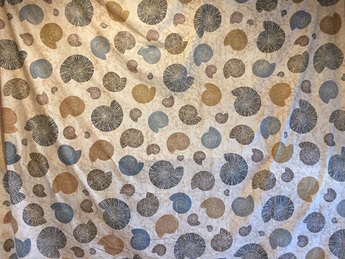
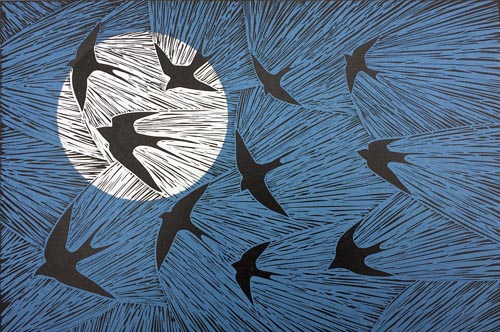
I often feature ammonites in my work as I see them set into the rocks along the coast at Whitby where I like to walk and fossil hunt. In 2015, I submitted some images to become part of the York Open Studios annual art event. It was a requirement to submit digital images as well as one actual physical piece. I submitted a print which featured ammonites and was successful at being selected. I have exhibited at York Open Studios three more times since then. I feel that the ammonite has been a lucky image for me and I use it as a logo on business cards and my online shop.

Where can we see your work? Where do you sell?

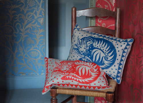
I sell my prints on Etsy and my designs are transferred onto a range of items by Redbubble. Both of these are available online. I also supply my prints to local galleries such as the Blossom Street Gallery in York and the Craft Centre and Design Gallery which is situated in the centre of Leeds. I also sell at art and print fairs in the Yorkshire area and I always use social media to show my latest work as well as to announce my up and coming events. Many of my designs are published as greetings cards and other items of stationery by Green Pebble, a greetings card company who sell throughout the UK as well as abroad. In the near future, I intend to run Linocut workshops in my studio for small groups of up to four. I will post the dates on social media platforms as well as on my website.

What will we be seeing from you next?

I am about to start working on some prints which incorporate stencils. This was inspired by some bold monoprints that I recently saw at the Venice Biennale by an artist called Ulrike Müller.

Do you have any advice for other printmakers and creatives?

My advice to other creatives would be to always be looking out for new ideas, never be afraid to try new things and just keep on creating.

Find me at:
Website:  www.janedignum.com
Etsy shop: JaneDignumArtworks
Redbubble.com : Jane Dignum
Instagram: janedignum
Twitter:  @janedignum
Facebook: Jane Dignum Artworks

Making a Reduction Linocut

Reduction linocut is one of the printmaking methods favoured by Picasso. To make a reduction linocut we use only a single piece of lino. Layers of colour are printed on top of one another, each from the same block which is carved between each colour.

A reduction linocut can be easier to register than a multi-block linocut as it does not rely on several blocks cut accurately to line up. By using Ternes Burton Registration Pins and Tabs we can ensure that our layers line up exactly each time. This style of linocut can also mean that we don’t need to rely too heavily on our original drawing whilst carving because the decisions we make will be constant throughout each layer.

Plan the design by drawing directly onto the block or transfer a drawing using carbon paper. We are using Red Carbon Paper to draw onto a single sheet of 152 x 203mm Traditional Grey Lino. Remember that the drawing must be reversed as it will print as a mirror image.

The first carving will decide the areas that we want to appear paper-white in the final design. Anything that is carved now will stay white throughout the whole process. In this design, the background behind the plant will be white. We are using a set of Japanese Cutting Tools.

A V tool is useful for outlining detail. This way, we can make sure that the important lines of the designs are crisp and are not accidentally cut into. Remember to cut only the areas that are to remain white. We are not outlining the whole design here, just the edge of the plant where it meets the white background.

A larger U tool can be used to clear large areas of lino. Choosing a consistent direction in which to carve will help tie the design together if these areas pick up ink when printing. Alternatively, if the design has a large area to be carved away, the whole section can be cut out carefully with a scalpel.

In order to ensure the design lines up perfectly, we can prepare a registration board using our Ternes Burton Pins. A piece of ply is perfect for this, or board from the back of a picture frame works well.
Draw around where you would like the paper to sit first so that we can choose a good position for our lino and pins. Use parcel tape to firmly stick down two Ternes Burton Pins. Decide on the position of the lino block and use double-sided tape to stick it down. The pins need to sit just above the top of the paper. These will stay here throughout the whole process.

The nature of a reduction linocut means that we cannot go back to print more of an edition once we have reached the second layer. We need to decide how large our print edition will be and prepare all the paper for the while edition. It is sensible to make the edition a little larger than your desired size as we may lose a few along the way.

Place two tabs onto the Ternes Burton Pins. Lay the paper over the top of the lino, using the pencil marks made earlier. Slip the paper underneath the tabs and use masking tape to stick them onto each piece of paper.

Prepare paper for the whole edition. We are using A4 Kent.

We will be inking up our block whilst it is stuck to the board. In order to keep the board free of ink (which may then transfer to the print), a mask can be helpful. Magazine pages work well as they are strong and wipable (and free!). Stick four pieces together to surround the block. This can then be removed to print.

Prepare the ink for the first layer. We will be printing each layer over the top of the last so it is usual to print from light colours through to dark. We are starting with Caligo Safe Wash Relief Printing Ink in Process Yellow. As we are using a pale colour, it is sensible to remove most of the carbon drawing on the block as it can show through the ink when printed. Using Zest-It will clean most of the drawing.

Roll out a thin layer of ink onto an inking plate. The rolled-out area of ink only needs to be a square the same width as the roller. We are using a Hawthorn Inking Roller which is slightly soft – this should give us an even layer of ink. The rolled ink should have a very slight texture to it but not be squelchy. The roller should make a zzz sound as it rolls across the ink.

Using the magazine paper mask to protect the board, roll the ink onto the block. If any unwanted ink is picked up by the carved lines it can be cleaned with a dry cloth.

Attach a piece of paper to the board by clipping the Ternes Burton Stripping Tabs onto the pins. Gently lay the paper down onto the inked surface.

Print by putting the whole board through a press or hand burnish with a baren. The Ternes Burton Pins can go through an etching press as
the pins are slightly lower than the lino. Gently test the pressure to make sure it is not too tight. Long strips of lino known as runners can be used on either side of the plate to help a piece of lino go smoothly through an etching press.

If the design has a large area that you do not want to print, a paper mask can be used to stop unwanted ‘noise’ from the carved area transferring to the paper. Print the first layer for the whole edition.

We can now wait for this layer to dry and print subsequent layers another day, or we can choose to print wet on wet. Printing wet on wet can result in slightly blobby-looking layers or improper ink adhesion so if you are after a perfect, flat finish it can be best to wait for each layer to dry. Using water-based inks will speed up drying times significantly but will also reduce the working time of the ink on the slab. Our printed layers are thin and even, so we are going to print wet on wet.

When the whole edition has been printed with the first layer, the block can be carved again. Leave the block stuck down onto the board. It is important that it stays in the same place so our layers line up when printed.

In this second carving, we are removing all the areas that we wish to remain our first colour; in this case, yellow. Everything that is already carved will remain white. There is often not very much to carve away between each layer. Here, we are using a small U tool to carve lines of a consistent width.

This second colour will be pale green. These inks are translucent so some of the colour underneath will show through. It’s important, therefore, to choose colours that will print well over one another. An easy way to do this is to work through a colour spectrum – the first three layers of this print will be yellow – light green – dark green. We know that these will print well over one another.

This pale green can be mixed using the yellow already rolled out onto the slab. Here, we have mixed in a tiny amount of Process Blue to our Process Yellow. For more information about colour mixing with Process Colours, see our recent blog post.

Using the magazine page mask, roll the ink onto the block. Clip a print into the tabs and gently lower it down onto the inked up block (using a mask to cover up background noise if you like).

Print the whole edition with this colour. The next layer of our print will add pattern to the leaves of this snake plant. A V tool can be used to create small textural marks. See more on mark making with carving tools here.

Again, we can add to our previous ink colour to create a new shade. Here, we have added a little more Process Blue to darken the green and a tiny, tiny amount of Process Red to create a more natural shade.

Print the whole edition with this colour. The final layer of this print will be the plant pot. The rest of the lino needs to be carved away. Again, a large U tool is useful for clearing large areas like the ground here.

To speed up this process, we can choose to ink up with a smaller roller and leave some of the block uncarved. As it is only the pot that needs inking, we need only clear an area of lino around it.

We are mixing a fresh colour for this layer. We will be printing over the top of dark green which will show through. This dark red should print over the green to make a brown. This colour has been mixed using Process Red with Process Yellow and a tiny touch of Process Blue.

This 1.5 inch Deluxe Rubber Roller by Speedball enables us to ink up a small area of the lino at a time.

Here we can see where the red ink appears brown on the print where it shows through a little of the dark green. The final layer on a reduction print is often black or another very dark colour. Print the whole edition with this layer.

The final print:

These inks can be washed up with water and washing up liquid or with Zest-It.

To make a reduction linocut you will need:

Single sheet of traditional grey lino
Ternes Burton Pins and Tabs
– Board for mounting pins, tabs and lino
Lino Cutting Tools
Carbon paper (optional)
– Double-sided tape
Parcel tape
Caligo Safe Wash Relief Inks
Baren or press
Paper to print on (such as Kent)
– Magazine pages
Inking Plate
Roller (plus smaller roller for detailed inking – optional)
Palette knife
Zest-It

Meet the Maker: Sean Starwars

We were extremely lucky to be joined by Mississippi-based woodcut printmaker Sean Starwars in our Sussex studio on the 4th of July. Sean joined us for an artist’s talk, demonstration and workshop in which participants could print a woodblock or linocut t-shirt using Speedball Inks!

Sean achieved his MFA in Printmaking from Louisiana State University and has been making woodcuts for over 25 years. He works in his own studio in Franklinton, Louisiana, relocating there after 5 years in downtown Laurel, Mississippi. During his presentation, Sean described printmaking as ‘the umbrella that goes over my whole life’.

Sean chooses to work in large scale woodcut because it ‘best suits my energy charged, caffeine induced, aggressive approach to image making.’ We were thrilled to rummage through the piles of vibrant prints that Sean brought along for us to see.

Drawing directly onto the woodblock with a permanent marker, Sean works from an idea in his head and rarely from photographs. He works quickly, using his intuition to guide the design. The blocks are then carved before being inked up and printed through a press. Using his large variety of coveted carving tools, Sean demonstrated his carving technique on a sheet of traditional lino before everyone had a go at creating their own linocut design.

When asked to describe a typical day in his studio, Sean stated
‘I like to stay up late working so I sleep in a bit in the mornings, so I typically roll in around 10 am and start cutting blocks wherever I left off. Go in and out of the shop all day taking breaks to play with my five kids or hang out with my wife Julie then I go back for more cutting. Eventually I might have to print something or answer emails or whatever, but I spend most of my time looking at old magazines /doing research and cutting!’

Much of Sean’s inspiration comes from advertising; specifically food packaging. Sean collects Mountain Dew packaging and has fond memories of cereal boxes of the 70s, particularly the Monster Cereals characters ‘Frankenberry’, ‘Count Chocula’ and ‘BooBerry’. Sean explains that ‘Charles Bukowski, Ms Pacman, Phillip Guston and Neil Blender are among my influences.’

Among Sean’s favourite products are Speedball Profesional Relief Inks and Speedball Fabric Block Printing Ink! He also ‘can’t say enough about the Shina Japanese Plywood – it is an amazing wood that is easy to cut and holds great detail!!!’

We were lucky enough to use some of Sean’s woodblocks to print onto t-shirts. We were given an amazing selection of blocks to choose from.

We inked the blocks up using Speedball Fabric Block Printing Ink…

…and put them through the etching press face down on a t-shirt all within a sandwich of newsprint.

Next on the cards for Sean is a ‘series of lifesized Blues greats from Mississippi … Legends such as John Lee Hooker, Muddy Waters, Bo Didley, and more. These are gonna be a lot of fun when they’re all done up and installed in one place!’

We all left the workshop feeling inspired and eager to get back to our own printing projects. Sean has pledged to make a print a week, urging us all to make as much work as we can and to worry less about what is good and bad when we’re making. He claimed to be ‘cheerleading for what [printmaking] can be in your life’ and left us with the following advice:

“stay active in the studio, take advantage of every minute you have – don’t just wait till you have a big block of time to work, and lastly be willing to reach out for opportunities – don’t wait for them to come to you! and VERY LAST – HAVE FUN !!!!”

For find more of Sean Starwars’s work, head over to seanstarwars.com or seanstarwars on Instagram. There are also lots of galleries in the US that sell his prints.

Indigo Shibori Dyeing

Indigo has been used to dye fabric in many cultures for centuries. Traditional Shibori folding techniques combined with indigo dye can create beautiful fabrics with intricate patterns with both subtle and bold shades of blue.

Begin by preparing your dye vat. We are using an Indigo Dye Kit that includes all the ingredients for a dye vat as well as full instructions. You will need:

When the dye vat is prepared (according to the instructions in the kit), begin with your piece of fabric laid flat.

Divide the cloth into equal sections in one direction using a concertina fold.

Concertina fold the cloth in the opposite direction.

If you begin with a square piece of fabric you should finish with a square like this.

This square can then be clamped in a number of different ways using a variety of objects. These Shibori Shapes are perfect for creating patterns. Use the same shape on the front and the back of the wad of fabric. Try to ensure they are roughly lined up. Clamp them tightly with clamps or pegs, bearing in mind that if the clamp causes the fabric to gather at all, this may come out mottled in the finished pattern.

The plastic shapes are forcing the fabric together, making it difficult for the dye to reach the fabric inside. The exposed areas of fabric will dye, leaving the clamped areas white.

Squares clamped either side of the fabric on the diagonal will create diamond pattern:

Circles will create a grid of polka dots:

These triangles will create diamonds.

Shapes can also be tied on with string or rubber bands. Tying two rectangles either side of the wad of fabric like this will create a diagonal grid pattern.

The string is not holding the shapes on as tightly as a clamp might, so some dye can get to the fabric underneath. The indigo dye creates the subtle shades of blue where a small amount of dye can reach the fabric.

For more types of patterns, begin with a concertina fold as before.

Concertina fold along the length of the fabric in a triangle pattern.

This right-angled triangle of fabric can be clamped with a smaller right-angled triangle to produce intricate patterns:

To fold the fabric into equilateral triangles, first concertina fold the fabric as before.

Next, concertina fold the fabric in the following pattern. You may have ends that you need to tuck in.

Clamp this triangle with a slightly smaller equilateral triangle to create a complex hexagon design where the exposed edges are open to dye:

For a more random, scrunched pattern, fold the fabric in half over a piece of rope.

Roll the fabric up around the rope.

Begin gathering the fabric up on the rope, scrunching it up.

Tie the two ends of the rope together creating a bundle of fabric like a hair scrunchy. Don’t scrunch and tie too tightly as this will not leave enough fabric exposed to the dye leaving large areas of white in the finished design.

When all your pieces are clamped or tied, they are ready to be dyed. Begin by thoroughly wetting the fabric bundles in cold water.

Gently squeeze the bundles to remove any excess water and air.

Wearing gloves, gently place the fabric bundles into the dye vat.

Leave the fabric in the dye vat for at least five minutes.

Wearing gloves, carefully remove the fabric from the dye vat. Gently squeeze the fabric before it comes out.

When it comes out, the fabric should be green in colour. Set the bundle down and leave it to oxidise for about 20 minutes. The colour should turn from green to dark blue.

To achieve a darker colour, dip the bundles into the dye vat again, repeating the steps above.

When you are happy with the shade of blue, it is time to rinse out the excess dye. Wearing gloves, rinse the fabric in cold running water.

Untie the bundle as you rinse.

Leave the fabric to dry. The fabric is now washable. Wash the fabric separately for the first time with a non-bio detergent.

The dye vat can be used again a few times over the next few days. When you have finished your dyeing session, gently stir the vat with a stick. Place a lid on the vat and leave it to settle.

Meet the Maker: Sarah Burns

As a pattern-maker, textile printer and natural dyer – Sarah Burns is passionate about slow, local production that creates beautiful fabric and is kind to our environment. We’re excited to have Sarah in the Handprinted Studio teaching Block Printing with Natural Dyes on Wednesday 20th and Wednesday 27th November 2019.

Describe your printmaking process.

I start with an initial idea and cut my block very soon as printmaking is an integral part of designing for me. I’ll keep printing and cutting and changing the block, editing the idea as it develops and being attentive to detail, colour, marks & scale… My goal is to create something that creates both harmony & movement – at the same time.

How and where did you learn to print?

Although I went to Cambridge and studied politics, I had a lovely friend who was at art school and we used to block print together – after that I never really stopped even though I was working in a very different field (community economics where I met my husband the writer David Boyle). When I was 40 and my youngest son went to school full time I decided to take the plunge and applied to Chelsea to study textiles – I could cycle there and back to Crystal Palace in time to pick up the kids up. Studying with lots of super talented 20 year olds was terrifying (I was the only mature student) and exhilarating at the same time. I got a first class degree and learned how to work very hard & really shifted in my approach to colour and design.

When I was in my second year at Chelsea I started interning with Michal at Christopher Farr Cloth; she took me to the wonderful Ivo’s screen printing factory in Southall and when I graduated I got a job there as a handprinter. I worked at Ivo’s for 3 years, commuting between Sussex and Southall and probably learned more there than I did at college – about colour, technique and the craft of printing. I wasn’t very good at it but it gave me a unique insight into commercial production and English manufacturing. The waste and toxicity of the process also made me want to do things differently so when I set up my studio in Steyning I decided to work in a way that was kinder to the environment – I do believe that beautiful things should be made beautifully otherwise they aren’t really honest.

I’ve just spent two years researching and writing a book on the 1930’s block printers Phyllis Barron & Dorothy Larcher –who combined block printing and natural dyes. Their work has really inspired to work even more with natural processes.

Why printmaking?

I love print because it intervenes between my intention and the final outcome – it always surprises me and acts like an unknown collaborator.

I also love that I am working in reverse – removing the line that I don’t want to print. I’m drawn to resist printing for the same reason.

Colour and pattern is also very important to me – it’s a very emotional and playful thing in my life.

Where do you work?

I now work in my studio workshop cum garage in Steyning West Sussex. I do most of my dyeing outside using whatever plants, fruits or roots are available seasonally and I always have an indigo vat on the go. I also grow lots of dye plants on my allotment and try to get up there most days with my dog Gwennie. Being outside and part of the seasons is very important to me – I try to plant something every day, even if it’s just a handful of seeds thrown into cracks in the pavement.

Describe a typical day in your studio.

I’m at my most creative first thing in the morning so I try and get all my blocks, fabric & colour prepped the night before so that I can get up early start printing first thing. The process of dyeing and printing has a definite rhythm to it and it’s one that definitely shapes my days and weeks. I normally print or dye all morning and then get on with other tasks in the afternoon – like preparing orders, organising workshops, talking to clients etc After supper, I often like to cut blocks as they are lovely and soft if you sit on the lino as you eat. In the evenings I’m not good for much excepting getting ready for the next day and maybe doing a bit of website admin. I often find that as I fall asleep problems that have been bugging me all day untangle themselves and new images float into my mind just as I doze off …

How long have you been printmaking?

For nearly 30 years – it sounds astonishing, especially to me. I’ve had some great teachers – Vivien Lodge at the Working Men’s College in Camden, Kathy Round & Mel Bowles at Chelsea, Podge at Ivo’s in Southall and my children – have all helped me develop in new and better ways. I remember reading somewhere that you don’t master any craft until you’ve put in at least 30,000 – I’m probably reaching the quota now.

What inspires you?

I’m originally from South Africa and love the traditional shwe shwe cloth or German print that is worn traditionally by domestic servants – I’ve named one of my recent designs Margaret after the lovely woman who looked after me and my brother when we were little. I love vernacular arts and crafts – like the beautiful Romanesque carvings and medieval wall paintings you find in ancient churches around Steyning. Their bold colours and rhythmic patterns are really wonderful. They are very honest and direct, made by incredibly talented and unknown craftsmen. I also like the immediacy and vitality of Peggy Angus for the same reasons. I especially like that she thought about and understood some of the reasons behind pattern making; for me making patterns is full of meaning and emotion and she devoted her life to teaching more people about that.

The actual process of patternmaking and printing is what inspires me most – the fabric I begin with, the process of mordanting, preparing the dyes from roots and berries and the act of printmaking itself – at each stage materials change and marks alter, the smells, tastes and feelings – it’s a very sensual process and one I’ve become completely captivated by.

I also love drawing and I mark the beginnings of a holiday by starting to draw as much as I can all the time, every day – I have lots of sketchbooks. When I’m most relaxed I dream about drawing.

What is your favourite printmaking product?

Probably manutex – because it’s a natural product (made from seaweed) so it’s kind to the environment mixes so well with natural dyes and makes beautiful silky printing paste.

What have you made that you are most proud of?

I spent several years making my map of world patterns – I collected stories from people all around the world and sewed their patterns onto a massive patchwork quilt of the world. The project taught me so much about our relationship to pattern and how patterns travel and change through culture, tradition and people http://unsewn.blogspot.com/2010/

Where can we see your work? Where do you sell?

I sell my naturally dyed and hand block-printed fabrics through my website www.dorafabrics.com

The lovely people at Guy Goodfellow Collection http://www.guygoodfellow.com also keep my work at their showroom in Chelsea. Virginia White has several of my designs in production as part of her fabric and wallpaper collection http://virginiawhitecollection.com/fabrics/ and my friend Alice Garner and I run the Steyning Imprint together – making tea towels and other lovely things for sale through our Etsy shop http://www.etsy.com/uk/shop/steyningimprint

What will we be seeing from you next?

I’m really excited to be out and about with my Barron and Larcher book this year – and I’ve been involved in helping with the Women’s Work show at Ditchling which celebrates craftswomen who turned their practice’s into successful businesses between the two World Wars – including Ethel Mairet, Alice Hindson, Phyllis Barron & Dorothy Larcher, Enid Marx, Catherine ‘Casty’ Cobb, Katharine Pleydell- Bouverie, Denise Wren and Elizabeth Peacock.

My partner Alice and I will be doing a Barron & Larcher inspired workshop there in June. I’m really excited to be following in their footsteps – pioneering low-tech, non-toxic textile making.

Do you have any advice for other printmakers and creatives?

Follow your passion and be brave.

Work hard and keep going – stamina is just as important as talent.

Try and learn something from everyone you meet – everyone has something to teach you.

Find good people to work with – the ideas you have together will nearly always be better than thoughts you have alone and they will be there to keep you going when you run out of steam.

Instagram: @patternmakers

Introduction to Colour Mixing: Caligo Process Colour Wheel

Colour mixing can become a very complicated topic. When printing, it is tempting to use colours straight from the tube as mixing the perfect shade can be a little daunting and result in a large quantity of unwanted murky brown ink. We wanted to create a few colour mixing guides to help printmakers build up their colour mixing skills.

For our first guide, we are going to be using Caligo Safe Wash Relief Printing Inks in the process colours: Process Red (Magenta), Process Yellow and Process Blue (Cyan). Process colours work like printmakers’ primaries. They are designed to be mixable to create a wide range of shades. You can also print these inks on top of one another when layering prints. We will focus on mixing secondary colours (orange, purple and green) using just two of these inks at a time.

Below, we can see the process colours unmixed, as they appear straight out of the tube (no extender has been added). The ink has been rolled directly onto the paper (not transferred from a piece of lino) and is therefore quite thick.

To make the colour wheel below we have mixed the three secondary colours using a 1:1 ratio of our process colours, measured by weight. When the process colours are mixed in equal parts we can clearly see that they are not of equal strength. When the red and yellow are mixed in equal parts by weight, the strength of the red dominates the yellow. The bottom wedge of the circle below shows a scarlet rather than a bright orange.

The yellow ink is also knocked back by the blue. When Process Blue and Process Yellow are mixed in equal parts by weight, the blue dominates the green shade as seen below.

The Process Blue ink is stronger than the Process Magenta in the 1:1 mix, resulting in a shade of blue that just hints slightly towards a purple.

In order to create a colour wheel with more subtle shades, and to explore the strengths of the process colours further, we added segments of colour with different ratios.

The below colour wheel includes 2:1 mixes by weight of each of the secondary colour mixes. We can see that the Process Red is still very strong when mixed with Process Yellow, even in a 2:1 yellow to red ratio.

The Process Blue is also still very strong when mixed with both the Process Red and Process Yellow.

In order to create more subtle shades of orange, purple and green, we can tint our inks. We can tint our yellow with tiny hints or red until we reach the desired shade. Below we have added increasing amounts of Process Red to Process Yellow, starting with 100% yellow and adding very small hints of red.

This is what our shades of yellow to orange look like when rolled directly onto paper.

We carried out the same experiment with Process Yellow and Process Blue. The blue is very strong so we need only add very tiny dots of the blue to alter the shade dramatically.

More natural shades of green can be created by adding the tiniest dab of Process Red.

To mix shades of purple, we added small touches of Process Blue to Process Red. It is useful to know which ink is stronger so we can begin with the weaker colour and add touches of the stronger ink until the desired shade is achieved. If we were to start with Process Blue here, we would need to add a lot of Process Red before the colour was altered, resulting in a large quantity of ink, much of which might be wasted.

Here we can see that the Process Red appears quite pink when rolled thinly onto white paper. This pink hue enables us to mix rich purples rather than dirty burgundies.

A huge range of colours can be mixed just using the Caligo Safewash Process Colours. In these experiments, we have only created secondary colours by mixing two inks at a time in varying proportions. However, more shades can be achieved by using all three Process Colours. Adding Black ink to this range opens up more possibilities, as does the addition of Opaque White and Extender. Please note that these colours are just a guide and how they appear on your screen may not be an accurate representation. More on this in further experiments!

Meet the Maker: YUK FUN

We’re Lucy and Patrick of YUK FUN. We’re based in Portslade (on the outskirts of Brighton) in our home studio. We design and make clothing, prints, stickers, tote bags and more… 

Describe your printmaking process. 

We are screen printers! We print our designs on to T-shirts, tote bags and sweatshirts. Our home set up is pretty basic – we expose our screens in our bathroom using a halogen lamp and a pane of glass. We print together on a table in our studio – Patrick usually holds the screen in place while Lucy does the squeegeeing. We’ll probably invest in some table top clamps or a printing carousel one day. 

How and where did you learn to print?

We both did a little bit of screen printing at university, but we also took an evening class to refresh our skills at Ink Spot Press in Brighton which was pretty fun. 

Why printmaking?

When we first started out, we paid other people to screen print for us. We quickly realised that we could do it ourselves, take full control of the process and save a big wodge of money. The best thing about doing it ourselves is we can make sure everything we print is nicely done. No more emailing people asking why a colour came out different to how we expected. 

Where do you work?

We work in our loft – we had it converted in to one big space last year. Prior to that we were printing in a poky little spare bedroom, so it really nice to have a dedicated space that’s nice and light with plenty of room.

Describe a typical day in your studio.

Sun comes up, Patrick usually gets up first and schedules tweets over breakfast and does a bit of sketchbook doodling. Lucy gets bullied out of bed by our cat Dora, has some toast and then we might screen print some tote bags and sweatshirts and pack some orders. After lunch we might work on some new designs, do a bit of admin or write a blogpost. Later in the day Patrick heat cures all of the stuff we’ve printed and Lucy sews in our labels. 

How long have you been printmaking?

We have been screen printing our own stuff since 2015, so four years now. 

What inspires you?

We’re inspired by other artists and illustrators and we actually have a section of our blog where we interview our favourite people. https://www.yukfun.co.uk/illustration-we-love/gaston-caba/

We also find inspiration in the natural world (we love going for long walks on the South Downs) and in films and animations. We’re both big fans of Studio Ghibli films – they’re just so full of imagination. We like all of the fun futuristic stuff that was designed in the 50s and 60s, like bubble cars and weird scooters. Have a look at our Pinterest account, we post new stuff every day: https://www.pinterest.co.uk/yukfun/

What is your favourite printmaking product?

We really love the Speedball in fluorescent hot pink. We use it on our Fluff Buddy totes and it really pops! https://yukfun.shop/collections/bags-purses/products/fluff-buddy-tote-bag

What have you made that you are most proud of?

Probably our Choon Chums T-shirt – it’s the most detailed image we’ve exposed on to a screen and we’re really happy with the design. It took us a couple of months to work out getting the exposure and screen mesh right for this design because of the fine lines. 

Where can we see your work? Where do you sell?

You can buy our stuff on our website here: https://yukfun.shop/ 

What will we be seeing from you next?

Lots of new stuff! We are currently working on a pattern that we can screen print on to fabric which we’ll then make clothing out of. We’ve never printed our own fabric so that will be really exciting. We’re working towards doing a kickstarter at the end of summer to help fund this screen printed fabric collection. Follow us on Kickstarter to find out when 🙂 https://www.kickstarter.com/profile/yukfun

We’re also taking part in On This Planet, a group show of risographs at The Old Street Gallery in London this May. https://www.onthisplanet.co.uk/ 

Do you have any advice for other printmakers and creatives?

Stop worrying about things going wrong and just go for it! It’s so easy to put stuff off that you’re unsure about, but you never learn until you give it a go.

Website https://yukfun.shop/ 
Blog https://www.yukfun.co.uk/
Instagram https://www.instagram.com/yukfunwow/
Twitter https://twitter.com/YUKFUNWOW
Facebook https://www.facebook.com/yukfunwow/

How to Carve and Print a Simple Linocut for Beginners

Relief printing is a technique in which the raised surface of a block or plate is inked up and printed when in contact with paper (or fabric etc.) A linocut is a relief printing method using carved lino. Any areas that are left uncarved will be inked up with a roller and printed. This project will work through all the steps needed to make a single colour linocut.

It’s easy to get started with some simple equipment:

Lino – we are using traditional grey, hessian backed lino. Lino carves beautifully and has a wonderful snap off when finishing your cuts (more on this later). When lino is fresh it is not difficult to carve (nothing like the old, crumbly stuff from the back of the art cupboard at college!) There are lots of other blocks you can choose from too.

Cutting Tools – The Japanese Cutting Tool Set is an inexpensive, good quality set. Each tool has its own handle so there’s no need to keep swapping the blades. More tools can be found here.

Carbon Paper – Carbon paper is optional but can be very handy if you want to transfer a drawing or image onto the block or are unhappy drawing on the block directly. Read about using carbon papers on different blocks here.

Roller – For this project, we are using a Soft Rubber Roller but there are lots to choose from.

Bamboo Baren – Some printmakers will choose to use other kinds of barens such as a Plastic Baren or Ball-Bearing Baren or even a wooden spoon! Of course, you can also use a press to print linocuts such as a relief press or an etching press. We are using a Bamboo Baren which is cheap and prints wonderfully.

Relief Printing Ink – There are many different kinds of ink to choose from. The two main categories of inks are oil-based and water-based. We are using Lukas Studio Linol Ink for this project which is water-based and so cleans up easily and dries quickly on the paper whilst still giving a clear, vivid print. Oil-based inks can have a lovely finish but take a long time to dry on the paper. Oil-based inks will ‘stay open’ on the inking plate for much longer, allowing for more working time.

Inking Plate – Something on which to roll the ink. An inking tray, inking plate or piece of toughened glass all work well.

Paper – We are using Kent which is a lovely 190gsm printing cartridge paper but any smooth, fairly thin paper should work well.

Other bits and pieces you may need –
A pencil for drawing the design
Paper on which to draw the design or an image to trace
Paper to use as a registration sheet
Greaseproof paper for using under your baren
Anti-slip matting to hold the lino still as you carve.
A palette knife
Rags for cleaning up

Begin by preparing a drawing. Draw directly onto the block with a pencil or use carbon paper to transfer an image. Place the carbon paper face down onto the block and lay the image over the top. Use a pencil to trace the image, transferring it to the block. When the block is printed, the image will be reversed so bear this in mind when planning the design. Make sure any text is backwards on the block or it will be backwards on the print! We are printing a chicken which can happily be printed either way.

If the drawing is a little faint, go over it with pencil.

Now we are ready to start carving. A V gouge is a useful tool to start with. The sharp point allows for cutting fine lines which is useful for cutting around the edges of our shapes.

Hold the tool in your hand with an index finger near the top to help control it.

When carving, it’s important to keep your free hand behind the tool in case the blade slips. Always cut away from you, turning the block as needed. You may want to use this hand to hold the block steady. Anti-slip matting can be helpful to keep the block still whilst you are carving.

Using the V tool to cut around the edges of the design will help keep them crisp when clearing the background. Remember that anything we carve away will not be printed (and will appear paper-white on the final print). We want to carve away on the outside of the shape, leaving our chicken uncut.

You can use the direction of the blade to suit the design. Instead of carving a smooth line around the tail feathers, we are making little cuts to create a loose, feathered edge.

The V tool is also very useful for carving detail. Press lightly to carve fine lines. When carving curves, it is easier to gently curve the lino block instead of twisting the tool.

Experiment with mark making to create interesting textures and patterns. We’ve written a blog about this here.

We want our background to remain white when printed so we need to remove the top surface of the lino. A wide U gouge is a useful tool for clearing as it will remove lots of lino quickly without creating lots of peaks and troughs.

We don’t want to leave many peaks as they can pick up ink and create ‘noise’ in our print. Some artists choose to include this noise in their prints as it can be very characteristic of linocuts. It is a good idea to think about the direction in which you are carving, especially when clearing large areas. Noise left by these carved areas can help to add movement or texture to an image. For example, lines sweeping across an open sky or radiating out from a furry dog can add interest to a print.

You don’t need to cut too deeply. It’s more important to create a fairly even lower level. If you go too deep you will expose the hessian like this – oops!

We decided to add more detail to the base of this design before carving it all away.

We decided to keep a solid base and break it up with a few grasses. This gives us an opportunity to play with negative space. On the sold printed base, our glasses will be carved out in white, on the white background above, the grasses will be left raised to print in red.

One of the nicest qualities of traditional lino is the ‘snap off’. This means that you can finish your cut by gently pinging the tool upwards. The piece of carved lino should snap off the block, leaving a crisp line. This is particularly useful when clearing areas between two shapes.

When the block is carved, it is ready to print.

A registration sheet will help ensure the print is centred and straight on the printing paper. To make one, draw around the printing paper onto a piece of copy paper. Place the block in the centre of the marked area and draw around it. This will help you place the lino and paper later.

Roll out some ink onto an inking plate, inking tray or piece of toughened glass. We are using Lukas Inks which are water-based.

We want an even layer of ink that is not too thick and squelchy. When rolling we want to hear a zzzz sound. The texture of the rolled out ink should be very slightly bobbly like suede but have no drag marks thick lines. We only need a rolled out square of ink that is as wide as our roller in both directions. Use the roller up and down and left to right until you have an even layer of ink. If you have too much, simply scrape excess away with a palette knife and roll again to even it out.

Roll the ink onto the block. Make sure that all the raised areas are inked. The block should appear shiny but not blobby. We do not want the ink to get into our carved lines. Using a roller that is slightly wider than the block will help to get an even coating but a smaller roller can be used instead. A slightly softer rubber roller will help you to avoid roller marks.

Place the inked up block onto the registration sheet.

Place the printing paper on top (we are using Kent) and cover with a piece of greaseproof paper (if using). Tuck your fingers into the handle of the baren and press quite firmly to rub all over the back of the paper. The stickiness of the ink should hold it still but be careful not to rub so vigorously that the paper slides. Ensure that you have rubbed over the whole block.

Peel back the paper to reveal the print!

If there are patchy area on the print it may be that either too little ink was used or you need to press more evenly with the baren. If the edges of the shapes are thick with a line of ink then too much ink was used.

In the image above, we can see the ‘noise’ left by the raised areas of our cleared background. If you are not happy with the look of these, simply wipe them clean with a cloth after inking up the block.

At this stage, we can also choose to carve more areas out – perhaps we missed a little bit or are getting a lot of unwanted noise somewhere.

We will need to re-ink the block in between each print as there will not be enough ink left on the block for subsequent prints. (However, pulling a second print from a block or plate that has not been re-inked is called a ‘ghost print’ and can be quite interesting!)

At the end of the printing session, we need to clean the block. This is a water-based ink so we can use a damp rag to wipe away the excess ink. We do not want to get our block too wet as it can warp. A wet rag can also be used to clean the roller and inking plate. If printing with oil-based inks, you can usually clean up with vegetable ink or Zest-It. (Caligo Safe Wash Inks are oil-based but water washable so can be cleaned up with soap and water.)

For more relief printmaking projects, take a look through the blog for lots more ideas and inspiration!

Meet the Maker: Hugh Dunford-Wood

I am Hugh Dunford Wood, aged just 70, and I have been an artist/designer all my working life.  I paint landscapes & portraits, I sculpt in strap steel and sometimes in neon; I throw pots and plates for my own use and I do a bit of graphic work such as hand drawn invitations and letterheads; I paint murals, engrave glass, and cut Lino blocks to print.  I have always run a design practice alongside my art work.  It is more sociable that way and keeps me sane. I maintain a steady practice of drawing in a sketchbook which feeds my appetites and my imagination.

Describe your printmaking process.

I have two printing practices, both using Lino.  One is the design and making of printed linens, for furnishings and for cushions;  the other is making small linocuts from observation or from the imagination that I print onto a variety of papers and combine to make collaged linocuts, or Collinos.  These are one offs and are exhibited and sold through galleries and art fairs.  Oh I also edition landscape prints, most recently a couple from a painting trip last year to the Saxon Villages of Transylvania, in Roumania.

How and where did you learn to print?

I was apprenticed to Peggy Angus in the 1970s, and she taught me much of what the Ruskin School of Art did not.  The Ruskin gave me the eye and a hand to draw and to paint with.  Peggy lived in Camden Studios, and in Barra, and also near Charleston in Sussex she had a small isolated shepherds cottage under the Downs that she first rented with Eric Ravilious in about 1937. Her son died of epilepsy aged 22, and sent her young men of his age to help her out.  I was the second of three.

Why printmaking?

I enjoy its definition, its directness and its simplicity.  I often print the small Lino blocks with the back of a spoon, and the very large wallpaper blocks by climbing on the print table and stomping out a print.

Where do you work?

I have been fortunate to always have a dedicated studio attached to my home.  We have just moved back to Bridport in West Dorset and the whole of the ground floor of the house is my domain.

Describe a typical day in your studio.

If I have a commission on the books I just get on with it, otherwise I play with ideas that have arisen as I lie excitedly awake in the early hours.  I sleep less now, but my dreams are richer for that.

How long have you been printmaking?

For about 50 years, and more than ever in the last 15.

What inspires you?

The natural world is indefatigable in its giving.  So I draw all the time. That is my foundation, my way or relating to the world. I love music and other people, especially younger generations who give me so many ideas.  I started teaching about 10 years ago, having always maintained that I was too busy and selfish to bother.  I get enormous pleasure from passing on the skills I have been taught, and encouraging confidence in others.

What is your favourite printmaking product?

Linoleum, paper and ink.

What have you made that you are most proud of?

Being one of the three founders of the Oxford Art Week in the early 1980s, which has led to a nationwide, and international, celebration of Open Studios.  Art and making are everyone’s birthright.

Where can we see your work? Where do you sell?

I have work in the V&A, the Devon Guild of Craftsmen, and various galleries.

What will we be seeing from you next?

New sculpture in Parlour, Kensal; a mural in the Marine Theatre, Lyme Regis; some new cushion designs and also a couple of fresh wallpapers before the year is out.  I am also giving a Weekend Wallpaper Making Workshop soon and another Travelling Sketchbook Weekend if you are lucky enough to get a place on either.

Do you have any advice for other printmakers and creatives?

Neither hide nor hoard your talents, but share them, and accrue to them by enquiry with other artists and makers.  Celebrate life and remember that the world is full of hosts – there are just not enough guests. So travel, overland, with your sketchbook and not with a camera.

I am on Instagram and Facebook – @hughdunfordwood, and my website www.dunfordwood.com has a diary of news. 

Cyanotype

Cyanotype is an early photographic process that uses two solutions (Potassium Ferricyanide and Ferric Ammonium Citrate) to create an image or ‘blueprint’. It was introduced by John Herschel in 1842 as a way to copy notes but was brought to the photographic world by Anna Atkins the following decade through her photograms of algae, seaweed, feathers and ferns.

We are using a Cyanotype Kit to create cyanotypes onto fabric and paper. As per the instructions on the kit, fill both containers with water and shake until they are fully dissolved. For best results, do this 24 hours before using. Mix the two solutions from the Cyanotype Kit together in equal proportions. Only mix what you need at a time (the sensitiser is only stable for 2-4 hours). For one piece of fabric we are using 5ml of each solution.

Paint the mixed solution onto your paper or fabric. Do this in subdued lighting. We are using a cardboard box to block out some of the light. We have pinned a piece of fabric to a frame to help the solution spread evenly and to help it dry. Dry the paper or fabric in complete darkness.

You can use paper stencils to block the light. Any objects used to block the light will appear white in the final design.

You can also use screen film and an opaque film marker to draw your design.

Use a combination of stencils, drawn designs and objects such as fabric to create a unique design. You could also use larger objects such as scissors, plants or even whole bodies!

If you are using sunlight to expose your cyanotype, you will need to place your objects on top of the painted paper or fabric. Quickly retrieve the paper or fabric from the dark and place your design on top. If your design is flat, cover with a piece of perspex or uncoated glass to hold the design still. We used bulldog clips to hold our sandwich together onto a board.

Watch as the cyanotype turns from a bronze or green colour to dark blue.

When it has turned blue, remove the plastic objects on top and quickly rinse in cold water. The unexposed area should turn white.

Leave the paper or fabric in a tray of cold water for five minutes.

If using an exposure unit, the light source will be from below. In this case, you will need to lay the design down first, making sure everything is laid down backwards. Lay the treated paper or fabric on top of the design, painted side down before exposing. Exposure times will vary depending on the unit you are using.

As before, quickly remove the fabric or paper and rinse under cold water.

Once again, leave in a tray of cold water for five minutes.

For this project you will need:
Cyanotype Kit
– Paper (cartridge paper, watercolour paper, handmade paper etc.)
– Fabric (thin, white cotton such as Prima works well)
– Paintbrush
– Pot to mix solutions into
– Measuring cup or spoons
– Dark place to dry painted paper and fabrics
– Frame and pins to stretch fabric
Screen Film
Opaque Film Markers
– Paper stencils
– Objects to use as masks
– Light source such as the sun or an exposure unit
– Sheet of perspex or uncoated glass to hold papers down
– Tray for soaking