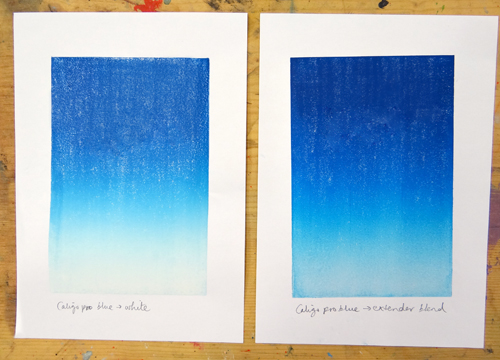
When mixing shades of ink, we have the choice to dilute the colour with either Opaque White ink or Extender. Both of these give us different results so which should we choose?
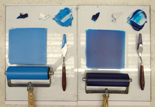
We have performed a few experiments to show the difference between mixing with Opaque White and Extender. We have used Cranfield Caligo Safe Wash Relief Inks which are oil-based but water washable.
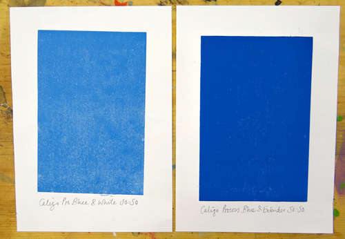
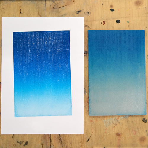
On the left, Caligo Process Blue is mixed 50/50 with Opaque White. On the right, the Process Blue is mixed 50/50 with Extender. We can see that the colour is much more subdued when mixed with white vs the extender. The white lightens the colour whereas the extender does not dilute the colour nearly as much.
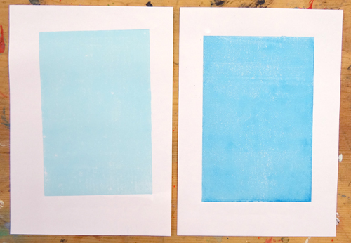
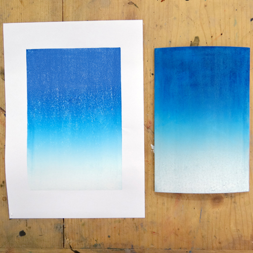
Below, the Process Blue has only been added as a tint to the Opaque White (on the left) and the Extender (on the right). The Opaque White mix has a much more chalky finish and sits more heavily on the paper. The Extender mix has more of a sheen and the colour is stronger.
When layering, we may want the colours underneath to show through or we may want to cover them up.
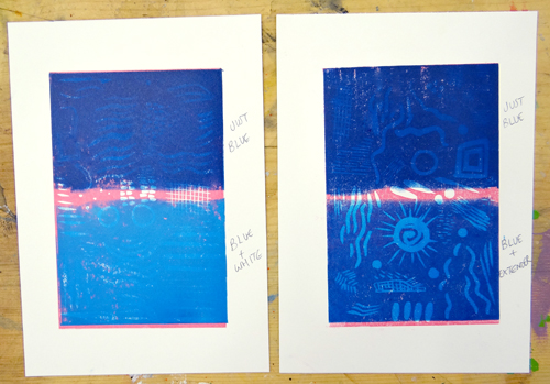
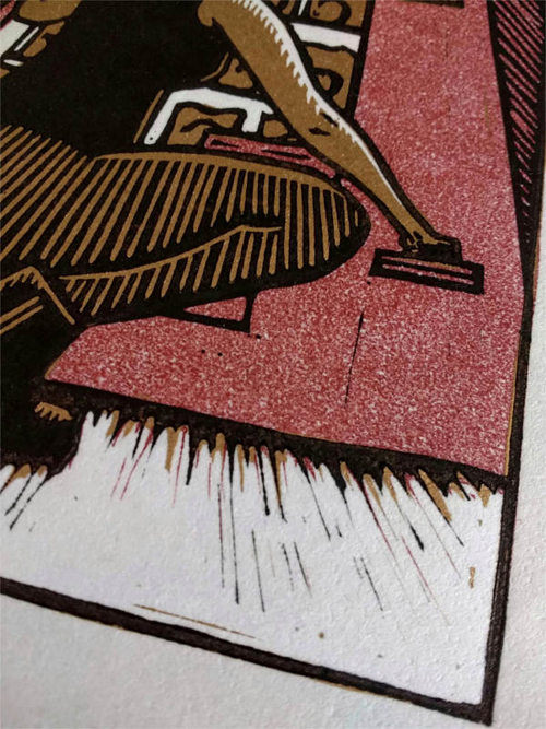
At the top of both of the prints below, Process Blue has been printed, undiluted, over the top of Process Magenta. We can see a little of the design through the Process Blue as the ink by itself is slightly translucent. At the bottom of the print on the left, a mix of 50/50 Process Blue and Opaque White has been printed over the Magenta.
At the bottom on the right, Process Blue has been mixed 50/50 with Extender and printed over the Magenta. We can see that the white mix is much more opaque and covers up much more of the Magenta than the Extender mix. We can see that the Blue and Magenta have mixed to create a new shade.
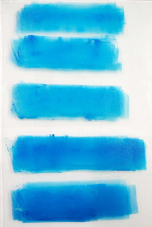
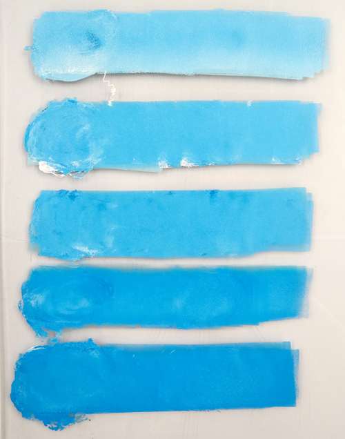
In the below experiment, increasing amounts of Process Blue have been added to Extender.
The ink rolled out on the slab shows the transparency of the Extender. We can also see that even a tiny proportion of coloured ink adds enough pigment to make a strong colour.
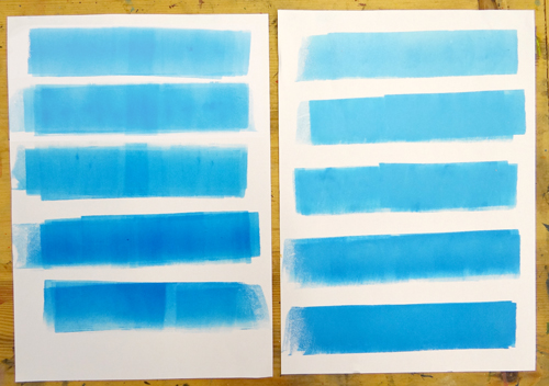
The transparency of these inks can be seen below where the ink has been rolled out onto white paper.
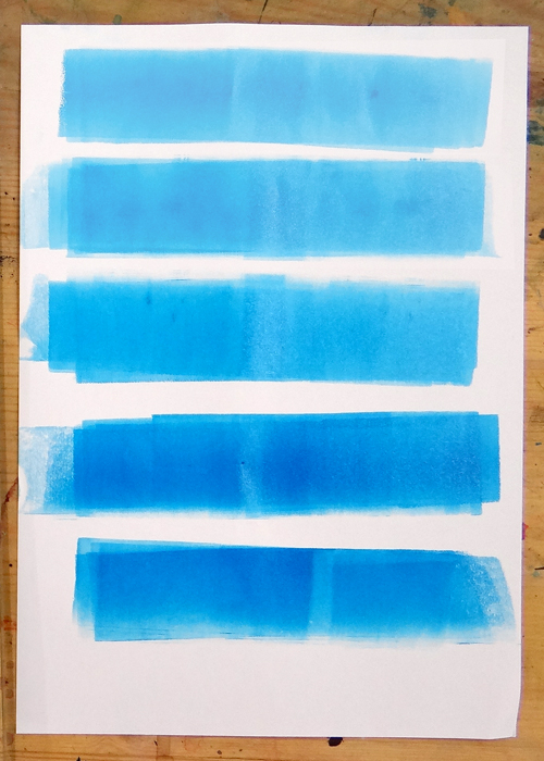
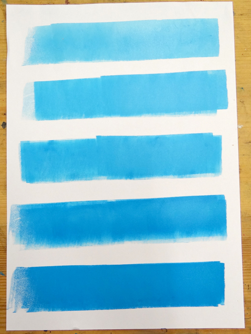
The same experiment was carried out using Opaque White instead of Extender.
Here, the resulting colours are a lot more opaque and chalky. The colour also changes much more as more Blue is added.
The inks are also much flatter and more opaque when rolled onto white paper.
On the left below is the Extender and on the right, the Opaque White.
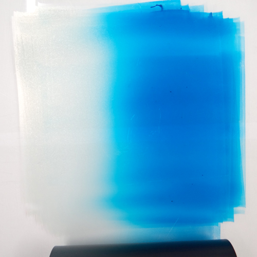
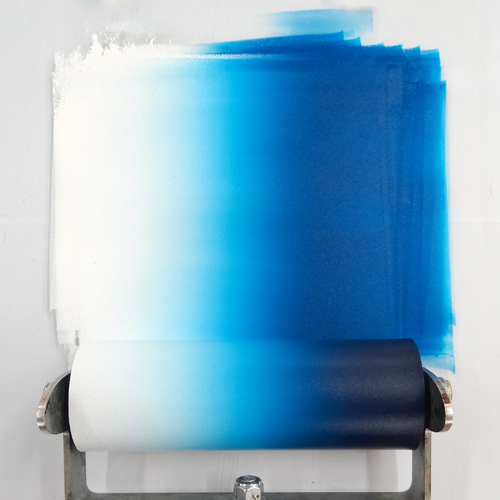
Next, we created rainbow rolls. The first graduated from pure Extender to Process Blue.
The colour crept along the Extender quite quickly, creating a fairly even blend.
When creating a rainbow roll graduating from Opaque White to Process Blue, we can see that the White held the colour back much more effectively. The blend is also fairly even.
The blend is more subtle on the right where the Extender has been used.
When printing these rainbow rolls over another colour, we can see the difference in opacity. At the top, where the white rainbow roll has been printed, the Magenta becomes covered much more quickly. At the bottom, where the Extender has been used, the Magenta remains visible underneath the whole rainbow roll. We can see new shades appear as the Blue and Magenta mix on the paper.
The below print shows the Magenta layer overprinted with pure Opaque White, pure Extender, a Process Blue and White mix and a Process Blue and Extender mix.
In conclusion, mixing colours using the Opaque White will lighten colours quickly but will create a slightly chalky finish. Colours mixed with Opaque White will be more effective at covering up subsequent layers of ink or when printing onto coloured surfaces.
Colours mixed with Extender are become transparent and can create new colours when printed over the top of one another. The Extender does not dilute the strength of the colour quickly meaning that only a small amount of coloured ink is required when mixing shades with Extender.
I’m an artist based using printmaking as part of my
practice. Since 2015 I have worked in Mokuhanga (water-based woodblock
printmaking) and have explored the possibilities of the technique in Japan,
where I have studied with master carvers, printers and contemporary
printmakers.
Describe your printmaking process.
Each project requires a
slightly different approach. Sometimes a direct drawn mark carved into the
woodblock is the beginning of the process for me, and other times I can be
captivated by a particular piece of washi and that dictates what kind of print
I want to make. Whatever the starting point, I am always required to slow down,
be mindful about the process, consider the materials at every point and
gradually become completely immersed in the making.
How and where did you learn to print?
In 1999 I went to London College of Printing to study for a BA in Print Media (Book Arts & Crafts). It was there that I was taught letterpress printing by a poet, etching by a fine artist and book making by a retired bookbinder. It was at ‘Bookworks’ in London where I worked while a student that I really learnt the skills needed to make accurate boxes and books. In 2015 while I was living in Japan I began to start my training in Japanese woodblock printmaking through artist residencies at MI-LAB (Mokuhanga Innovation Laboratory) with Keiko Kadota san, close to Mount Fuji.
Where do you work?
I have a live/work space in rural Northumberland, since moving there for a 1 year artist’s residency in 2016. I fell in love with the landscape and light and have continued to be based there when I am not travelling to teach workshops and attend residencies.
Describe a typical day in your studio.
There’s never really a
typical day in my studio because I live in a remote and very beautiful place,
my day can depend heavily on the weather. If the light is flooding into the
studio, then I will use the opportunity to carve woodblocks and cut washi, or
complete a book or box making commission. If it’s raining, which it often is in
the Tyne Valley, I’ll prepare to print by making a damp pack and mixing
pigments in readiness to print in the afternoon and into the evening. If I can
manage to take a walk out and explore the
moorland in the last hour of sunlight, my favourite time of the
day, then I’d consider it a productive day.
How long have you been printmaking?
I’ve been making
artist’s books using letterpress, silkscreen, etching and cyanotype printing
since 1999. In the last 5 years I have been committed to exploring non-toxic
techniques such as Mokuhanga for environmental concerns and as a means of being
able to work from anywhere without the need of a heavy press.
What inspires you?
The moon, the light, how time behaves and how memory informs us, place, belonging, dislocation, remoteness, ritual, separation, intimacy, impermanence, isolation, repetition, stillness, silence, rhythm, pilgrimage and the colour indigo.
What have you made that you are most proud of?
I have wanted to learn
how to make a traditional scroll since first learning to make books 20 years
ago. This year in Japan I finally learned how to. I am currently creating a
series of mokuhanga prints representing the passage of time in landscape form
to make my longest print to date, in the scroll format.
Where can we see your work? Where do you sell?
I recently had an artist’s book on show in the Royal Academy Summer Exhibition, which was a mokuhanga printed accordion book. I am preparing a large scale piece of work for an upcoming group show in Glasgow at ‘The Briggait’ gallery in November with 96 pieces of hand formed mulberrry paper made over the 12 daylight hours of the Spring Equinox.
What will we be seeing from you next?
Right now I am busy
planning my Autumn and Winter woodblock printmaking workshops around the UK. I
have a Mokuhanga retreat planned in the Sussex Downs this November, where
participants learn printmaking amongst the beautiful setting of a former
Bloomsbury farmhouse. I am beginning to run 3 day workshops close to my studio
in Northumberland too, starting this September, to invite people to gather
inspiration from the landscape and light and join me in creating woodblock
prints. Next year sees the International Mokuhanga Conference in Nara,
Japan, and I am working towards a new series of prints using sumi ink.
Do you have any advice for other printmakers and creatives?
The best advice I’ve
ever received in terms of printmaking, was from my Japanese mokuhanga sensei,
Tetsuo Soyama san, who said,
‘The world is between
the paper and the block. The world changes every minute, therefore the printing
can also change.’
The wonderful
printmaker Katie Baldwin also shared with me her 3 golden rules of Mokuhanga,
which though I don’t necessarily follow in my own practice, I try to teach my
students.
I am an artist printmaker
working in print, books and animation. My first degree was veterinary medicine;
the minute I graduated I received a government scholarship to study Japanese
woodblock printmaking in Kyoto, and since then I’ve worked in both the veterinary
field and in printmaking.
Describe your printmaking process.
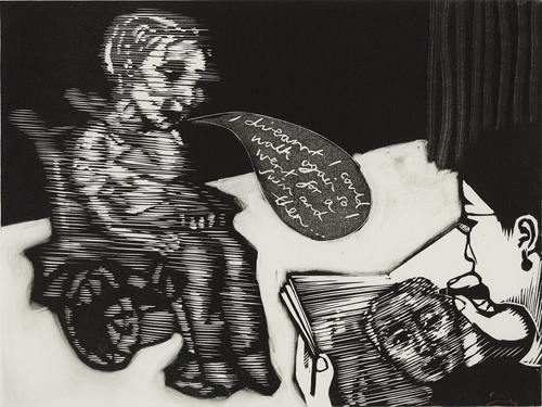
My recent series of 80 prints, the Diary of a Printmaker series, are about personal experiences and intended to be full of narrative humour: a little satirical, a bit tragic, sometimes absurd. They are made for my dad, who remains in a care home after breaking his neck five years ago. I draw directly on the block from a combination of memory and imagination. Sometimes I take images from life, but often times drawing from life favours a photographic view of the space and can make the final work feel artificial. My imagined view of spaces and places is quite wide angled, using a roving perspective and high viewpoint. There is a dream-like logic to the spaces, which have their own internal references. Sometimes I hide stories, clues, dates, times and images in the work to make a richer narrative. These may not be obvious to anyone but myself, but I like the potential treasure-hunt and slowing of the reading of the image.
How and where did you learn to print?
I made my first linocut in
a tent in a field in Art in Action, when I was 11 years old. It was a
picture of a cat on a roof, and I got confused as to which part would be black
and which white, so I ended up carving most of the block away. After then, I
was allowed to make linocuts on the kitchen table at home, which I did,
printing away in my spare time until I went to vet school. There was a darkroom
in my undergraduate college (St. John’s, Cambridge) which I would spend hours
in, teaching myself to develop and print old-style black and white film. By the
time I arrived in Japan on the government scholarship I had spent 14 years
making prints on my own.
Why printmaking?
I love printmaking! It’s a
fascinating process; the language of the carved line intrigues me; I like the
way there is a challenge to say a lot with very little; I like the economy of
the medium. I also like the democratic overtones of the medium: something which
is affordable, that can be folded and carried, something which can be a cheap
thing, easy to post as a gift, can be iconic or throwaway, enduring yet
unassuming. Most of all I like the evidence of the touch and the handmade in
the printed object
(being old school I love the traces of pressure and the smell of the lavish
inks), so much more rewarding to peer at than at a smooth, impersonal,
perfectly made surface.
Where do you work?
I work in East London
Printmakers C.I.C, a community print workshop in Mile End, London, where I am a
keyholder and committee member/ director. Sometimes I work from home in London,
and sometimes I make big new bodies of work on residencies. 60 of the current
set of prints were made in the Royal Academy Schools in the print room during
my fellowship there.
Describe a typical day in your studio.
Hmm, there is no typical
day. I prefer to work late though, so will happily do jobs and admin and swim
and catch up with people and tidy in the morning, and start work around 2 pm,
and work til 10 or later…
How long have you been printmaking?
35 years… That sounds like
a very long time! But printmaking has the best people and machines and spaces
and attitude… It doesn’t feel that long.
What inspires you?
Situations. The way people
move. Funny things that I overhear. The comedy of life. The adoration of pets.
Expectations and disappointment. The fact that even though I’m getting older
I’m not getting any wiser…
What is your favourite printmaking product?
Sakura oil-based relief inks. They are better than anything else I’ve tried. They have a very fine intense colour and mix to make brilliant blends, and are easy to wipe.
What have you made that you are most proud of?
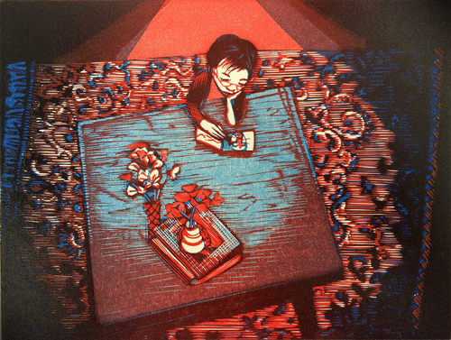
I always like the latest
print, then when I’ve made the next print, I like that one more. My latest
print that I really like is called Blue Table Porto, which was about a
café in Porto with the most beautiful weather-beaten blue table, spot-lit from
above by skylights, surrounded by trendy grey walls and old Turkish carpets,
with designer furniture and trailing ferns, and the most undrinkable coffee and
inedible cake. It was funny. Cosy and slimming all at once. I like the feeling
of being marooned in a sea of carpet and the intensity of making things, like
being in my own world.
If anyone would like to stock my work and sell it
for me, please get in touch!
What will we be seeing from you next?
I’m thinking of showing all the Diary of a Printmaker prints as one whole series, as there are 95 of them now. The next project is brewing, but I can’t share anything yet.
Do you have any advice for other printmakers and creatives?
Keep walking towards your
goals, even if the path is not straight or easy, because you will always learn
something, and the journey is going to be full of surprises.
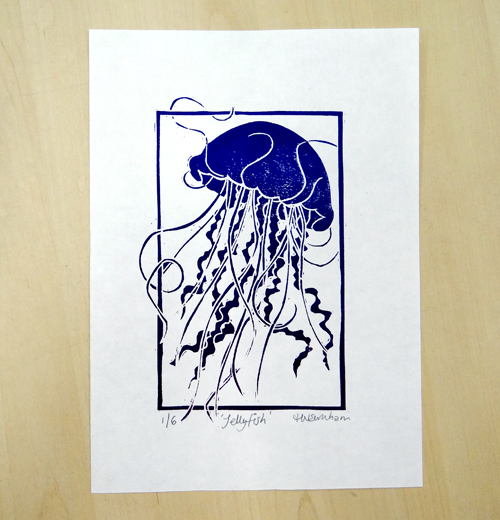
One of the great things about printmaking is that one design can be used to create a whole edition of prints. That being said, editioning is something that some printmakers can find frustrating if you just want to get on with the next design! Knowing how to edition, sign and number your prints can be complicated so here are a few general editioning guidelines to follow:
Original prints are not reproductions
Original prints are prints in the medium the artist originally used e.g. linocuts, collagraphs, lithographs, etchings, screenprints etc. This is not the same as a reproduction which is usually digitally printed. Editioning helps printmakers to distinguish their work from reproduction prints.
Don’t hand sign prints that are not original, such as giclee. Giclee and digital prints can include a signature within the artwork instead.
What is an edition?
An edition is a set of identical prints taken from the same matrix or matrices (printing surfaces). Editions can either be limited or open. Limited editions mean that no more of the same prints will be made.
The modern tradition of signing prints was first introduced by Whistler in the 1870s (Rosslyn, 2018).
Edition sizes
In general, the fewer prints in the edition, the more valuable the print and the higher the price.
You may decide on the desired edition size at the beginning of printing. If so, it is usually a good idea to print a few more to allow for mistakes, misregistration, flaws, colour choice changes etc. When you have finished printing, the prints can go through a curation process in which flawed images are taken out (more on proofs later). The remaining images are the edition and therefore the edition size is set.
Occasionally, edition sizes can be partly decided by the number of prints the matrix can produce. Depending on the technique used, the matrix itself may not survive a large edition size. Collagraphs and drypoints, for example, can degrade with use and can be unable to produce a large number of identical prints.
Some printmakers may choose to print the whole edition in one run. Others may choose to print a few and then continue printing the edition as prints sell. Some methods require the artist to print the whole edition together: reduction relief printing changes the original block as more layers are carved and printed, making it impossible to go back to print more. However you print your edition, it’s important to keep track of your edition size, how many you have printed and signed.
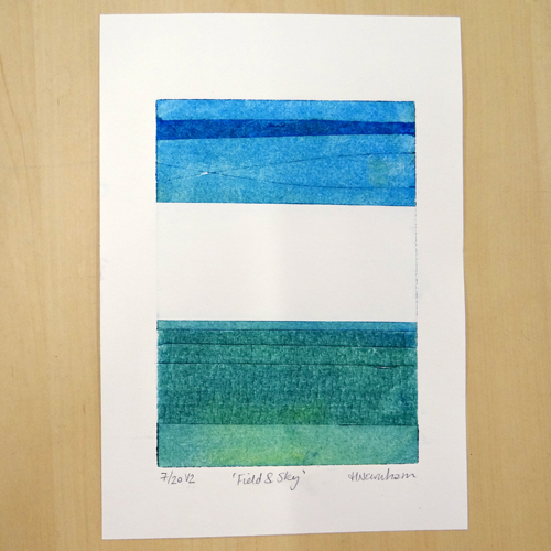
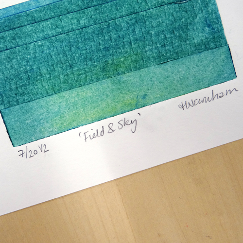
How to number, title and sign
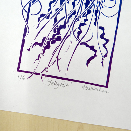
As a general rule, prints are numbered on the left-hand side at the foot of the print, the title (if given) is written in inverted commas in the middle at the foot of the print and we sign on the right-hand side. You can choose whether or not to include a date with this signature. Editioning should be written in pencil, not pen. This is a good idea as it is harder to forge pencil signatures and mistakes can be erased if necessary!
If the print bleeds to the edges of the paper, the print can be numbered and signed along the bottom edge of the image or on the reverse of the paper. Signatures can also be incorporated into prints, for example by carving initials into a lino block (in reverse of course!)
How to number prints
When we number prints, we usually use the x/y format where y is the total number in the whole edition and x is the individual number of the print being signed. For example, an edition of 10 prints would be labelled 1/10, 2/10, 3/10 etc.
Prints are not necessarily numbered in the order in which prints were taken: signing and numbering are often done when the whole edition is finished.
Other edition labels
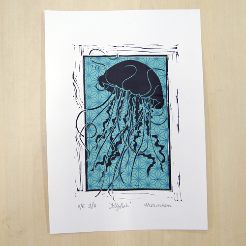
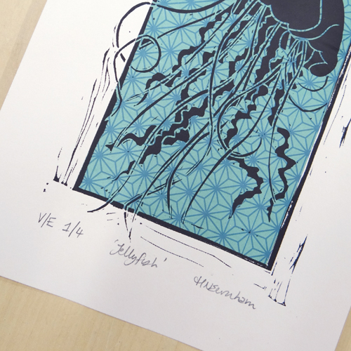
Variable Edition – VE or EV (or V/E, E/V) Prints in your edition may vary, either by design or by the nature of the printmaking process you have chosen. Prints may be hand coloured or use chine collé, for example. Prints in editions like this can be labelled VE x/y (or EV x/y). If these prints vary a lot, you could choose to label each print 1/1 but this can make it more complicated for potential buyers to understand the rarity of the work you are selling.
Variations in print editions can also be marked with V1, V2 etc. denoting a different variety of print, for example, a different colourway. (Chesterman and Nelson, 2015).
Artist Proofs – AP, EA (Epreuve d’artiste) or PP (printer’s proofs) (or A/P, E/A, P/P) Artist proofs usually shouldn’t exceed 10% of the overall number in the edition. So, if there is an edition of 50, there should not be more than 5 artist proofs. Artist proofs are usually identical to the edition but may include slightly flawed prints omitted from the edition.
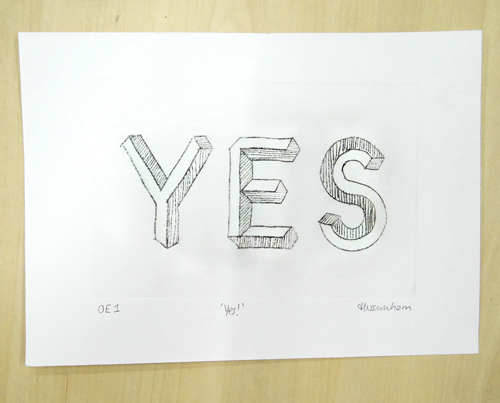
Open editions – OE (or O/E) Open editions are unlimited and have no pre-determined number of prints. The artist may go on printing more if there is demand. Open editions may be marked as OE and can also be numbered OE1, OE2 etc. Open variable editions may be marked as OVE1, OEV2 etc.
Bon a Tirer – B.A.T (‘Good to shoot’) The first perfect print to come from the matrix (printing surface) is sometimes called a Bon a Tirer and is labelled B.A.T. This is usually made when the artist themselves is not printing the edition and so a B.A.T print is used to show the print from which the whole edition should be matched. There is usually only one of these.
Trial Proof – TP (or T/P) Test prints marked TP are usually used to check the development of the print in process. These can be sold and numbered, e.g TP1/5. Trial proofs can sometimes show the development of an image or feature different colours to the final chosen edition prints.
Chops and Stamps Chops and stamps are seen more often in traditional Chinese and Japanese printmaking. That being said, some printmakers choose to use a stamp or chop to sign their work as a way of being more individual or adding more design elements to the finished work. Chops and stamps can be handmade or made commercially. If chops or stamps are used, they are often printing at the bottom right foot of the print, where the signature might have been. (Chesterman and Nelson, 2015)
I’m Nathalie Krona of Krona Prints. I am a linocut printmaker from
Birmingham, England and I currently live in Edinburgh.
My most popular prints have been pieces that use multiple blocks. I hand
burnish all of my prints and work mainly on paper but occasionally play with
fabrics.
I’m currently making prints that are re-framing negative experiences and
emotions as signs of strength instead of weakness.
Another subject I’m focusing on is the minutiae of millennial life and I’m
attempting to create nostalgia for times that haven’t quite passed yet.
Describe your printmaking process.
The majority of my printmaking process involves just thinking about how a
print is going to work.
Once I have a strong idea and I’ve worked out in my head how the blocks are
going to fit together, the journey from sketch to print is pretty rapid. I get
so stuck into the process that I forget to take breaks!
All of my drawing is done with a pencil and paper. I scan the sketches and
play around with different colours digitally.
I test print a lot throughout the carving process. I’m not too keen on
surprises!
How and where did you learn to print?
I learnt to print by reading the instructions that came with my linocut starter
kit. From then on, I’ve just been winging it.
Why printmaking?
In the beginning, printmaking appealed to me because I loved the idea that I
could make something for me, and if someone else happened to like it, I could
easily make one for them too. It was about sharing and in many ways it still
is.
Where do you work?
I work in a tiny studio halfway up a massive hill in Edinburgh.
Two mango wood tables make up my workbench. The larger of the two used to be
my dining table, until I realised I liked printmaking much more than I liked
dinner parties.
I can just about see Edinburgh Castle from my
window and I’m in the process of hanging prints from other artists whose style
I love.
Describe a typical day in your studio.
Every day is different, but my favourite type of day is when it’s sunny
enough to film a process video.
I prepare by stacking up all of my stools to create a makeshift camera rig. I set up the shot and get the settings on my phone right. I prepare a cold, sugary drink with a straw so I can sustain my energy levels and keep my hands clean and dry. If it’s still light after all of that, I film the video and edit it the same day.
How long have you been printmaking?
I’ve been making linocut prints since December 2016, so about 2 and a
half years.
What inspires you?
My background is in psychology and that influences pretty much all of my
pieces. Memory, emotions, the zeitgeist, identity and perception are a few
topics that regularly inspire me.
Visually, I’m not quite sure what has inspired me until I see the finished
print. Recently I can see a lot of 90’s cartoons and Instagram-style interior
design coming through in my prints.
What is your favourite printmaking product?
Awagami’s handmade Japanese paper is my current crush. It’s quite
overwhelming to print on something which has so much beauty already. I feel
like I’m printing on a piece of history.
‘She who Walks Away’ is the print I’m most proud of because of the reaction
it received. I love that I’ve created something that has inspired strength and
perseverance in (mainly) women from all over the world. The print is currently
displayed in homes from California to New Zealand. It’s very humbling.
Where can we see your work? Where do you sell?
The best place to see my work is on Instagram. I post pretty much everything I make – including the duds! I also show a lot of my process there too.
I sell most of my favourite pieces on my website www.kronaprints.com. The website also features a blog where I go into a little more detail about the things I’m making.
What will we be seeing from you next?
I’m superstitious and I don’t want to jinx anything… Keep an eye on my
Instagram account!
Do you have any advice for other printmakers and creatives?
Create things for yourself. Make things that
you want to own and things that make you happy. If you do that, then you’ll
pretty much never be disappointed.
I’m
a graphic designer primarily, and often work straight to screen, but after
having my first daughter I found myself getting back to drawing and enjoyed
being more hands on. I began to draw the nature around me and form patterns
with the hand drawn elements. This soon progressed to me trying lino block
printing. Later down the line I released a collection of digitally printed
fabrics based on my botanical lino prints, and it has gone from there.
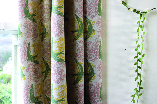
I now have three young daughters so I work flexibly around them, and still have local graphic design clients. However, my textiles have really given me the chance to follow my own creative desires again, rather than simply answering a brief. I am very grateful that a change of direction in life, caused by motherhood, made me realise how important my own personal creativity was to me. It is a big part of my identity, and it is good to have found that again.
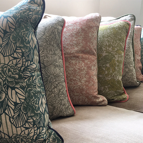
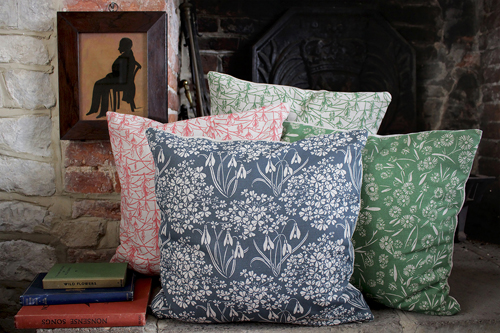
I sell cushions,
lampshades and tea towels as well as fabric for soft furnishings, printed to
order by the metre.
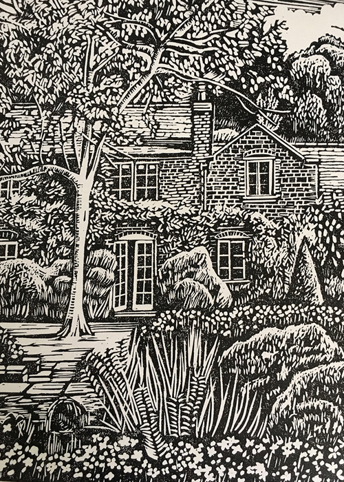
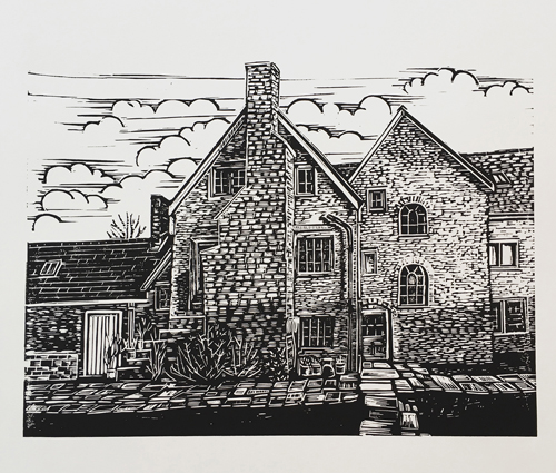
More recently I have
also done some Lino prints of period buildings; ones that are personal to me,
or commissions of other people’s houses. This is a bit of a treat for me,
outside of my normal work, and it allows me to get really detailed and hone my
printmaking skills.
Describe your
printmaking process.
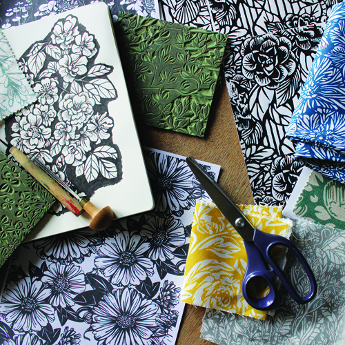
I draw in black pen,
referencing photos I’ve taken on my phone… mainly small details seen in my
immediate outdoor surroundings. Trees, leaves, flowers, sometimes birds; any
shapes I find beautiful. I scan these drawings into the computer to play with repeat
patterns on screen… but then print and trace the resulting pattern tiles to
lino. I really enjoy carving and like the imperfections it brings. I find it
loosens up my otherwise quite controlled style of drawing.
I print my lino block in
repeat, just to see what it looks like, but I find I can’t do long lengths of
fabric with my current set up. To allow me to print fabric for interiors, which
is where my interest lies, I scan my printed block back into photoshop and
ultimately send files to my printer digitally, to be reproduced by the metre. I
purposefully leave some imperfections and texture in the files… I want them
to look as hand made as they can.
How and where did you
learn to print?
My printmaking is pretty much self-taught. When I was at art college, I was largely focussed on learning the skills I needed on the computer for my degree in graphic design. I kick myself now for not making use of the amazing printmaking facilities I could have had access to. So when I started Lino printing much later, I was just following instinct and guessing at what I needed to do. There is probably lots more I could learn if I went on a more advanced course, and one day I would love to do just that. It would be great to work alongside other printmakers and to use a proper press.
Why printmaking?
I find carving Lino
really satisfying, and I love learning how to create an image just by observing
light and dark areas of an image. With patterns, block printing is a great way
to produce a repeat, and I love the natural variations and texture you can
bring to something that started off as a drawing.
Where do you work?
Currently I work at home, in our rather overcrowded cottage near Stroud, in the Cotswolds. I often struggle with not having a proper studio yet; three little kids and my materials stored here there and everywhere makes for a tricky working environment. My partner has commented that he thinks the bathroom is the only room in the house where I don’t have some sort of work stored! But I am really lucky to work from our location as we live in a beautiful village on National Trust common land. On my doorstep I have never-ending inspiration. The Stroud Valleys also has a very high density of other artists, and opportunities to sell/exhibit work together are plentiful. Some artistic/maker friends in our village formed ‘Amberley Artisans’ with me, and we put on a Christmas Market each year. It’s a great way to connect with a wider audience and I find the connections I have made avoid me feeling too isolated when working from home. My graphic design work is also useful with that… my work life is very varied and busy.
Describe a typical day
in your studio.
A work day doesn’t start
until I have done the school and playgroup run… and ideally that is on foot so
I can sometimes take photos on my way there and back, to come back to when I
get a chance. Just the fresh air is a good start to a productive day.
I must admit, that a
huge proportion of my work involves no block printing at all. I have often created
drawings in snatched moments over the course of many weeks, and then when I get
a break in my other work, I start developing patterns and carving. Last year I
carved about five blocks on my week long summer holiday… it took having a total
break from the routine to give me that focus.
I often find I work like
this in bursts when it comes to printmaking. Months of gathering photos or
doing small drawings, suddenly comes to a head when I bring a design together
and get a chance to carve. Once I have started a block I get totally addicted
to the process and will do anything to make time for it. I have even carved
Lino whilst parked up in a car before! I tend to print my work in the evening,
when the coast is clear. I can find myself working late into the night to get
results I am happy with.
How long have you been
printmaking?
I think I first picked
up my first Lino tool about 6 years ago.
What inspires you?
My work almost
exclusively features leaves, flowers and trees that I have seen within a mile
of my house. I often feel like nature has done the hard work for me, as I see
patterns everywhere I go.
I am also very inspired
by Arts & Craft designers. William Morris and Voysey are my absolute
heroes. But I also find the modern connectivity of Instagram is really great
for me being able to surround myself in things I find beautiful. I definitely
find that online community a source of encouragement and inspiration, as well
as a good outlet for my work.
What is your favourite
printmaking product?
I don’t use anything fancy, and I use a mix of traditional and soft cut Lino, and a mix of papers too. I am currently using Aqua-Linoldruck ink from Schmincke, as I really like it being water-based for easy cleaning up. I am particularly attached to a really old palette knife and a baren I had from the beginning… not because they are anything special but if you use a tool for long enough it becomes an old friend!
What have you made that
you are most proud of?
There are definitely
some favourite fabrics that stick out from collections I have made. ‘Rodborough
Whitebeam’ is one that seems to be enduringly popular, and it was inspired by a
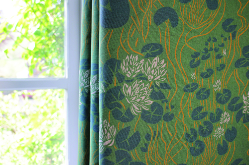
tree just along from my house. I am just releasing a fabric called ‘Waterlily’
that I am particularly pleased with. I am also really proud of some of my Lino
prints of houses… they are so detailed that it takes very little to go wrong
and ruin a block. So if they turn out well it feels like a personal
achievement.
Where can we see your
work? Where do you sell?
I mainly sell my fabric and some products directly from my website www.susiehetherington.co.uk but my fabrics do also sell through both shops and via interior designers. I haven’t yet released proper pattern books so it tends to work on a sample basis. Locally I sell some cushions and tea towels at my favourite museum, ‘Museum in the Park’ in Stroud. Also, I have designed the branding and packaging for my favourite client ‘Soap Folk’ (www.soapfolk.com) and these products can be found in a variety of independent shops and directly from the Soap Folk website.
What will we be seeing
from you next?
My new collection of
fabrics is ready to go, and will soon be featured online and in press. Keep an
eye out for it! I also have some exciting graphic design projects in the
pipeline, though that side of my work is very anonymous. Perhaps I should shout
about it more.
Do you have any advice
for other printmakers and creatives?
I think the main advice
that has helped me is that just getting on and doing is better than
overthinking what you are going to do and what it will turn into. I had no idea
where drawing again would take me. I had no idea what was going to happen when
I picked up a Lino cutting tool for the first time. I now teach beginner Lino
cutting workshops from time to time, and that is my main message; don’t worry
too much about the results. You learn so much just by doing.
A multi-block linocut uses more than one piece of lino to create a layered image. Usually, each block is inked with a separate colour. Where the colours overlap, another colour can be achieved.
Multi-block linocuts allow you to partially print an edition and create complete test prints as you can go back to each block to print more. This is one of the advantages of using the multi-block method rather than a reduction linocut (where just one block is used and carved away between layers). Another advantage of multi-block over reduction linocut is the freedom you have when choosing colours: not all the layers have to be printed over the top of the previous colour and so cleaner and more contrasted colours can be used.
Multi-block linocuts can be tricky as each block must be cut accurately in order for the layers to register well.
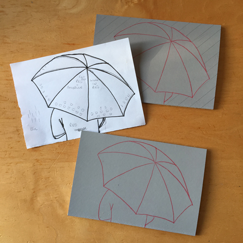
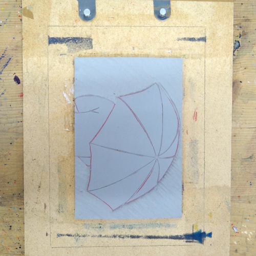
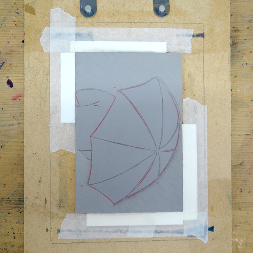
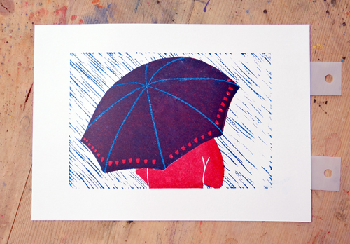
To begin our multi-block linocut, we need an accurate drawing cut to the same size as the lino. Here, we decide which area will be which colour and where they will overlap. This print consists of a cyan and a magenta layer. Try to choose two pieces of lino that are as close in size as possible. If the two blocks vary in size slightly, pick a corner from which to register the drawing. Remember this corner for later.
Use the drawing to transfer the design onto each block. Place red carbon paper onto the block and, with the drawing on top, draw over the design. It is important that this drawing is accurate so it is a good idea to use masking tape to secure the drawing to the block whilst you are drawing.
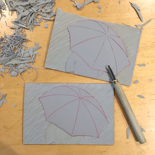
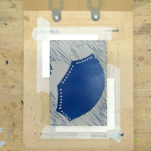
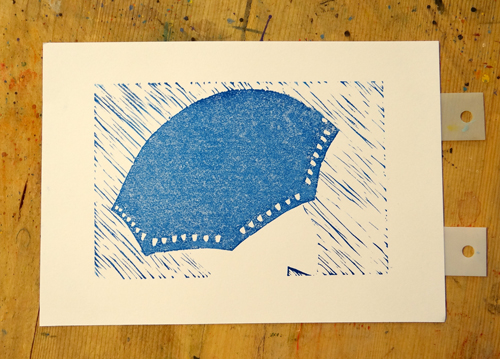
We want our umbrella to print from each block so it is being left uncarved on both blocks. The backgrounds need to be cut away from both blocks. We are using a large shallow U tool to carve the background from the magenta block (the top block in the picture below). We are using a shallow U tool to carve the background away from our cyan block. We want some of this cyan background to pick up ink and print like rain.
The coat of our figure is being printed in magenta so it is cut away from our cyan block and left uncarved on the magenta block. The spines of the umbrella are cut away from the magenta block.
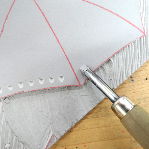
We are adding a little pattern to our umbrella on the cyan block. A small U tool can be used to create little half-moon shapes by digging the end of the tool into the lino and flicking up with the tool to snap off the piece. This technique only works with traditional lino as softcuts and vinyl will not snap.
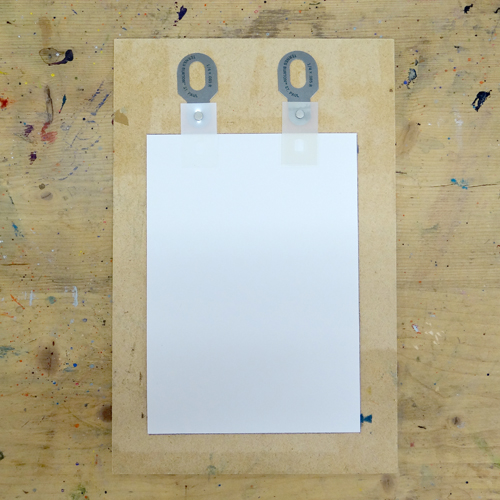
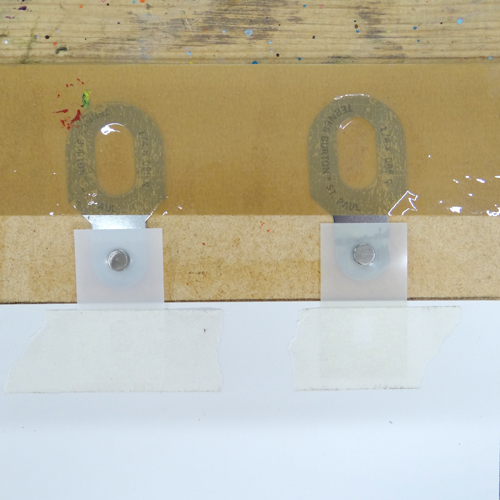
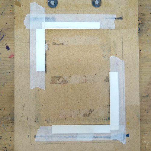
When the blocks are cut, we can prepare our registration board. We are using Ternes Burton pins and tabs to make sure our paper goes down in exactly the same place each time. Place a piece of the printing paper onto a board. Place a pair of Ternes Burton pins above and snap a tab onto each one. The bottom half of each tab should overlap the paper.
Use parcel tape to secure the pins to the board. Use masking tape to stick the two tabs onto the back of the piece of paper. It is useful to draw around your print paper whilst it is in position: this will help us to position our lino in the middle later.
Place each piece of paper down on the board, snap a new pair of tabs onto the pins and masking tape them to the back of the paper. Do this for your whole edition (although with a multi-block linocut you can always go back and add more prints later).
Place one of the lino blocks onto the board. Use your pencil marks to help to position it straight and in the centre.
Use strips of mount board to create raised edges in which the blocks can be positioned. You can choose to create corners, as in the image below, or place one piece in the centre of each edge. Secure firmly with masking tape.
If your lino blocks vary very slightly in size, make sure they both fit into the slot. Mark the corner to which you registered the drawing on your blocks. When you place the blocks in the slot you’ll want to make sure they’re all hard up against this corner.
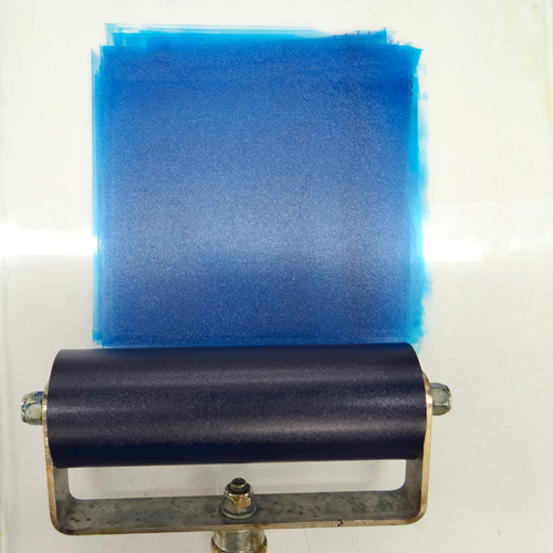
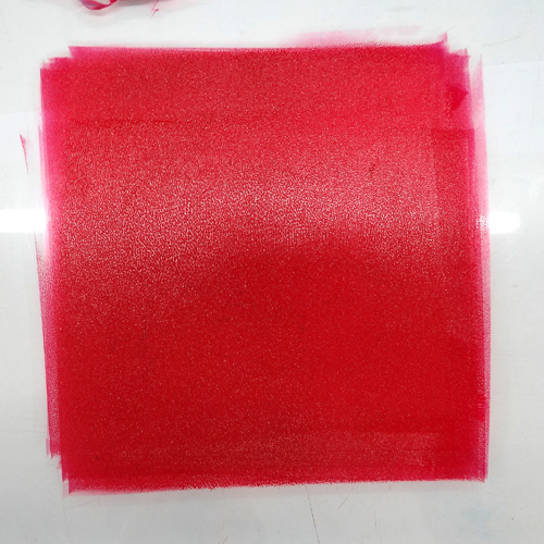
Our cyan block is being printed first. We are using Caligo Safewash Inks in Process Cyan mixed with a little extender. Roll out an even square of ink the same dimensions as the width of the roller.
Roll the ink onto the block and place it into the slot on the board. Make a note of which way up it goes: the top of our print is on the right.
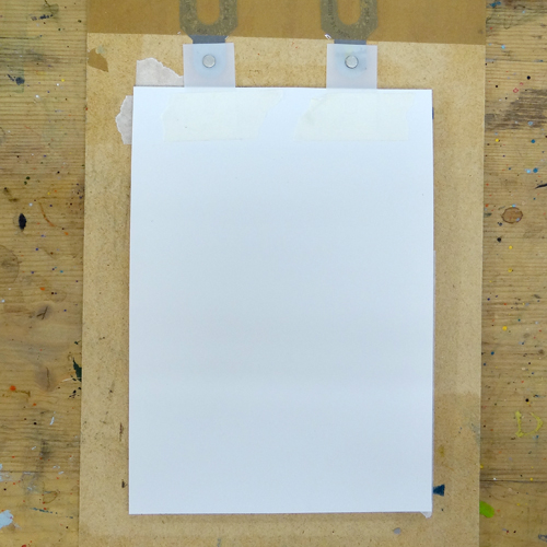
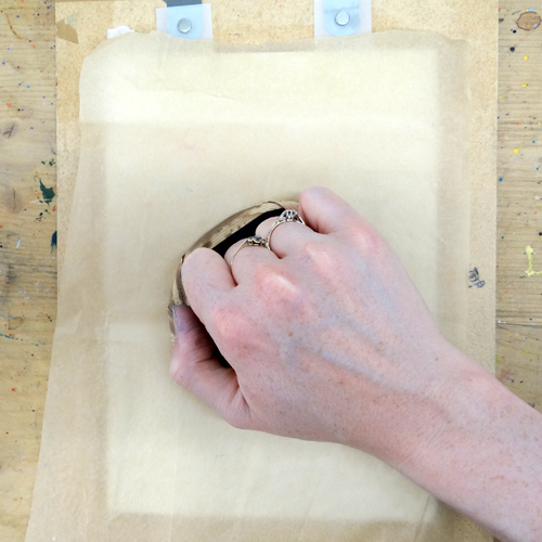
Click the tabs on one of your pieces of printing paper onto the pins and, starting from the pinned end, gently lower the paper onto the block.
Put the whole board through a press (you may want to protect any blankets from the pins with a few sheets of newsprint as, although the pins are slightly lower than the lino, if the press is too tight they could mark them). Alternatively, cover the back of the paper with a sheet of greaseproof paper and hand burnish with a baren.
Repeat the inking and printing steps for each of the prepared pieces of paper. As this is a multi-block linocut, you can always go back and print more of layer 1 if you need to.
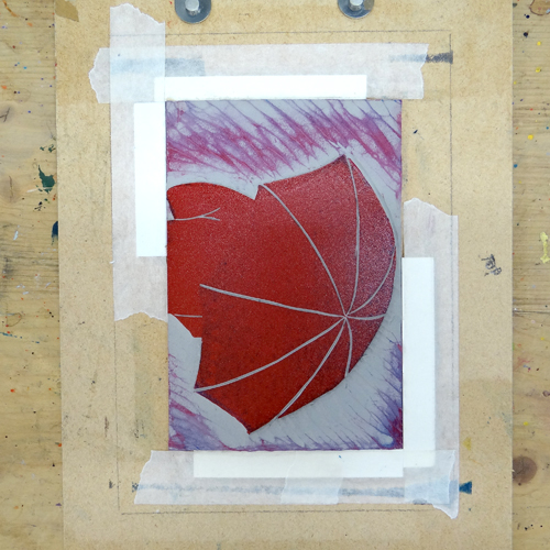
Our second block will be printed in Caligo Safewash Process Magenta Ink mixed with a little extender to make it a little more translucent.
We do not want any of our background to print in this colour so any ink that was picked up has been wiped away.
Place the second block into the slot on the board making sure it is in the same orientation as the first block.
Place the tabs of the paper onto the pins and gently lower it onto the inked block. Take the print through a press or hand burnish, as before.
Where our cyan and magenta layers have overlapped we have a purple umbrella. The patterned cuts on the cyan layer let the magenta show. The cuts on the spokes on the magenta layer allow cyan spokes to show through.