Printing with Different Stamping Blocks

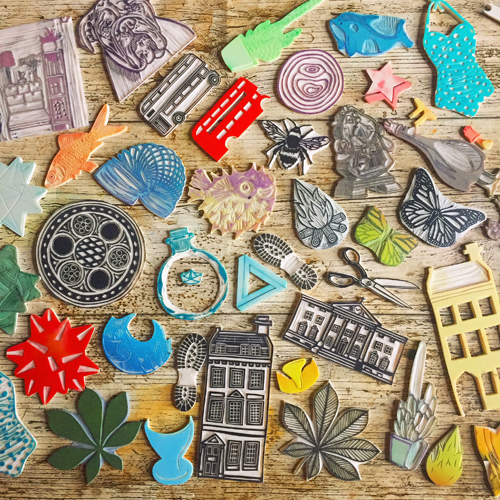
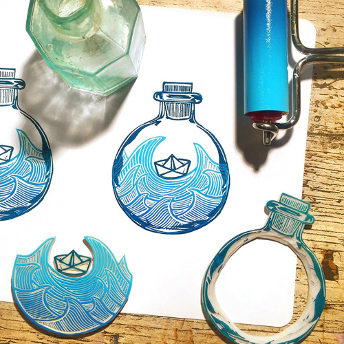
There are lots of different blocks available to make your own stamps. Unlike linocut blocks, stamp blocks are designed to be cut into smaller shaped pieces. We have tested four of our blocks to help you decide which is the best block for your project and budget:
Pink Speedy Carve, white Mastercut, blue Speedy Cut Easy and green Japanese Block.
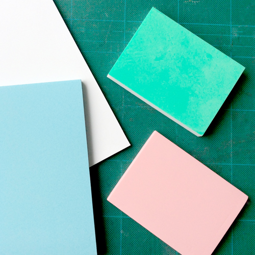
It’s easy to use a pencil to draw on all four of the stamp materials.
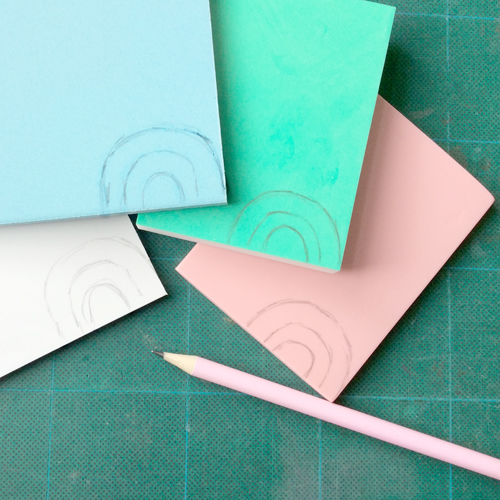
We used the V tool from the Japanese Cutting Tool Set to carve out the lines. All four blocks were very easy to cut. The blue Speedy Cut Easy feels the softest but none of the blocks requires any effort to carve.

The pink Speedy Carve and white Mastercut are a little stretch when carving near the edges of the block whereas the blue Speedy Cut Easy and green Japanese Block remain stable all the way to the edges. The green Japanese Block has a white centre which can make it clearer to see the carved lines.
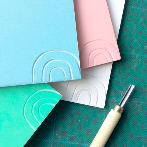
Next, we used a Pfeil 11/1 tool to carve fine lines. This tool is fantastic for tiny detail.

The pink Speedy Carve enabled really tiny lines to be cut. The edges are smooth and clean. The corners were a little trickier to cut as the material began to stretch a little. This didn’t affect the design too much though.
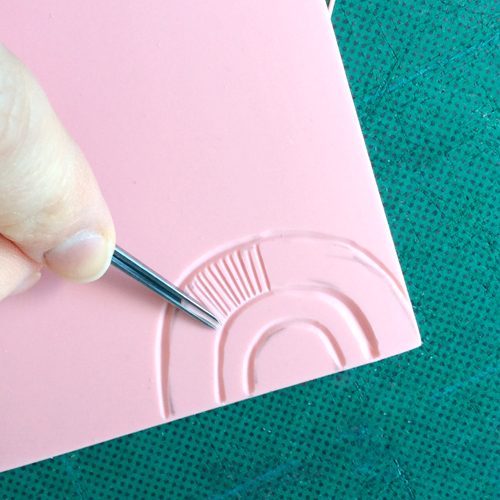
Next, the same detail was carved into the blue Speedy Cut Easy. It was trickier to cut very fine detail as the material is slightly more crumbly. The edges of the tiny lines are a little less clean and a little fluffy.
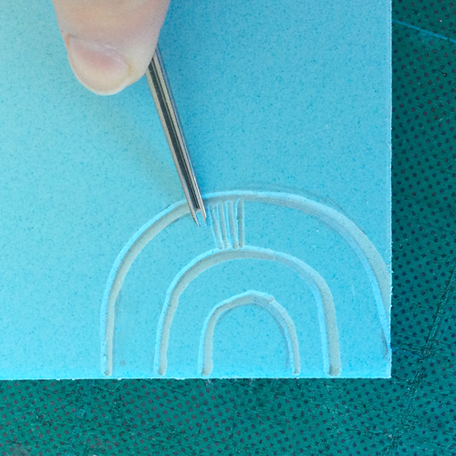
The white Mastercut cut well with the tiny gouge. It was tricky to get the detail as fine at the edges of the block where it began to stretch a little. The edges of some of the lines became a little fluffy and less clean than the pink Speedy Carve.
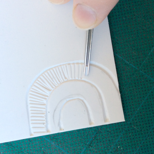
The green Japanese Block carved beautifully with no stretch. This enabled very fine detail to be cut right to the edges.
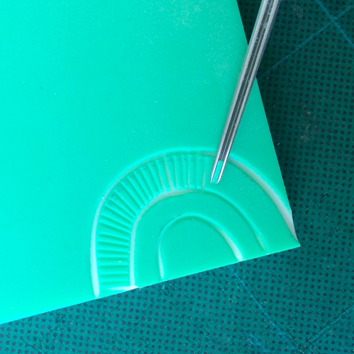
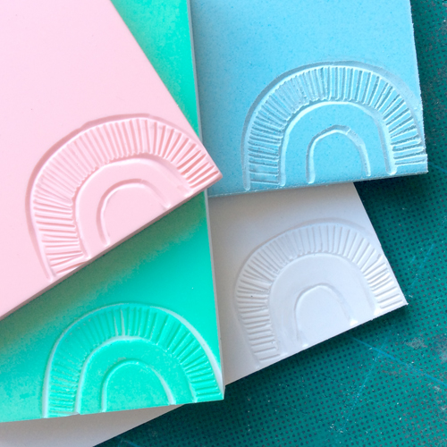
Next, we used the 11/1 Pfeil Tool to carve tiny dots into the blocks. By rotating the block underneath the tool, a dot can be cut.

The pink Speedy Carve cut easily. The tool slid a little on the block so the result was little curls rather than round dots but they were very clean and neat.

The blue Speedy Cut Easy stretched a little when carving the dots so the results were not very neat.

The white Mastercut was tricky to control when carving a dot so the marks left were a little erratic.

The green Japanese Block cut dots perfectly leaving clean round holes.
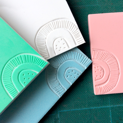
The final areas to carve was the centre, which was cleared using a large U gouge. The centre cleared very easily on all four of the blocks. The green Japanese Block was the cleanest to carve, leaving a smooth texture. The other three blocks need a little neatening, especially at the edges. The blue and white were a little fluffy, the pink was lovely and smooth like the green block.
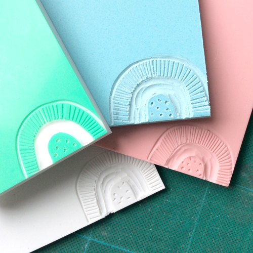
When the stamps were carved, it was time to cut them out. All of these blocks can be easily cut using a scalpel.
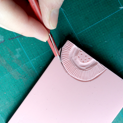
The pink Speedy Carve and white Mastercut were easily cut using just one swipe of the scalpel. The blue Speedy Cut Easy took one or two swipes to get through the material. The green Japanese Block took two or three swipes to get through the block. The Japanese Blocks are thicker than the other three.
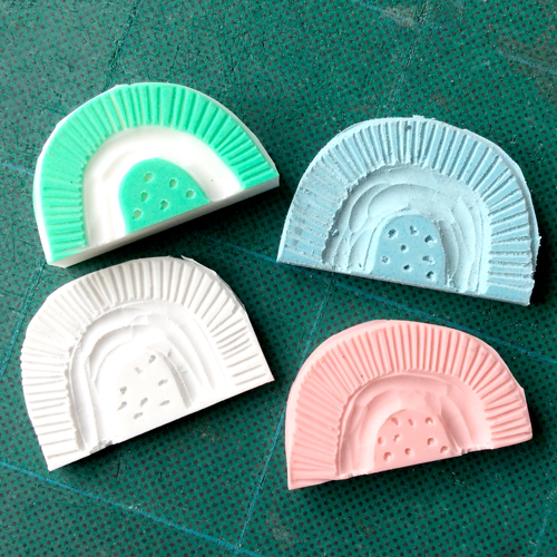
All of the stamps can be printed easily. We used Versacraft Ink Pads on paper. Placing the stamp on the table and dabbing the pad on top is the easiest way to ink up and allows for small pads to be used for large blocks.
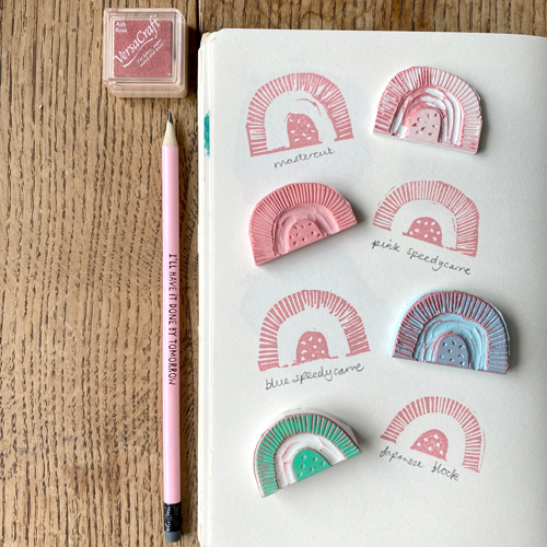
The green Japanese Block is the thickest, making it easiest to pick up and print with. The white Mastercut block is the thinnest and so is possibly a little messier and more fiddly to print with. The prints below show that the Mastercut, Speedy Carve and Speedy Cut Easy need a little more neatening is the cleared out area, especially at the edges. A scalpel can be used to trim the raised edges a little so they won’t pick up ink. The clarity of the pink Speedy Carve and Japanese Block is the neatest. The Speedy Cut Easy and Mastercut are a little fuzzier, though they all print beautifully!
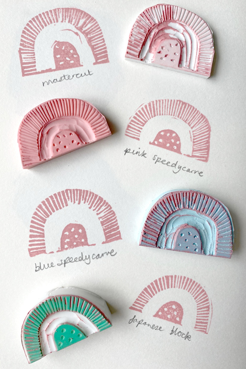
Here’s a little summary of our findings:

White Mastercut – very easy and quick to cut, a little stretchy at the edges, carved lines can be a little fluffy here and there. The thinnest of the blocks. Very inexpensive. Available in packs of two in four sizes including a large block which can be cut up to make many stamps.

Pink Speedy Carve – carves easily and clearly, very fine detail is possible, stable to cut but a little stretchy at the edges, smooth cut texture with neat lines. A little more expensive. Available in three sizes including a large block which can be cut up to make many stamps.

Blue Speedy Cut Easy – very soft and very easy to carve, a little crumbly on occasion, trickier to achieve fine detail, slightly fluffy cut marks. Inexpensive. Available in three sizes.

Green Japanese Block – easy to cut, doesn’t stretch at all, white centre makes it easy to see where has been cut, smooth cut texture and neat lines. A little more expensive. Thicker block makes it a little trickier to cut through with a scalpel but easier to hold to print. Available in two sizes (larger size is yellow).

How to Use Tjantings to Make a Batik

Tjantings (or cantings) are beautiful Javanese tools for applying wax to cloth when making a batik. They have a long handle and a little copper or brass pot with a spout from which melted wax is let out.

Tjantings can be tricky to use at first but don’t be discouraged! Once you have got the hang of how to use them, they will enable you to draw fluid lines onto cloth, creating detailed and delicate batiks. Here are our top tips for using tjantings: 

Tjantings are available in different types and sizes. Usually, tjanting sizes are numbered: a smaller number referring to a smaller sized spout. The larger the spout, the faster the wax will come out and the thicker the drawn line will appear. Smaller spouted tjantings will allow you to draw more slowly but will require more frequent dips into the wax pot to remain hot as the small spouts are quicker to cool and block. 

Hold the tjanting in the palm of your hand, not like a pencil. This should give you more control over the tool and it is less likely to spill. You want to hold the centre of the handle: holding too close to the end will be wobbly, too close to the pot will be too hot.

In your other hand, hold a wad of kitchen roll or a folded rag. Use this to cup the tjanting each time it comes out of the wax pot. It will collect the excess wax from the outside of the tool, preventing it from dripping onto your work. It will also stop wax dripping from the spout of the tool until it has reached the cloth to make its first mark.

Make sure the tools stay hot. Warm each tool in the wax pot before use. We are using a Tixor Malam Wax Pot set at about 5 on the dial. This pot can accommodate several tools so place all the tjantings and brushes (natural fibres only!) you are going to need for the session to allow them to get warmed up.

Only remove a tool when you are ready to make a mark. Pick up the tjanting and place it immediately into the wad of kitchen roll or rag in your other hand. Be careful as the tool and wax will be very hot. Bring the tool to your work and place it confidently down onto the fabric. The spout of the tjanting should make contact with the cloth. Begin moving along the fabric straight away to avoid a large blob at the start of each line. As soon as you have finished a mark, pick up the tool, cup it in the rag once more and carry it back to the pot. 

To achieve a smooth line, it can help to hold the tjanting with a very slight tilt to one side. A right-handed person may tip it slightly to the right. The enables the spout to glide along the fabric whilst allowing a little gap from which the wax can pour. Be careful not to tip it too much or the wax can spill!

Return to the wax pot frequently, after each long mark or collection of short marks. Don’t wait for the tjanting pot to be empty – it is likely that the wax will cool down too much before that point. 

If the wax in the tjanting becomes too cold it will begin to leave the spout more slowly before blocking it completely. The wax needs to appear darker that the fabric. Wax that is too cold looks pale on the fabric and won’t penetrate all the fibres. This means that the dye will undermine the wax and your marks will disappear! 

Take a look at the video below to see tjantings in action. For more information about making a batik including dye recipes, see our other batik blog posts here. 

You can find a selection of tjantings and other batik tools here. 

Meet the Maker: Ruby & Bean

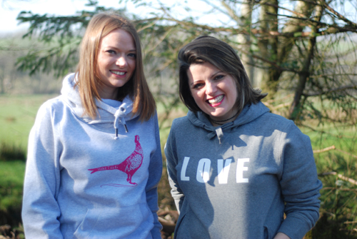
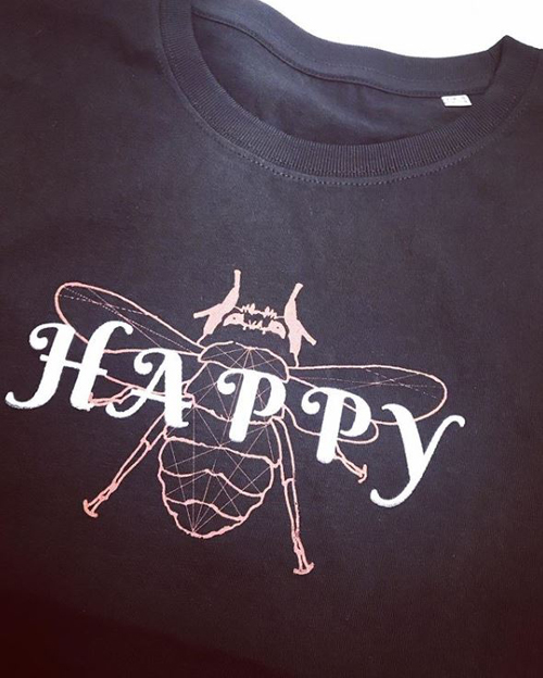
We, Amy and Louise, started Ruby and Bean because we wanted to provide a range of clothing which not only gave positive messages to all who wore them but also a range of clothing that would suit the demands of an entire family – being able to buy for all the family under one roof was the aim and one that definitely appealed to us! We have also made the move this year to be more environmentally friendly choosing organic fabrics and environmentally friendly inks where possible.

Describe your printmaking process.

 Our designs start off with simple pen and paper designs ~ we can then mull over them for 2 minutes to 2 months before the final designs are sent away and turned into wonderful screens we can use over and over again. We like to use simple designs and quotes that can be interpreted by our customers to suit their demands.

How and where did you learn to print?

 Amy has some experience of screen printing from her days studying fashion design at University. A lot of what we have learnt has been trial and error with experimenting with designs and inks – to start we had just as many mistakes as successes which we battled through.

Why printmaking?

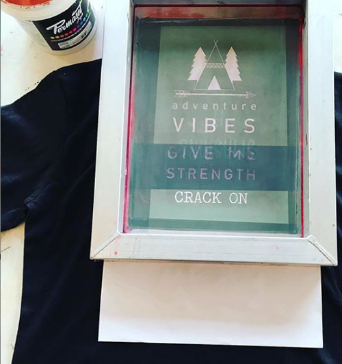
As well as feeling much more ‘hands on’, this process guarantees longevity of our makes, something that we take incredibly seriously as the idea of “fast fashion” does not sit well with us. Unlike vinyl or other printing methods, we knew we could make this a ‘cleaner’ option as we use the amazing Permaset inks which are environmentally friendly .

Where do you work?

 Our studio is based on Amy’s family farm just on the outskirts of the Lake District. We are super lucky to have a fantastic space to work as well as being close to amazing scenery if we need to get away from it all.

Describe a typical day in your studio.

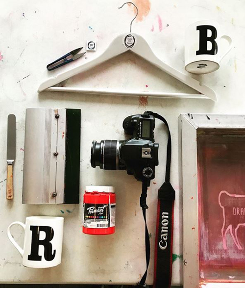
As two mums, our days are limited to school hours. Once we get to the studio, the first port of call is a cup of caffeine as we sort new orders from the website and social media.

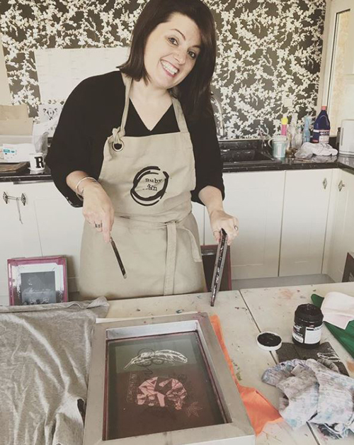
We then take it in turns to screen print orders/heat press/label/iron and package orders. When we aren’t taking care of orders, we try to keep on top of social media and product photography as well as our website. As we are the only two members of the business, we have to wear a lot of hats so during busy times and things can definitely slip if we don’t work from home too (once the kids are in bed that is!).
 How long have you been printmaking?

We started our business in October 2017 – sometimes it still feels like we a brand new and we are definitely still learning so much as time ticks on!

What inspires you?

When we first started, we took a lot of inspiration from our children or fashion trends. As we have evolved and become a predominately ladies brand, we now feel much more inspired by current goings-on and our own loves such as exercise and sarcasm ha ha ha.
What is your favourite printmaking product?

This isn’t technically a printmaking product but when we first started we used an old butter knife to get the ink out of the tub and this is still one of our favourite pieces of equipment – there is normally mild hysteria if the said knife goes missing! Thankfully it is always found again!

 What have you made that you are most proud of?

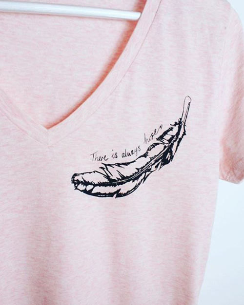
Definitely the pieces that ‘speak’ to our customers. Some of our slogans have been taken on by people who have been through a really hard time so when we get a message of thanks or see someone wearing something we know means so much it gives us a huge buzz!

Where can we see your work? Where do you sell?

 We sell most of our makes through our own website although we still make a few sales via Facebook and Instagram. We are also proud to sell in some local, independent stockists such as The Gather Café in Ennerdale and Only Willow Designs in Kirby Stephen.

What will we be seeing from you next?

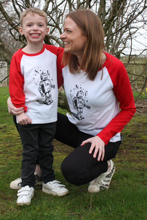
This year we have definitely seen a shift to more activewear due to a number of festivals we have lined up. As we approach Spring/Summer you can definitely expect to see some new colourways and styles of tees to complement our positive messages.

Do you have any advice for other printmakers and creatives?

Definitely experiment with ink! If it goes wrong you can just try again, some of our favourite and most popular makes have been using mixed colours or combining inks as they have a more unique/handmade appeal.

Find out more from Ruby and Bean:
rubyandbean.com
Facebook

Instagram

Meet the Maker: Mat Pringle

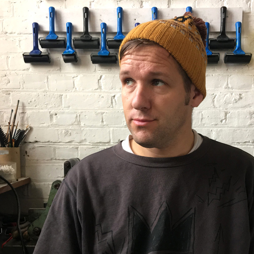
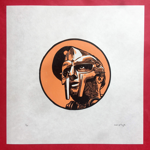
I’m an Illustrator, Printmaker and Arts Educator based in Margate.  I used to love drawing as child but it took a long time to find my way back to art, spending my twenties in a variety of unfulfilling jobs before studying Digital Design at the London College of Communication.  After a few years of being an Artworker and Illustrator I stumbled into the seedy world of printmaking firstly via screenprinting at Print Club London before settling on linocut.  For the past five years I’ve been teaching Illustration and Printmaking at the BRIT School in South London at the Saturday school BRIT Kids for 8-18 year olds. 

Describe your printmaking process.

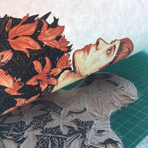
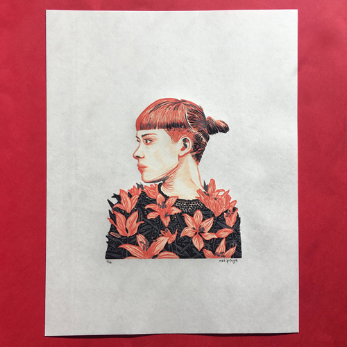
Fraught.  Sketchbook studies become pen and ink illustrations sometimes with watercolours.  Then these get transferred onto old school grey lino via rough pencils.  Then I use Indian ink and dipping pen straight onto the lino.  It’s water resistant so withstands multiple block cleans although it does sometimes transfer onto lighter colours in the print process but it usually gets covered by subsequent darker layers.  I use Ternes Burton registration tabs – I’ve tried some multiple block printing but it stresses me out and I don’t get great results – so the registration tabs are a dream to use.  I love carving lino and feel confident doing this part of the process.  I can’t say the same about the printing which is where everything tends to go wrong particularly now I’m using a bigger press at Hello Print studios and I’m basically winging everything.  

How and where did you learn to print?

I’m self-taught for the most part.  I did some linocut printing at college but the tools were bad, the inks were worse and the results were terrible.  I didn’t have any initial draw towards the medium.  Fifteen years later my partner bought me a basic linocut set and I gradually got hooked.  It was a lot of trial and error and bugging linocut artists on Twitter/Instagram about inks and tools etc.  I’m still learning.  I can get bored if I’m too comfortable with a process so I’m always looking to develop whether it be in scale or technique.  

Why printmaking?

Initially I liked how I could recreate my illustrative linework quite closely in linocut prints.  And the DIY inexpensive nature of the medium.  Plus over the course of the last ten years I’ve become less and less content relying on computer techniques for finishing artwork.  I find colouring and layering on a computer absolutely joyless.  With linocut I can make a run of prints without even opening Photoshop.  Which has also become prohibitively expensive so it’s a win/win.   

Where do you work?

I work between my home studio space and increasingly at Resort/Hello Print Studios in Margate where I share a deskspace and have access to the fantastic printmaking facilities there.  

Describe a typical day in your studio.

Tea.  Draw a bit.  Fret about how much nice paper costs.  More tea.  Listen to a record.  Cut some lino.  Adam Buxton podcast.  Tea. Crisps.  Do some printing. Fret.  Get Nick Morley aka Linocutboy to help me out of a horrendous print hole.  Tea. Collapse.  

How long have you been printmaking?

Screenprinting on and off for about ten years and linocut for about five years.  I’m pretty much all linocut now.  

What inspires you?

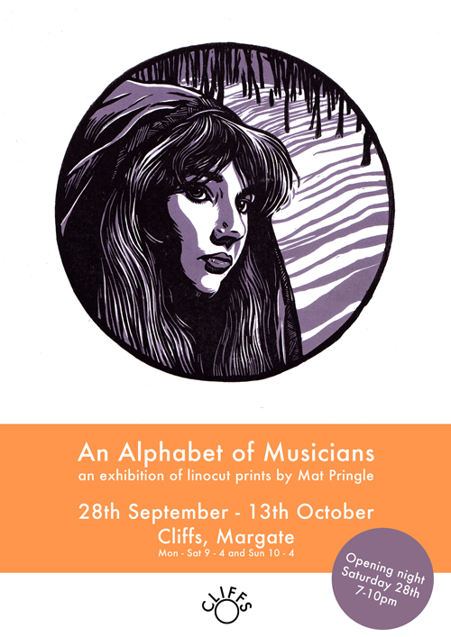
Too much.  It means my work isn’t always terribly cohesive but I’m into too many different things.  Music is a big inspiration hence my Alphabet of Musicians series from 2018 where I did a two colour reduction print every fortnight for the entire year covering all my favourite musicians, singers, producers and rappers through A to Z.  I also love folklore and myths.  I self published a collection of illustrated folklore stories called FOLKGORE a few years ago with more effin’ n’ jeffin’, blood n’ guts and nudity.  I’d love to go back to that but with linocuts.  I curated an Instagram linocut witch themed folklore collection called Linocutcoven with some of my favourite printmakers.  I’d love to do more of that and get an exhibition together of the wonderful work artists made. Plus I’m inspired by film, books, art, children’s book, nature etc.  

What is your favourite printmaking product?

Hmmm maybe Caligo safewash inks.  They were a bit of a breakthrough after printing with water-based inks and getting poor quality prints.  That said Ternes Burton registration tabs are probably the most irreplaceable element of my printing process.  

What have you made that you are most proud of?

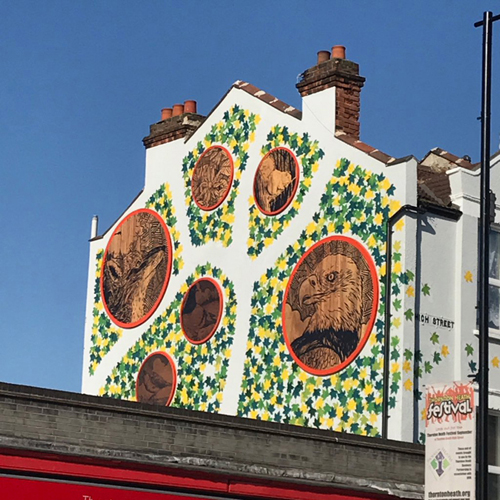
I have a mural on the High Street in Thornton Heath which evolved from a public art project with the local council.  I led linocut workshops for the local residents on the theme of flora and fauna in the area and we created a series of prints.  I then developed the prints into my own linocuts and went onto paint the artwork onto huge panels creating a map of the local area including Kayla the Eagle (representing my football team Crystal Palace).

More recently I did a six colour reduction print inspired by Joan of Arc that was technically very demanding and I’m really happy with how it turned out. 
Where can we see your work? Where do you sell?

I’m on Instagram and I exhibit now and again, most recently in Whistable at the Horsebridge Arts Centre alongside the likes of Laura Boswell, Ben Dickson and Ieuan Edwards.  I’d like to sell in galleries and shops more but I tend to underprice my work so by the time you factor in commission I’m better off selling online.  I’m working on this though.  I also currently sell on Etsy but they’re turning into greedy rob-dogs so I may switch over to Big Cartel soon. 

What will we be seeing from you next?

I’m halfway through a big tiger reduction linocut print based on a watercolour illustration I did last year; if it works it could be vying for proudest print achievement.  Big IF though as quite a lot has gone wrong so far… 

Do you have any advice for other printmakers and creatives?

Be patient.  Make prints that draw on your loves rather trying to make work following trends.  Be nice.  Have a master printmaker on hand for when everything turns to shit.*

Website – www.matpringle.co.uk
Instagram – @MatPringle
Etsy – www.etsy.com/shop/MatPringle

* This may not be an option for many people but I highly recommend it. 

How to Make a Sgraffito Batik

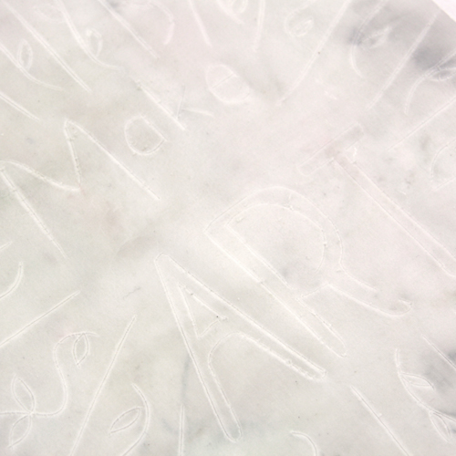
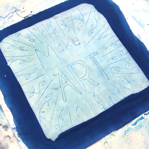
Sgraffito is a fast batik technique in which positive marks are scratched into the surface of the wax and filled with ink. Use sgraffito in combination with other batik methods or make a speedy sgraffito batik like in the project below:

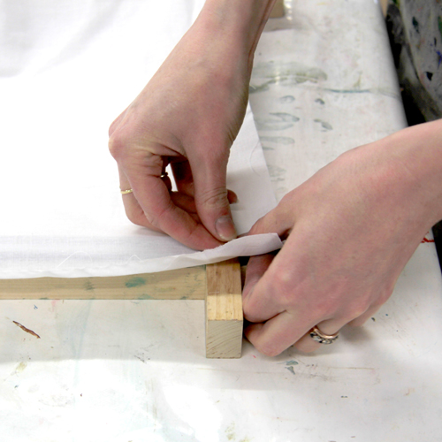
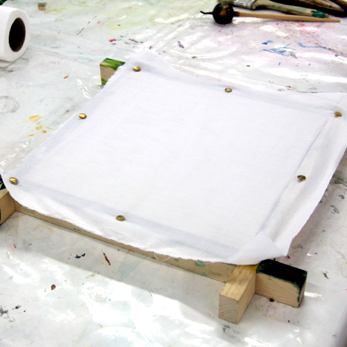
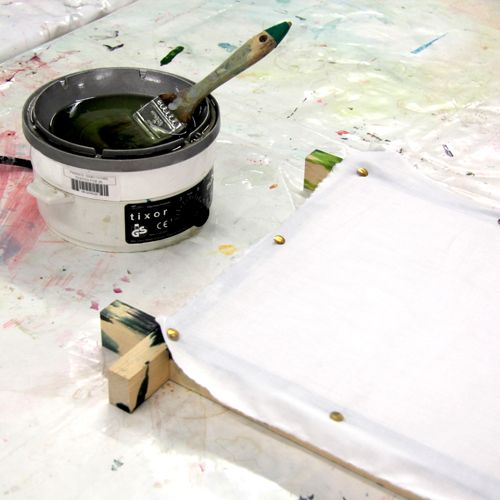
Begin by pinning out your fabric. Pre-washed, 100% cotton works best – we use Prima Cotton which is dye ready and doesn’t need washing.

Pinning the fabric onto a frame holds the fabric above the table, allowing the wax to dry without sticking.

Heat Batik Wax in a Tixor Wax Pot. It is important that the wax is hot enough to penetrate the fabric rather than sitting on the surface. We keep our pot on a 5 or 6 setting on the dial. If the wax starts to smoke, unplug immediately. Place a wide natural-fibre brush into the wax (synthetic fibres will melt). Once a brush has been used for wax it is very difficult to restore it for other uses – once a wax brush, always a wax brush! Leave the brush in the wax until completely soft.

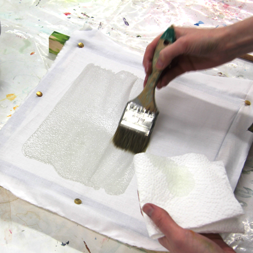
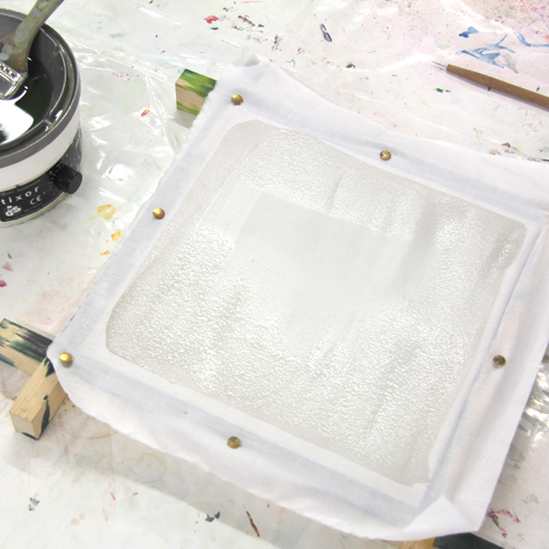
Holding a piece of kitchen roll or rag in your other hand to catch the drips, lift the brush from the wax pot and begin to paint the wax onto the cloth. Frequently return the brush to the pot to recharge it with hot wax. If the wax starts to look pale on the cloth it is too cool.

This wax will act as a resist to the dye we will add later. Leave the wax for a minute or two to cool.

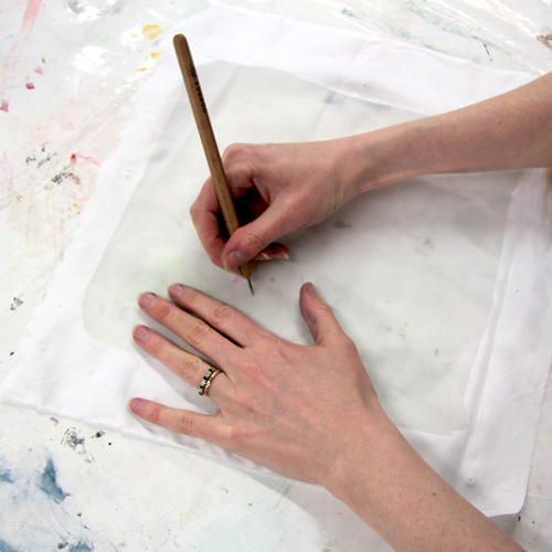
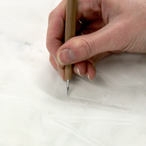
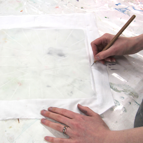
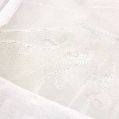
Unpin the fabric from the frame and place on the table. Use an Etching Needle to scratch marks into the wax.

These scratches will open up thin strips of fibres so that the dye can get in.

Mix a dye using 1tsp Procion MX dye to 50ml water. Mix a separate fixative chemical water using 100ml warm water, 1tsp urea and 1/2tsp soda ash (plus a pinch of Calgon if you live in a hard water area). It is good practice to wear a dust mask when working with these substances in powdered form. Pour a little of the chemical water into a pot. Add pipettes of the dye solution until it reaches your chosen strength, remembering that the colour will dry slightly lighter.

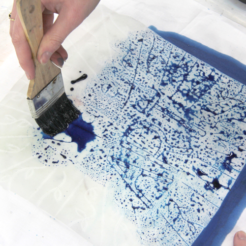
Use a stiff brush to paint the dye onto the waxed cloth. This dye will stain your clothes and hands so you may wish to wear gloves and an apron.

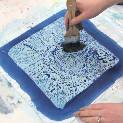
Work the dye into the lines using circular motions.

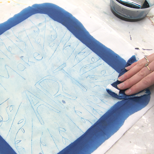
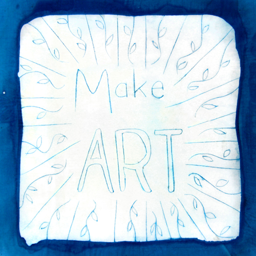
Remove excess dye with a piece of kitchen roll or rag. Add more dye to areas that are not showing clearly. You may wish to repeat the dyeing process on the back of the design too.

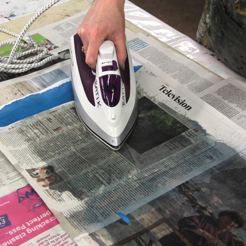
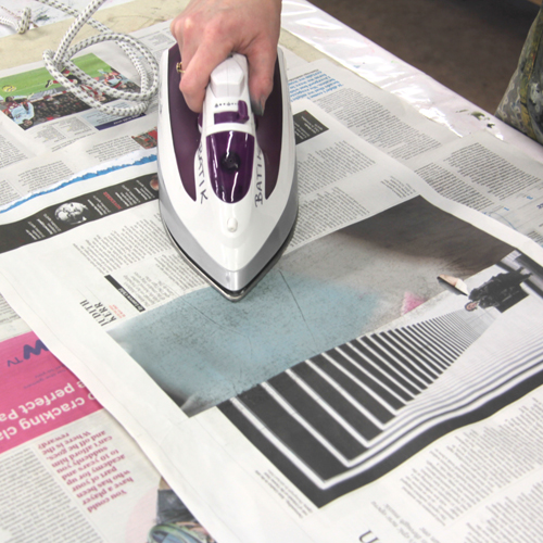
When the batik has dried, it’s time to remove the excess wax. Lay down a few layers of newspaper or newsprint on a padded surface. Place the batik on top and cover with a single layer of newspaper or newsprint.

Iron over the batik. A separate iron should be used for this process as wax residue may come off on other clothes. If the iron begins to smoke, unplug immediately and leave to cool down. The wax should instantly melt into the newspaper. Remove the waxy sheet and replace.

Continue to replace the sheets of newspaper on top and underneath until very little wax is appearing on the fresh paper.

To make your own sgraffito batik you will need:

Meet the Maker: Tweeny

I’m Christina, also known by the moniker Tweeny. I’m a designer by day, living and working in the beautiful city of Bath, and an artist-printmaker in my free time. I mainly do lino printing, but like to experiment with other processes.

Describe your printmaking process.

I tend to sketch out ideas first, either on paper or ipad. I then neaten it up a little, trace it onto tracing paper with pencil, then transfer to the lino by rubbing the reverse. I then go over the pencil lines with a Sharpie and then start carving! It’s usually still quite rough at this point, and I work a lot of the details of the print as I go along.

How and where did you learn to print?

I vaguely remember doing a bit of lino printing at art college, however in recent times it’s been self-taught through experimentation. I’ve also learnt so much from following other lino printers on social media, seeing different processes from others has been so helpful to me.

Why printmaking?

I’ve always been a quite creative person, and a few years ago whilst experimenting with various crafts (dressmaking, needle felting, crochet, knitting, painting to name a few) I tried lino printing and something just clicked! I’ve always found myself drawn to art and design with a good dark/light contrast and strong lines, so when I started to research mono lino prints there was a sudden moment of clarity – “this is me!”. I love it, the long carving process and then the final reveal is so satisfying.

Where do you work?

I do most of my sketching and carving at home on the sofa, and then printing happens on the dining room table. My husband is an artist too, so we work around each other. One day maybe we’ll have room for a studio!

Describe a typical day in your studio.

There is no typical day, it’s not my full time job so it’s a case of finding time in between work and life to carve.  

How long have you been printmaking? 

Approximately eight years

What inspires you?

Other creatives, including my husband who is bursting full of ideas at all hours of the day.

I also take so many photos (so, so, many photos) of objects and textures that I see that I think would work well in a print.

What is your favourite printmaking product?

Either my Pfeil tools – they make the carving process so much more enjoyable, as well as making me less likely to injure myself! Or my Woodzilla press – before I had that I was using my Grandmother’s book press which my Dad had restored. It was fantastic as my first press, but such hard work!

What have you made that you are most proud of?

I don’t think there’s a single print I’m most proud of, I’ve loved making them all. However, in October 2018 I did a lino print a day for #Inktober and came out with a body of work that I was really proud of.

Where can we see your work? Where do you sell?

I sell on Etsy: https://www.etsy.com/shop/tweeny/

I’m on Instagram as @Tweeny and twitter and Facebook as @tweenyprints

What will we be seeing from you next? 

I would like to try and be more confident at selling my work – selling at fairs etc. I’d also like to do some larger prints and I’d love to experiment with wood engraving too.

Do you have any advice for other printmakers and creatives?

Advice I should probably take on myself – try not to get frustrated with yourself when you’re being so inspired by other people’s amazing work. Just enjoy what you and they are doing.

More from Tweeny:
Instagram @tweeny
Etsy – Tweeny
Facebook – @tweenyprints
Twitter -@tweenyprints

Blind Embossing with Lino

Blind embossing is a beautiful way in which to add light and shadow to your prints. Embossing adds subtle texture and interest. Emboss prints ‘blind’ (without ink) or combine with inked lino for a complex final print.

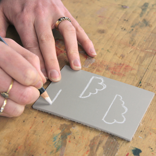
Prepare the design. These white pencils are brilliant for drawing designs onto traditional lino. The marks show up beautifully and there’s no danger of transference onto white paper.

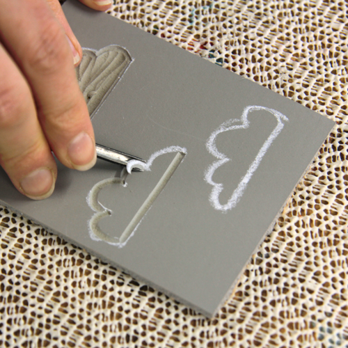
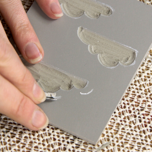
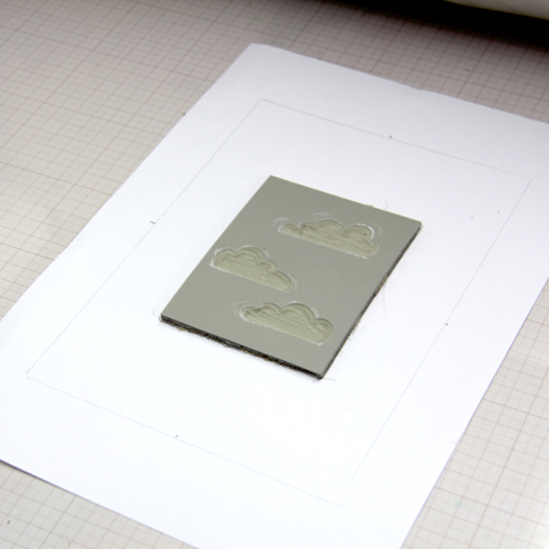
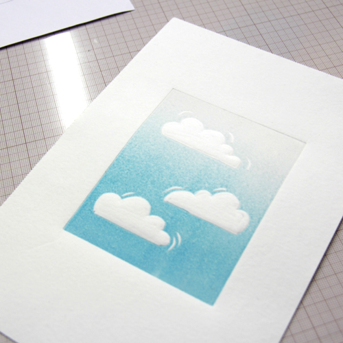
Carve the design. Remember that anything we carve away will be raised in the final print. We want these clouds to puff out of the paper so we are carving them into the lino. A small U tool is perfect for carving the edges of the clouds.

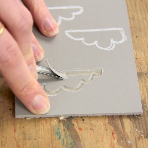
A large U tool works well to clear the larger areas. The texture of these carved areas is likely to show up in the final print. Use a large U or chisel to flatten and smooth out carved areas with too much texture.

We are using a V tool to carve a few extra lines around the clouds to add detail.

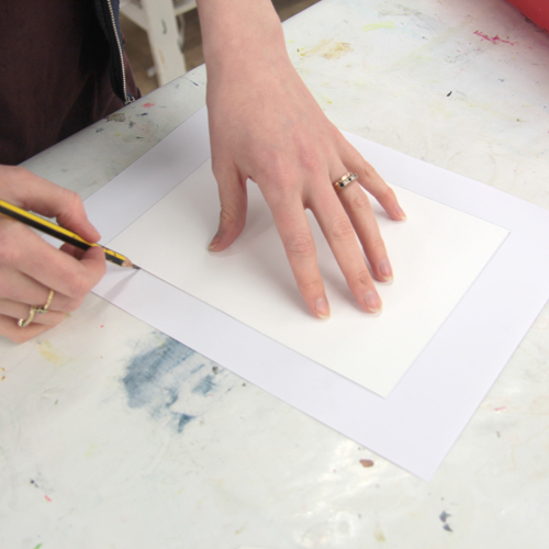
Before printing, make a registration sheet. Lay a sheet of your printing paper onto a plain sheet of copy paper. Draw around it.

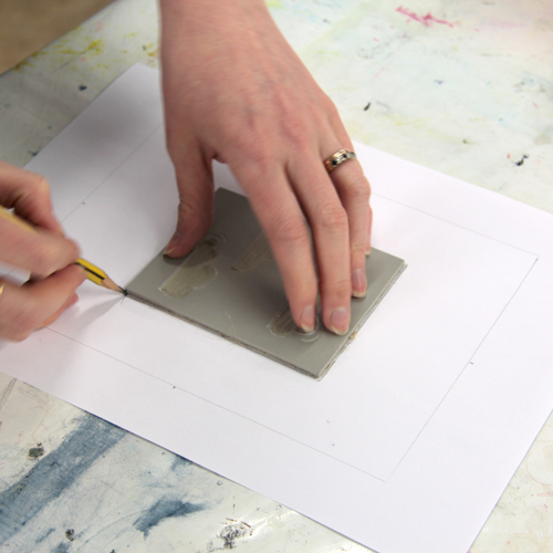
Place the block in the centre of the registration sheet. Draw around it. This will help us to ensure the block and paper are straight and square when put on the press bed.

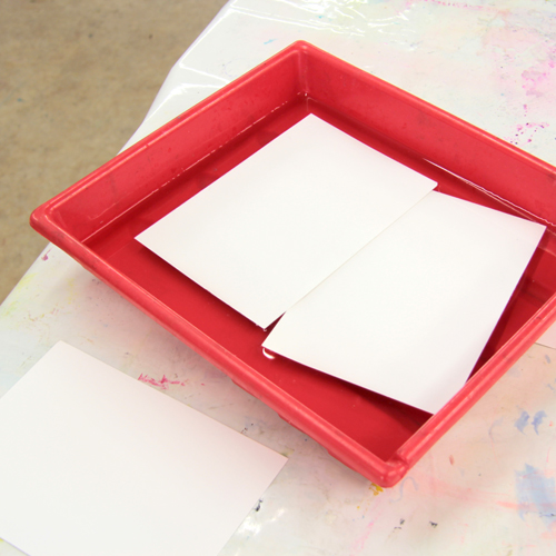
Soak the printer paper in a tray of water. We are using Snowdon 300gsm cartridge paper. A thick paper is best for soaking as it is more sturdy, less likely to curl and should receive lovely plate marks – perfect for embossing. Leave the paper to soak for at least 3 minutes. Experiment with different soaking times for varied embossing results.

Place the registration sheet on the etching press bed. Lay the lino block in the centre, face up.

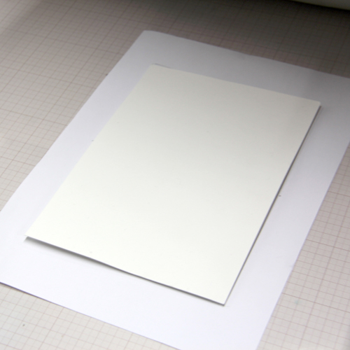
Remove a sheet of paper from the water bath and blot it. it should feel damp but not be dripping wet. Lay it on top of the block using the registration sheet to guide its position.

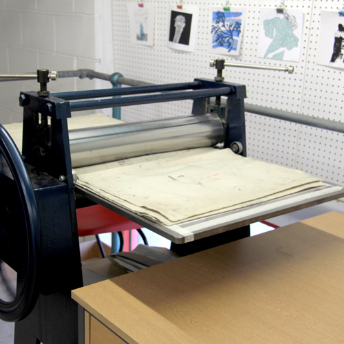
Cover with blankets and roll through the press. The pressure should be a little tighter than normally used with lino.

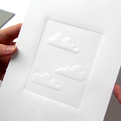
Peel the block from the paper to reveal the print! The carved areas should be raised.

Experiment with combining inked and uninked blocks. The print below was made using the same method but the block was inked with a rainbow roll of Caligo Process Blue mixed with Extender through to pure Extender to create a faded sky.

To emboss your own prints you will need:

Meet the Maker: Jamie Barnes

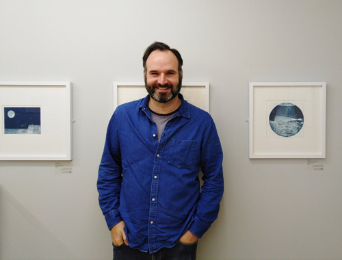
We are very lucky to have Jamie Barnes in the studio teaching Aquatint Etching in April 2020! Join us for the weekend or weekday workshop and read on for more information about Jamie and his beautiful work.

Describe your printmaking process.

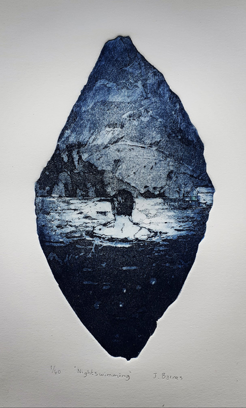
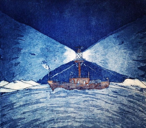
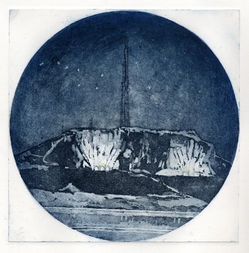
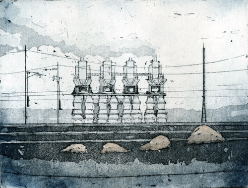
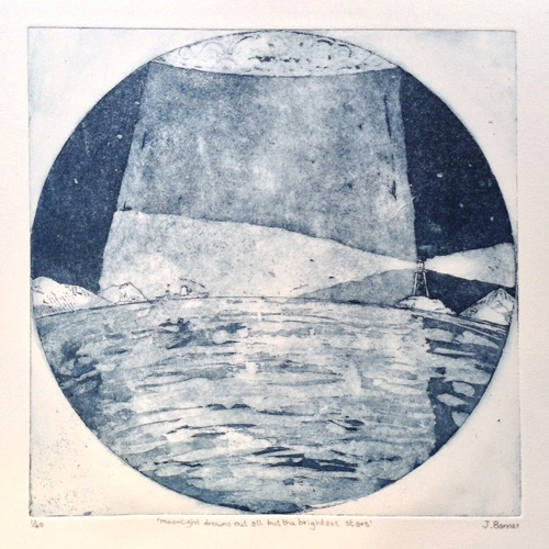
I make etchings about structures in the landscape and on the coast, so everything begins with a real or imagined place. I then develop that into a drawing on tracing paper then reverse the drawing to use as reference to make an etching. I etch the lines into the zinc plate using copper sulphate solution. Next I add all the tones to the plate, this is called the aquatint. I then add ink to the plate and take a print using an etching press.

How and where did you learn to print?

While I was working as a museum curator about 10 years ago I took a printmaking night class in the local art college. As soon as I learnt the etching technique I was hooked and my fascination with it has never waned. 

Why printmaking?

Two reasons 1. I absolutely love drawing and etching is an excellent way of processing line drawing, and 2. I’m colour blind, and a limited palette suits etching really well

Where do you work?

I work in my studio right in the middle of my hometown, which I share with two other printmakers, a painter, a photographer and a sculptor.

Describe a typical day in your studio.

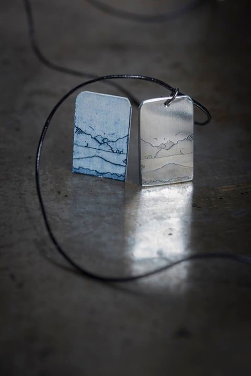
I live in Kendal in a terraced cottage in an area of town called Fellside, where the houses are stacked up like an Italian hill village – but with a lots more rain! My studio is a 3-minute walk down this hill into the market place. I usually start with a bit of editioning of etchings while listening to lots of art podcasts or music. After lunch I’ll either make my etched jewellery or do a bit of framing or drawing. If I’ve been on my own in the studio, I may go to the local coffee shop mid afternoon and have a natter with the staff and other customers, and perhaps do some research for future projects.

How long have you been printmaking?

10 years now

What inspires you?

The tracks and traces left by humans in the landscape; be it buildings, power lines, infrastructure or just curious structures. 

What is your favourite printmaking product?

Probably the intriguingly-titled ‘straw hat varnish’ which I use to ‘stop out’ areas when making my etching plates.

What have you made that you are most proud of?

I think the etching ‘Stone Semi-Circle and Shap Cathedral’ (below) from my recent group show ‘Shap Shape’ ticked all the boxes for what I was trying to achieve.

Where can we see your work? Where do you sell?

If you visit my website www.jamiebarnes.co.uk you can see and buy my work, as well as see a listing of the many art selling events I attend throughout the year. 

What will we be seeing from you next?

I will be attending Printfest Ulverston the first weekend in May; the best printmaking festival in the UK, and luckily for me just on my doorstep! I am also trying to develop some new work about space architecture.

Do you have any advice for other printmakers and creatives?

Don’t try and do too many different things. Concentrate your efforts on a couple of strong ideas or techniques follow them right through. This helps give your work consistency which is often what galleries and buyers want to see.  

Join Jamie Barnes in the studio for his Aquatint Etching Workshop in April 2020! Join us for the weekend or weekday workshop.

See more from Jamie:
Instagram: PrintmakerJim
Facebook

Screen Printing onto Fabric with Translucent Colours

This week’s blog post has been created with Sophie, our fantastic work experience student!

Over this past week, I have been doing work experience. It has been an amazing opportunity and I have learnt some great new skills.

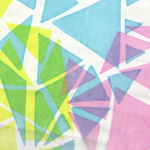
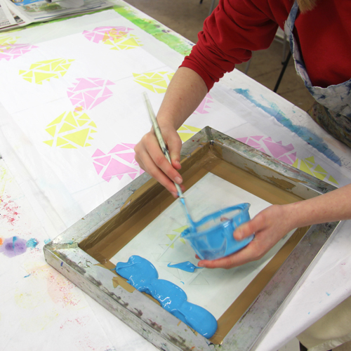
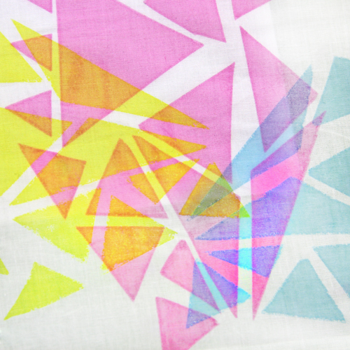
Yesterday I tried screen printing, I drew out my own designs which I used in three different colours to overlap in translucent coloured ink – pink, yellow and blue. I also did a different design where I layered up the same stencil in the same colour, going from lighter to darker shades. I really enjoyed the screen printing, especially seeing my first design go through the stages to get printed onto fabric.

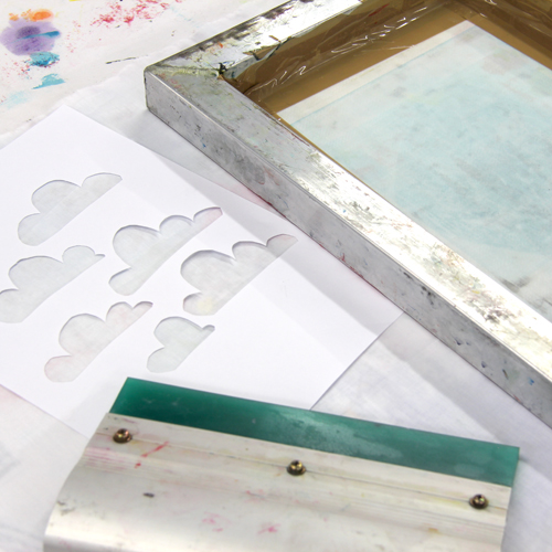
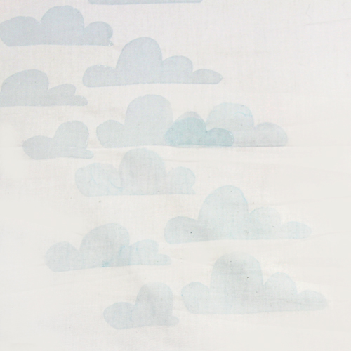
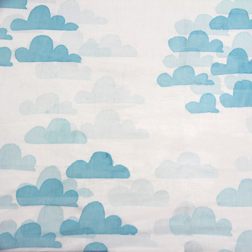
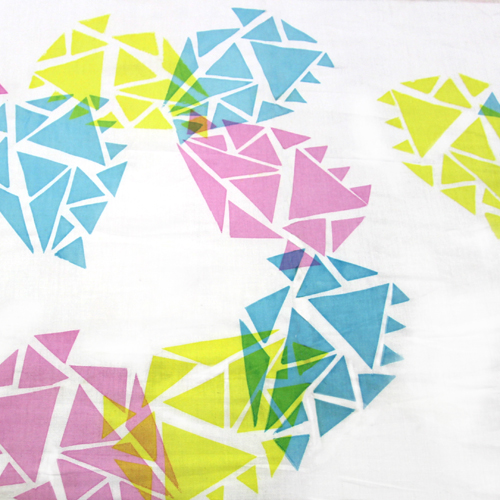
I used Pinterest to help me design my screen print – for more inspiration, you can see my Pinterest board here. My final templates were a series of triangles arranged at different angles which when printed in different colours overlapped to create different shades. My other print was clouds overlapped with shades of blue. Here is how I did it:

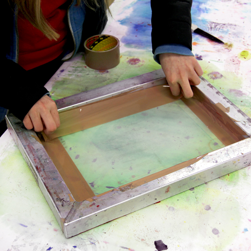
Start by taping around the edges of a 43T A4 screen. Tape the front and the back of the mesh, leaving an aperture just a little smaller than the stencil.

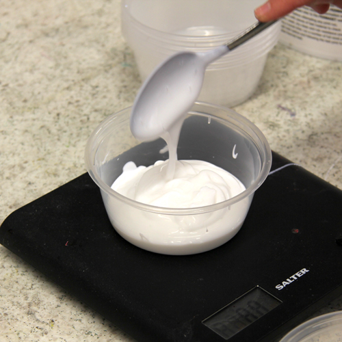
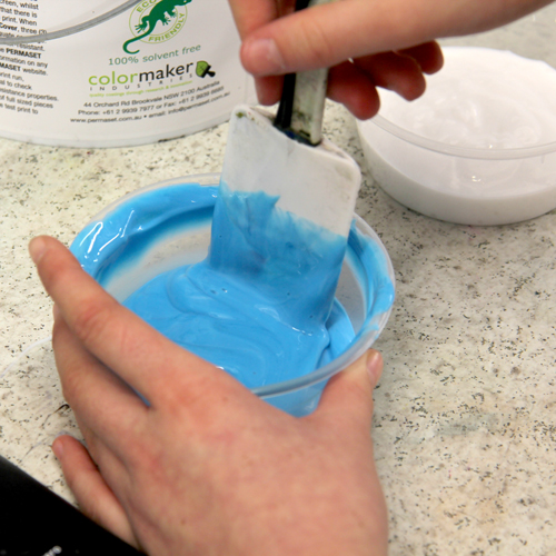
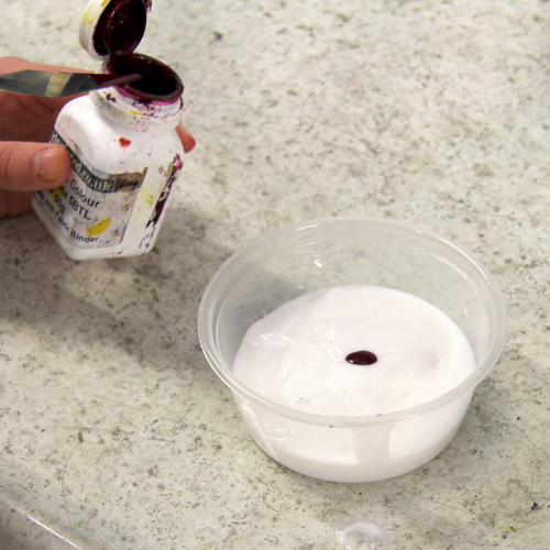
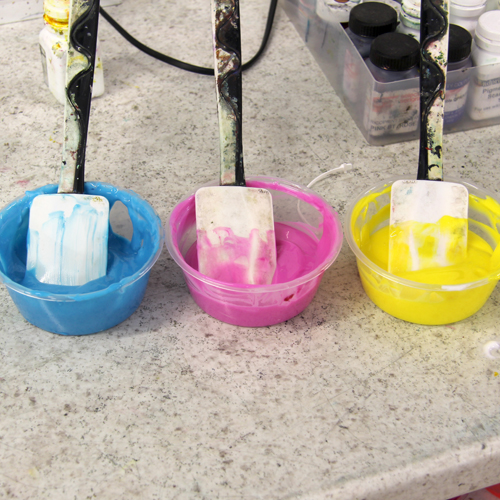
To mix up the inks, we started by measuring out 100g of Permaset Print Paste.

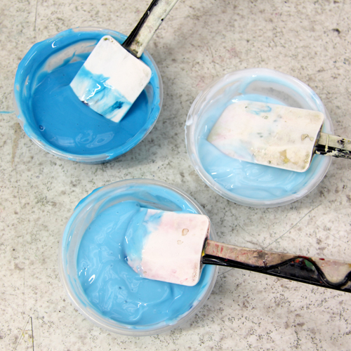
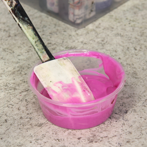
For the darkest shade of blue, we added 1 drop of Turquoise Pigment.

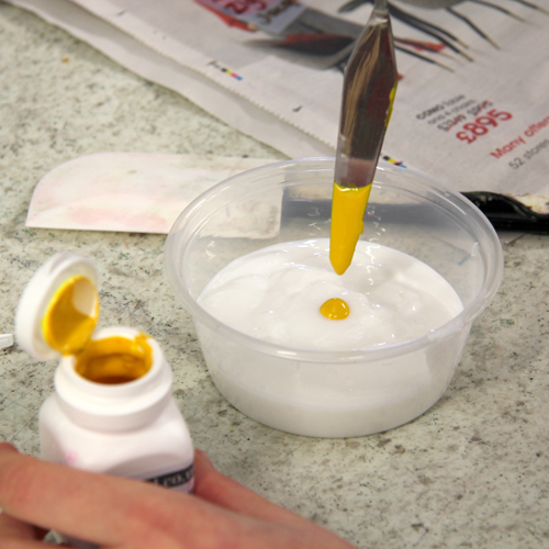
For the palest shade, we used a chopstick to add a small dab of pigment to 100g of print paste. We added two dabs of pigment to the middle shade.

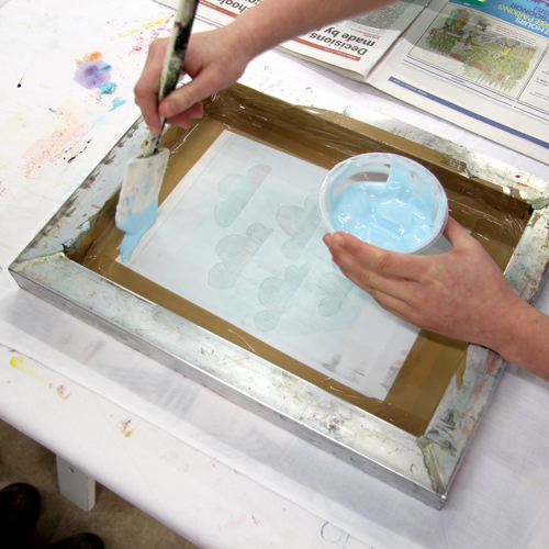
Using a padded surface, pin out some prima cotton. Place the stencil in the top right of the fabric. Place the screen on top, making sure there are no gaps left between the stencil and the tape. Place a bead of the palest shade of ink along the top of the screen.

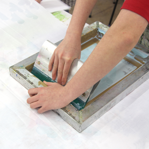
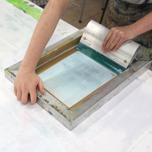
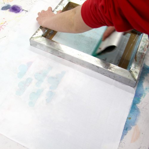
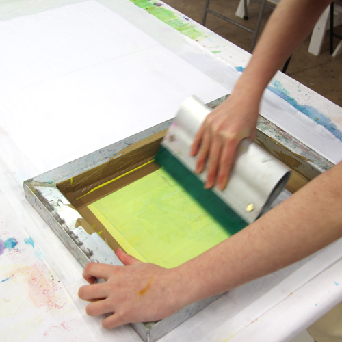
Holding the screen with one hand and the squeegee with the other, drag the squeegee at a 45′ angle down the mesh. Begin by pressing gently to flood the mesh and then finish by pressing hard. You should hear a zip sound.

Lift up the screen to reveal the print. The stencil should stick onto the mesh. Place the screen down on another area of fabric, making sure the screen doesn’t go down on a wet print. Print the design again.

Continue to print the first layer, overprinting when the first layer is dry. The two layers of transparent blue overlay to create a darker shade.

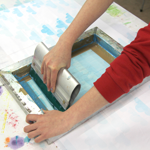
Scrape any remaining ink from the screen using a spatula. The stencil can stay attached to the screen because we are continuing to use blue ink. Add a bead of the next shade of blue and print all over the fabric. Repeat this with the third shade.

When you’ve finished, peel the stencil from the screen, remove any excess ink and clean the screen down with a damp sponge and cold water.

Sophie’s second printing project used Magenta, Turquoise and Yellow inks. These translucent primary colours overlap to create secondary colours. Each pot of ink was created using 100g of print paste mixed with one drop of pigment.

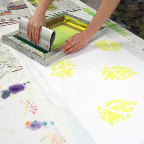
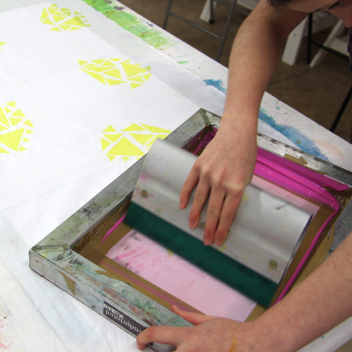
Sophie started with the yellow ink. The inks being used here are very translucent and so the colours underneath will show through each layer. If we were printing with slightly more opaque ink, we may want to print with the blue or magenta ink first as they will be stronger colours than the yellow.

When changing the ink colour for a new layer, clean the screen down and replace the stencil. Sophie cut three of the same stencil for this fabric.

The translucent inks overlay to create new shades of green, purple and orange.

To do this project at home you will need:

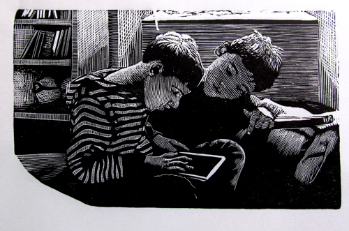
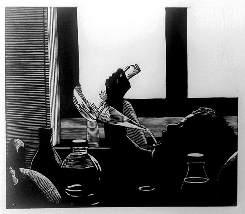
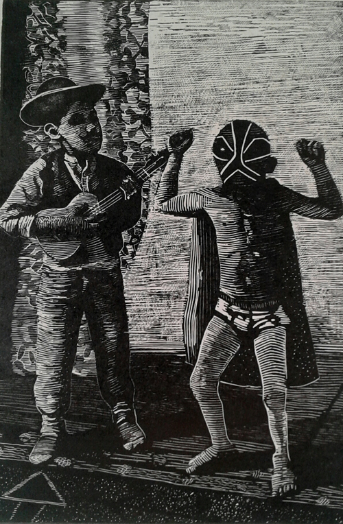
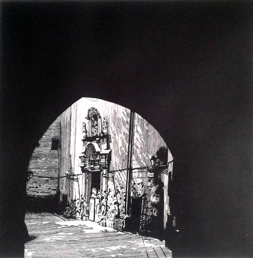
Meet the Maker: Chris Pig

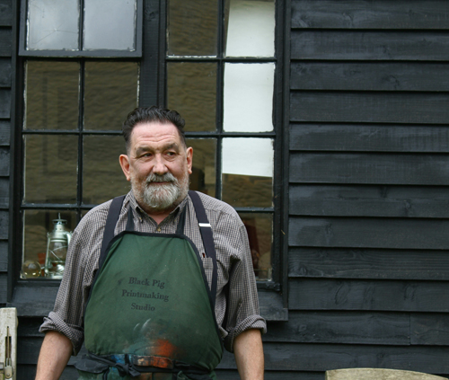
I’m Chris Pig, an artist printmaker living in Frome with my family. I am director of a small teaching/professional studio Black Pig Printmaking Studio. I designed it myself and managed the project and am very proud of what it has become.

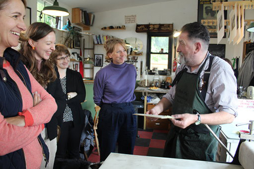
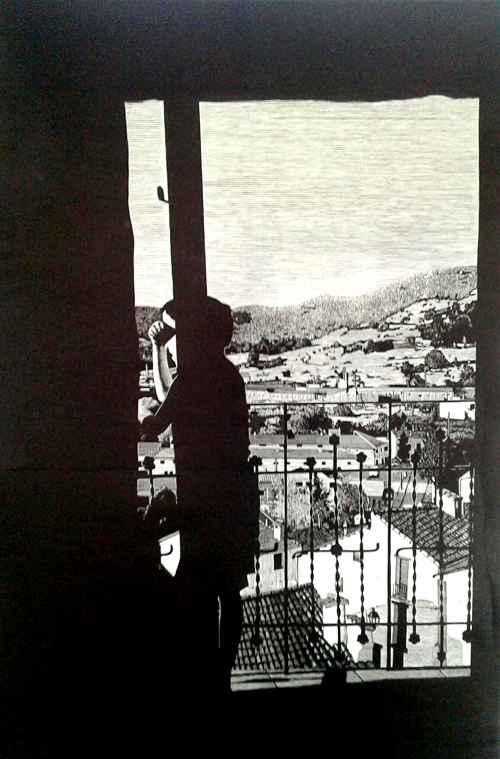
Recently I’ve been collaborating a lot with academics, historians who study prints and drawings mostly. They have come to learn the processes in making the prints that they study. Dr Alixe Bovey, director of studies at the Courtauld Institute, Dr Bethan Stevens who heads the Dalziel project at Sussex University and Dr Esther Chadwick, also of the Courtauld have all recently been involved.

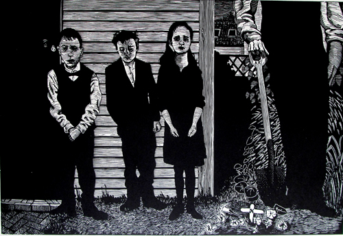
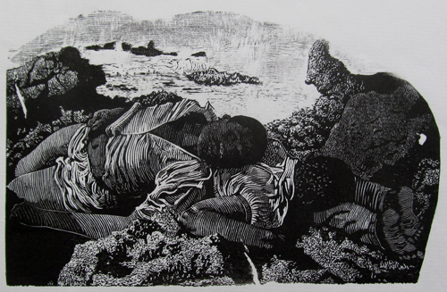
Most of my work at the moment is to do with childhood. My partner works away for four days a week and I’m the primary carer. One day, as the kids filed out to bury a goldfish, Frank crossed his arms in front of him and said, “I’d just like to say a few words.” It was a damascene moment for me as I realised I had a rich seam of pathos right under my nose. Adults tend to patronise and belittle childhood emotions when they are the richest and most intense. Why should a child’s grief for a lost pet carry any less gravitas than an adult’s bereavement?

In the studio, learners work alongside professionals and all their work is together in the ball racks. This suggests to learners that their work is of value no matter what skill level they are. I have been making prints for a very long time and no other profession has really interested me. I am not passionate about printmaking, that suggests something more intense and short-lived, like an affair. I’m married to printmaking, a much more complicated and nuanced relationship.

Describe your printmaking process

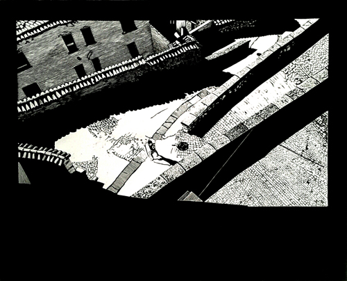
I have two printmaking processes, wood engraving and linocut. They inform each other, I cut boxwood like a linocutter and lino like a wood engraver. Often I’ll do two versions of the same composition, one in box and then scale it up for lino. 

How and where did you learn to print?

I was a sickly child with a reduced curriculum. I managed to exagerate my sicknes to the extent that I spent my whole time in the library and the art room. Mike Kitchener the art teacher, formed me and taught me enough drawing skills to last me the rest of my life. He taught me how to etch by about 14. We had acid baths open on the benches with no extraction. Because of my open sores from eczema, he used to immerse the plates for me. No gloves or protection at all, no extractor fans. The sixth formers used to flaunt the brown burnt ends of their fingers from the nitric acid which looked like heavy nicotine stains. We only had money for steel couldn’t afford copper ’til I went to art college. 

Why Printmaking?

I came across printmaking by circumstance but it is very addictive and I decided it was the one for me. Plus it’s egalitarian. It’s possible to own and appreciate an exquisite, hand made work of art for an affordable price.

Where do you work?

In my studio, black pig. It’s easiest to cut alone and print with company. I have that luxury and am very aware of how lucky I am.

Describe a typical day.

On a good day I get to the drawing board by nine, work ’til twelve, lunch ’til one, teaching from one to three then it’s all over when I pick up the kids.

How long have you been printmaking?

Forty years this year, man and boy.

What inspires you?

Everyday life inspires me, I get my best work ideas when I’m open to possibilities in story-telling and a good image from that which surrounds me. There are lots of artists of course, Masereel and Valloton I’ve had since I was a kid. I’ve worked a lot with victorian engravers, particularly Doré and the Dalziel brothers and during a recent spell in hospital Hans Holbein the younger and Sandow Birk.

What is your favourite printmaking product?

EVERYTHING involved in the process of relief printmaking is intensely satisfying, sensuous and beautiful. My tools are Pfeils for lino, J.Buck for engraving, victorian originals, and EC Lyons of course. I print only with VanSon rubber based inks and lots of different papers, Sunome Senaka being my favourite for large work.

What are you most proud of?

I like my big linos the most.

Where do you sell?

Different Trains Gallery, Decatur, Georgia USA Wharepuke Gallery, New Zealand. Why Gallery UK,  Society of Wood Engravers, UK

What will we be seeing from you next?

Large work, either to do with the homeless or kids living in food poverty, depending on my mental health. I find depressing subjects take a toll on me, partly because with relief work you are so up close and personal with your subject. Something has to be done though to counterbalance these cartoon bigots, these fascist pigs who have been allowed to take over our political system. Dark work for dark times.

Do you have any advice for other printmakers or creatives?

Yes. Don’t lose focus on your work and don’t anticipate it making you any money.

More more from Chris Pig, visit his website.