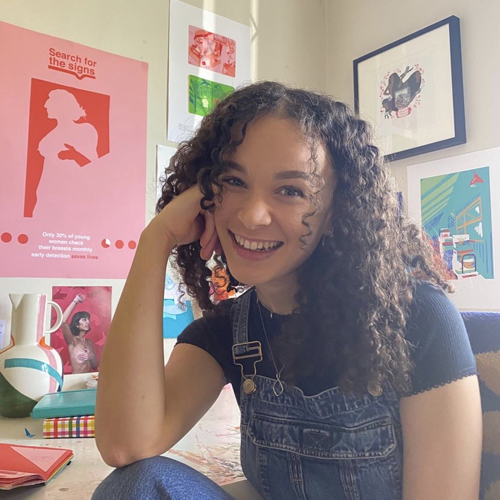
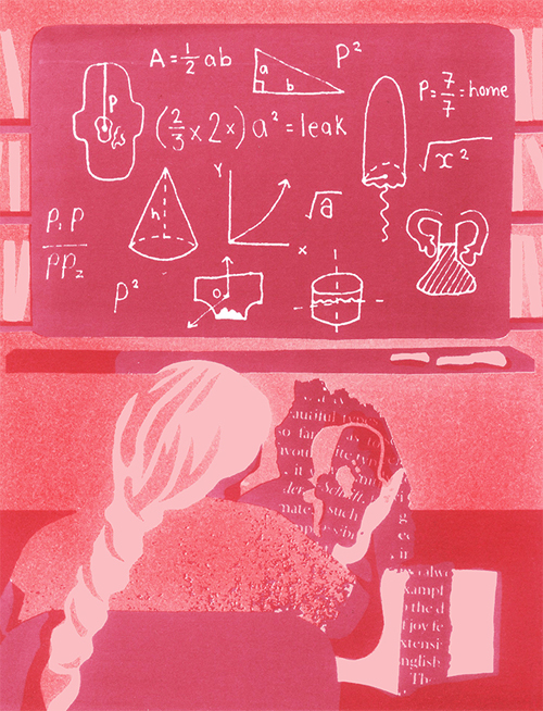
I’m a Bristol based illustrator and designer with a love of bold colour. I am an advocate for diverse representation, challenging taboos and stereotypes. My work comments on recurring social issues in modern society.
How and where did you learn to print?
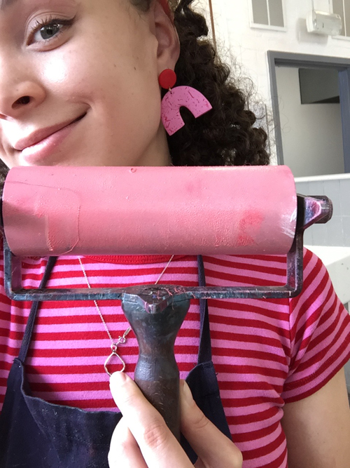
I learnt to print in Bristol during my time on UWE’s illustration course. The print rooms were just downstairs from my studio so I was able to nip down and spend the day experimenting. Often I won’t come out of the studio with “perfect” prints but instead ideas, tests and happy accidents that I can feed into my work outside of the print room.
Why printmaking?
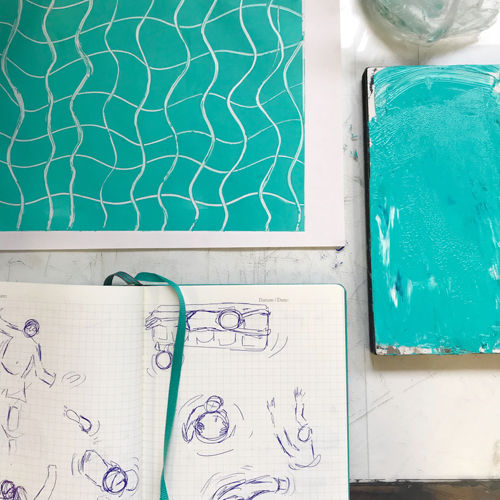
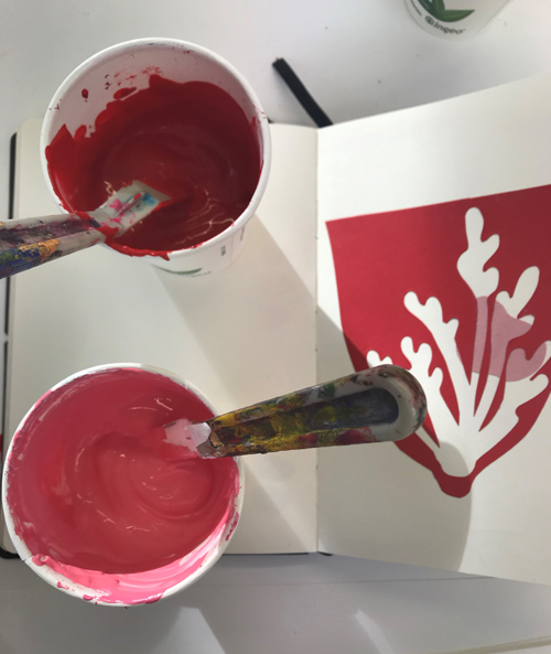
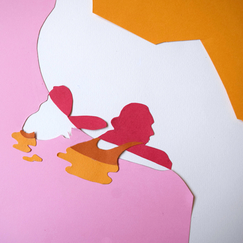
For me printmaking has always been about experimentation. Blocking out that time to just play with techniques, colours and shape. I use a lot of cut collage work that heavily relies on bold shapes. Moving my screen directly around the bed to create different compositions was a fun way to capture how I work. My work has moved on in recent months from printmaking, but I think I’ve learnt a lot from it, such as the use of a limited palette, and an open mindedness to play.
Where do you work?
I’m currently back home in Oxfordshire but hoping to be back in Bristol very soon. For now I’ve set up a little studio in the spare room where I can still keep busy creating and generating ideas.
Describe a typical day in your studio.
Each day varies but I like starting the day with idea generation and sketchbook work as I tend to feel the most free in the mornings. Before moving onto things I’ve got to finish up that day.
What inspires you?
I take a lot of inspiration from Matisse’s collages and Noma Bar’s use of negative space. I also take a lot of inspiration from the things going on around me as I take a hands-on approach to both the making and the research of my projects.
What have you made that you are most proud of?
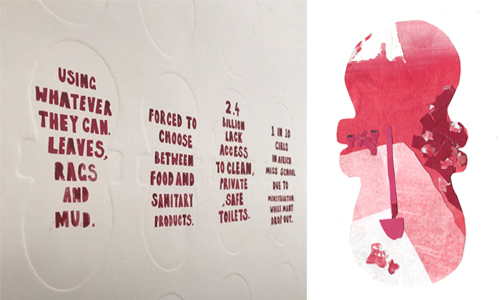
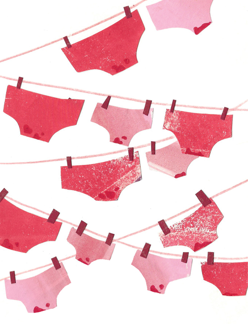
I’m a big advocate for representing social issues within my work. One of the pieces I felt was really brought to life with print techniques was my ‘Periods without Privilege series’, focusing on period poverty. It was a mixture of blind embossed period pads with collagraphed narratives and statistics into each pad. I loved experimenting with the different textures made using mono screen printing which I later used to collage with. Using a limited palette really made me utilise texture and shape more.
Where can we see your work? Where do you sell?
My full portfolio is on bethsuzanna.com, which I’m hoping to launch an online shop on very soon!
What will we be seeing from you next?
Bold, colourful and uplifting work that makes complex issues easy to digest in a playful manner!
Do you have any advice for other printmakers and creatives?
I’d always say to other creatives to make the work that you care about and that excites you. When doing this it’s easy to keep feeling inspired and motivated. For me my work comes from a place of genuine interest or experience, creating honest representations and elevating voices. When you marry this with the experimentation and play that comes naturally to you as a creative, your work will keep evolving!
Follow Beth on Instagram and Twitter or head over to her website.